Destinations: a simpler way to send data out of Mixpanel
We’ve reworked the Integrations page to make it easier to create and manage Destinations, Cohort Syncs, and Data Pipelines.With this update:- “Integrations” is now “Destinations”: The new name makes the page’s purpose clearer — it’s for connecting data flowing out of Mixpanel — and reduces confusion for users who came looking for ways to bring data in.
- Destinations lives in the Data menu: Find it under Data → Destinations in the main nav. It’s still available in the settings menu for now, but that entry point will be removed eventually.
- Onboard cohort syncs directly from Destinations: No more bouncing between the Integrations page and Lexicon. Open a connected destination, go to the Syncs tab, and click Add Cohort Sync. Onboarding from Lexicon still works.
- Separate views for connected and available destinations: Your connected destinations and the full library are now split, making it easier to see what’s already connected and to add something new.
Passkeys
You can now sign in to Mixpanel with a passkey - no password and no one-time code. Register a passkey once and authenticate with the same Touch ID, Face ID, Windows Hello, or hardware security key you already use to unlock your device.Passkeys are built on the WebAuthn/FIDO2 standard. The credential never leaves your device and is cryptographically bound to Mixpanel’s domain, so it can’t be phished, replayed, or used on a fake login page.With this update, you can:- Sign in without a password: Enable “skip password” for a fully passwordless login (org-mandated SSO still applies)
- Manage your passkeys: Register, name, and remove passkeys from Personal Settings, one per device
- Stay covered if you lose a device: Generate single-use recovery codes to sign in when you can’t present a passkey
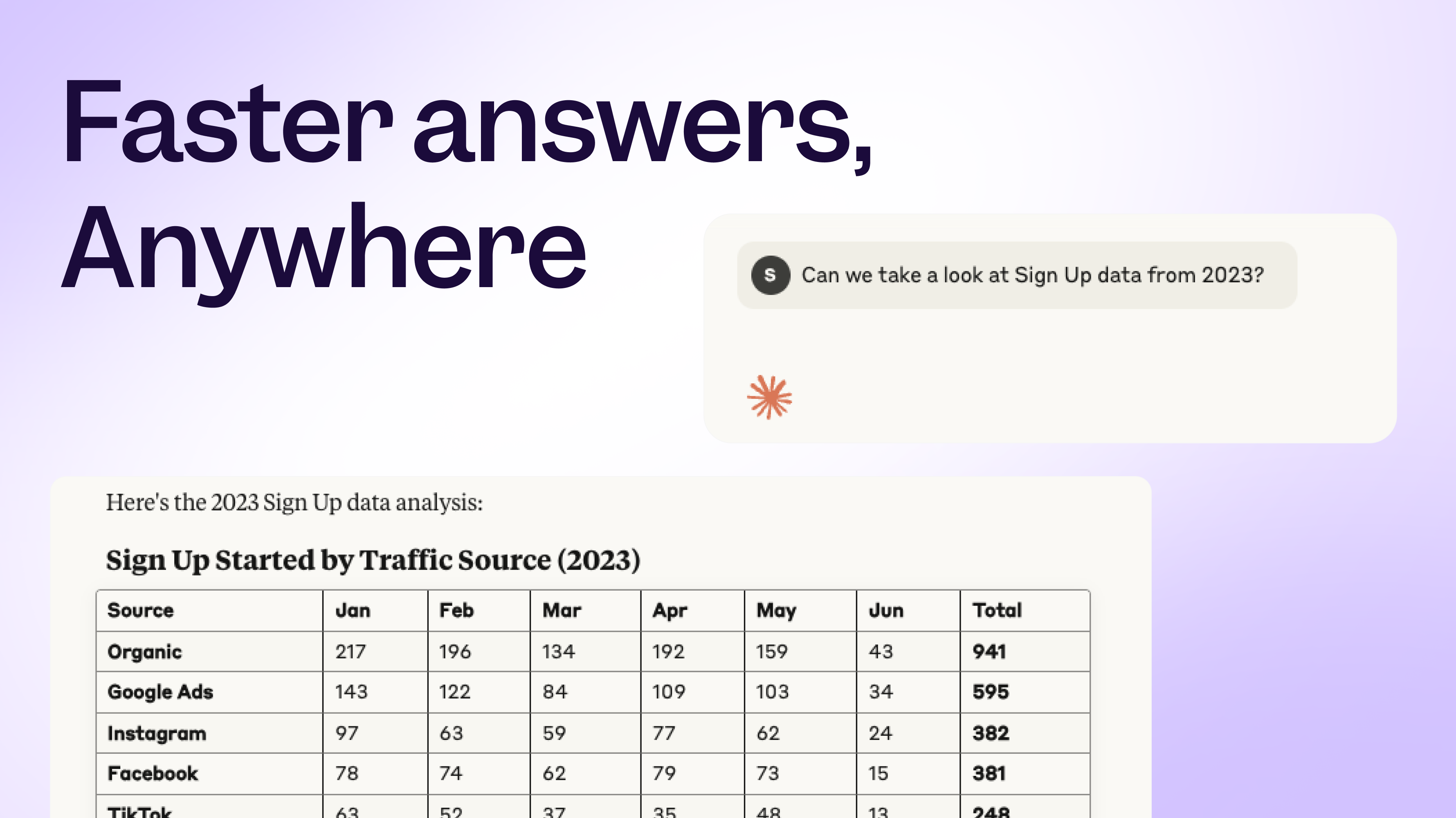
Introducing Mixpanel Agent: your always-on product analyst
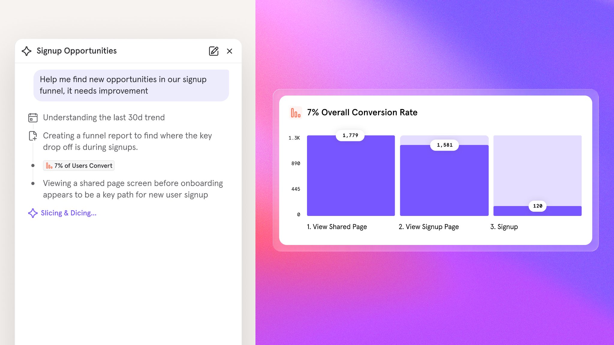
- Self-serve answers: Ask anything about your product and get an answer in seconds. No query builder, no data team required. Try asking:
- “How many users signed up for a trial last month”
- “Summarize the insights from this analysis and give me top 3 takeaways.”
- “Build a dashboard for this new feature launch”
- Root cause analysis: When a metric moves unexpectedly, Mixpanel Agent automatically investigates the likely drivers and helps you get to the bottom of it.
- Try asking: “Why did my activation rate drop last week?”
- KPI monitoring: Set up a monitor for any metric you own and Mixpanel Agent will surface what moved on your schedule, whether that’s daily, weekly, or monthly.
- Try it: Open Automations and set up a monitor for a key metric you own today.
Session Replay: Flutter SDK for Android, iOS, and macOS
Session Replay now supports Flutter. By many estimates, Flutter accounts for around 20% of all mobile apps being built — surpassing React Native and trailing only native — and until now, Flutter teams didn’t have a way to capture replays from their apps.With this update, you can:- Record replays across Flutter targets: Capture sessions from Flutter apps running on Android, iOS, and macOS.
- Get parity with other mobile SDKs: Flutter Session Replay matches the capabilities available on our other supported mobile platforms.
- Move seamlessly between reports and replays: Filter Flutter replays with the same Mixpanel events, properties, and cohorts you already use.
Experiments and Feature Flags: Multi-Environment Support
You can now copy experiments and feature flags between Mixpanel projects, so promoting work from dev → staging → production no longer means recreating everything from scratch.Some teams run separate Mixpanel projects per environment, but Experiments and Feature Flags had no way to move work between them. Customers had to manually rebuild every flag and experiment in production, leading to typos, drift, and long debugging sessions when something didn’t match.With this update, you can:- Copy flags and experiments between projects: Promote work from dev to staging to production without manual recreation.
- See which projects an item is linked to: A new Environments dropdown in the Experiments and Feature Flags side panel shows the projects a given flag or experiment is linked to.
- Manage connections over time: Remove inter-project connections when you no longer need them.
- Works with third-party flags too: Multi-environment support applies to experiments backed by Mixpanel flags or third-party flags.
Feature Flags: Flag Persistence for Mobile and Web SDKs
Client-side flags now resolve instantly on launch instead of blocking on a network round-trip.For mobile-first customers, every app launch meant the SDK had to wait for a network response before flag variants resolved. On slow or flaky connections, users would see the fallback experience before their assigned variant kicked in. Customers running large rollouts had been asking us: how do we serve the right experience during a slow or offline network connection, or a Mixpanel feature flag service outage?Client-side SDKs can now persist flag assignments locally and return them instantly on next launch.With this update, you can:- Resolve flags instantly on launch: Cached assignments are returned immediately, with no network round-trip required before variants are available.
- Stay resilient to network conditions: Users see their assigned variant even on slow, flaky, or offline connections — and continue to during any service disruption.
- Ship consistent experiences: Eliminate the fallback flash that occurs when a variant resolves after initial render.
Audit Log: 60+ New Log Types
Self-serve audit logs launched last month, and we’ve been expanding what’s captured so customers can investigate activity without filing support tickets.With this update, the self-serve Audit Log now captures entries for:- Access changes: User, Team, Organization, and Project access changes
- Data exports: Raw Export API requests
- Feature flags and experiments: Configuration and lifecycle changes
- And much more: Dozens of additional event types across the platform
Databricks Pipeline Integration is now Generally Available
The Databricks export destination for Data Pipelines is now Generally Available.Since launching in Private Beta, we’ve worked with early customers to harden reliability and polish the setup experience. It’s ready for production workloads.What you can do with it
Export your Mixpanel event data directly to your Databricks workspace via Unity Catalog Managed Volumes — no third-party ETL tools or custom infrastructure required. Mixpanel loads raw events into a single-column table and automatically creates a typed view on top, so your data team can start querying with standard SQL immediately.A few things that make this integration particularly useful:- Works across all Databricks clouds — AWS, GCP, and Azure are all supported
- Date-clustered tables — raw tables use liquid clustering on
event_date, so date-range queries are fast without manual optimization - Static IP support — works with IP allowlisting if your Databricks workspace has network restrictions
- Serverless-friendly — pairs well with Serverless SQL Warehouses for fast startup and pay-per-use pricing
MCP Server: Support for Experiments and Feature Flags (Beta)
You can now manage experiments and feature flags directly from the Mixpanel MCP Server. Ask your AI assistant to list, inspect, create, or update experiments and flags in natural language — no context switching required.Experiments (Beta):- List Experiments: List and search experiments in a project
- Get Experiment: Retrieve experiment details, configuration, and results
- Create Experiment: Create a new experiment
- Update Experiment: Modify an experiment’s configuration or manage its lifecycle
- Get Experiment Setup Guidance: Best-practice guidance for designing an experiment
- Get Experiment Results Interpretation Guidance: Best-practice guidance for interpreting experiment results
- List Feature Flags: List and search feature flags in a project
- Get Feature Flag: Retrieve feature flag details and targeting rules
- Create Feature Flag: Create a new feature flag
- Update Feature Flag: Modify a feature flag’s configuration or targeting
- Get Feature Flag Setup Guidance: Best-practice guidance for creating and configuring a feature flag
- Get Feature Flag Lifecycle Guidance: Best-practice guidance for rollout, kill-switch, and cleanup
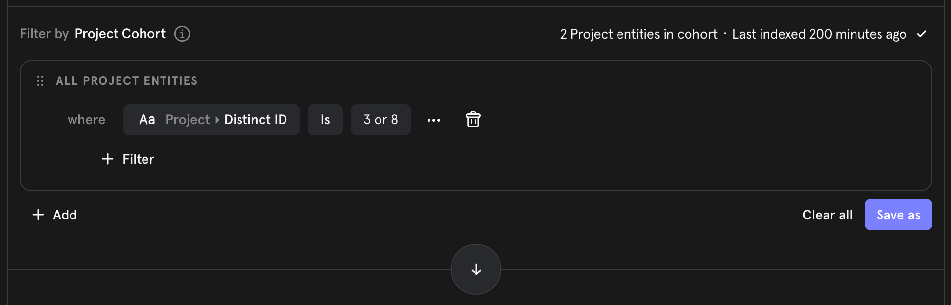
Drop Filters
Keep unwanted events out of your project — before they’re stored. You can now define filters in Lexicon using event names and properties to drop events at ingestion, so they never hit storage or count toward your volume.With this update, you can:- Define drop rules in Lexicon: Filter by event name, properties, and values to catch the events you don’t want.
- Drop at ingestion: Matching events are discarded before storage — they don’t consume volume and don’t show up in reports.
- Improve data quality: Keep noisy, irrelevant, or misfired events out of your project automatically.
- Control cost: Reduce event volume by filtering junk at the source instead of paying to store it.
- Enable self-serve governance: Give data teams a way to keep projects clean and the ratio of used-to-tracked events high, without engineering involvement.
Session Replay: Mobile Session Replay is now open source
Session Replay for iOS and Android is now open source. The full source is public on GitHub alongside the rest of our SDK lineup.Android is now a single multi-module repo (mixpanel-android) covering analytics, session-replay, common, and openfeature-provider — one repo, one release flow, consistent versioning.With this update, you can:- Debug Session Replay issues yourself: Read the actual SDK source instead of filing a support ticket to understand behavior.
- Get better results from AI tooling: Claude Code, Cursor, Copilot, and similar tools work dramatically better when they can read the SDK source directly.
- Contribute and inspect changes: Follow development, open issues, and review changes in the open.
Verified Cohorts in Lexicon
Cohorts can now be verified in Lexicon, giving your team a clear signal for which cohorts are trusted for analysis. Until now, users could verify events and behaviors but had no way to do the same for cohorts.With this update, you can:- Verify cohorts in Lexicon: Bulk-verify up to 100 cohorts at a time from the cohorts table, or verify individual cohorts via the overflow menu or edit modal.
- See verification status at a glance: Verified cohorts display a verified icon — just like events. Hovering over the icon shows who verified it and when.
- Filter by verification status: Quickly find verified cohorts using the verification filter in the Lexicon cohorts table, or filter by verification status in the query builder.
Experiments: Variant Screenshots, Configuration Tab, and Diagnostics Tab
Reviewing and debugging experiments just got significantly easier. Previously, experiment variants were identified only by key name — reviewers couldn’t see what was visually different between them. Health check alerts (SRM, Pre-Experiment Bias) were also unactionable, with no per-metric detail, no drill-through, and no way to inspect the underlying user population.This release brings visual context to variants, a redesigned configuration surface, and a new diagnostics workflow for investigating experiment health.With this update, you can:- Attach screenshots to variants: Give reviewers a visual reference for what each variant looks like, so approvals and QA don’t rely on variant keys alone.
- Configure experiments in a full-width tab: The new Configuration Tab replaces the sidebar, with room for cohort targeting and rollout group management alongside the rest of your setup.
- Investigate experiment health: The new Diagnostics tab includes Health Checks (SRM and Pre-Experiment Bias) with per-metric breakdowns, actionable next steps, and drill-throughs into the underlying data.
- Inspect exposed users: A new Exposed Users table surfaces the user population behind each experiment so you can validate assignments and troubleshoot unexpected results.
Feature Flags: OpenFeature Providers Across Mixpanel SDKs
Adopt Mixpanel Feature Flags without rewriting your flag-evaluation layer. Teams that have standardized on OpenFeature — the vendor-agnostic feature flag API — can now plug Mixpanel in directly through official providers.With this update, you can:- Keep your existing OpenFeature integration: Swap Mixpanel in behind the standard OpenFeature interface with no application code changes.
- Standardize across languages: Official providers are available for 8 languages — Web JS, Node.js, Go, Java, Python, Ruby, Kotlin, and Swift.
- Discover through the ecosystem: All Mixpanel providers are listed on the OpenFeature ecosystem page.
Session Replay: UI Controls for Sampling
Change sampling rates without shipping code. Previously, adjusting sampling required a code change and engineering effort — and on mobile, teams could be stuck with the wrong rate for months while waiting on app store review.Paid Session Replay customers can now manage sampling directly from the Mixpanel UI, with changes taking effect within the hour.With this update, you can:- Set sampling rates from the UI: Adjust replay sampling without touching code or waiting on a release.
- Add conditional rules: Sample based on event, property, or URL to focus capture on the sessions that matter most.
- Iterate quickly on mobile: Skip the app store review cycle when tuning replay volume on Android and iOS.
Stripe Projects: set up Mixpanel without leaving your CLI

- Provision without context-switching: Set up a Mixpanel account and project from the Stripe CLI. There’s no separate signup flow and no manual implementation.
- Let your agent handle it: AI agents assembling a project stack can now add Mixpanel automatically. Credentials flow directly to wherever they’re needed, with no human intervention required.
- Go from zero to tracking fast: Once provisioned, you get a fully configured Mixpanel project ready to receive events — skip the setup and start shipping.
Session Replay: Console Logs & Network Calls
Debug faster with full visibility into what your app was doing during a replay. Previously, troubleshooting from a replay meant guessing at what went wrong under the hood — no console errors, no failed requests, no way to see why something broke. It was the single biggest gap our customers cited compared to competing tools.Session Replay now captures console output and network activity, synced to playback so you can see exactly what happened at the moment of an issue.With this update, you can:- See console errors and warnings: Console messages are captured alongside the replay and synced to the timeline, so you can jump straight to the error and see the surrounding context.
- Inspect network calls:
fetch,XHR, and resource loads are captured with full request and response detail — status codes, headers, payloads — available in dedicated drawers as the replay plays. - Debug without leaving Mixpanel: No more toggling between replay and browser devtools or piecing together logs from your monitoring stack.
OpenAPI Specs for Feature Flags & Experiments APIs
Feature Flags and Experiments management APIs are now fully documented with public OpenAPI specs at developer.mixpanel.com.Previously, teams building automations against Flags and Experiments had to reverse-engineer network requests from the Mixpanel app or file support tickets to get endpoint details. Now, the full API surface is documented and ready to build against.With this update, you can:- Automate flag and experiment management: Programmatically create, update, and archive flags and experiments as part of your release workflows.
- Generate client code: Use the OpenAPI specs to generate typed clients in your language of choice.
- Integrate with your stack: Wire flag and experiment lifecycle into CI/CD, internal tools, or approval workflows without guesswork.
Experiments: Dynamic Config Support
Ship variant changes without shipping code. Previously, running an experiment meant hardcoding the logic for each variation in your app — any tweak to copy, layout, or a threshold required a code change and a release. There was no way to remotely control experiment parameters from Mixpanel the way you already could with a Dynamic Config feature flag.Now, experiment variants can carry a JSON parameter, matching the Dynamic Config behavior already available on flags.With this update, you can:- Attach JSON to any variant: Define an arbitrary JSON object per variant directly in the experiment setup UI.
- Read parameters from your SDK: Access the structured parameter from your SDK the same way you read a Dynamic Config flag — no new integration required.
- Drive multiple changes from one experiment: Control copy, layout, pricing tiers, thresholds, and more from a single experiment, all remotely from the Mixpanel app.
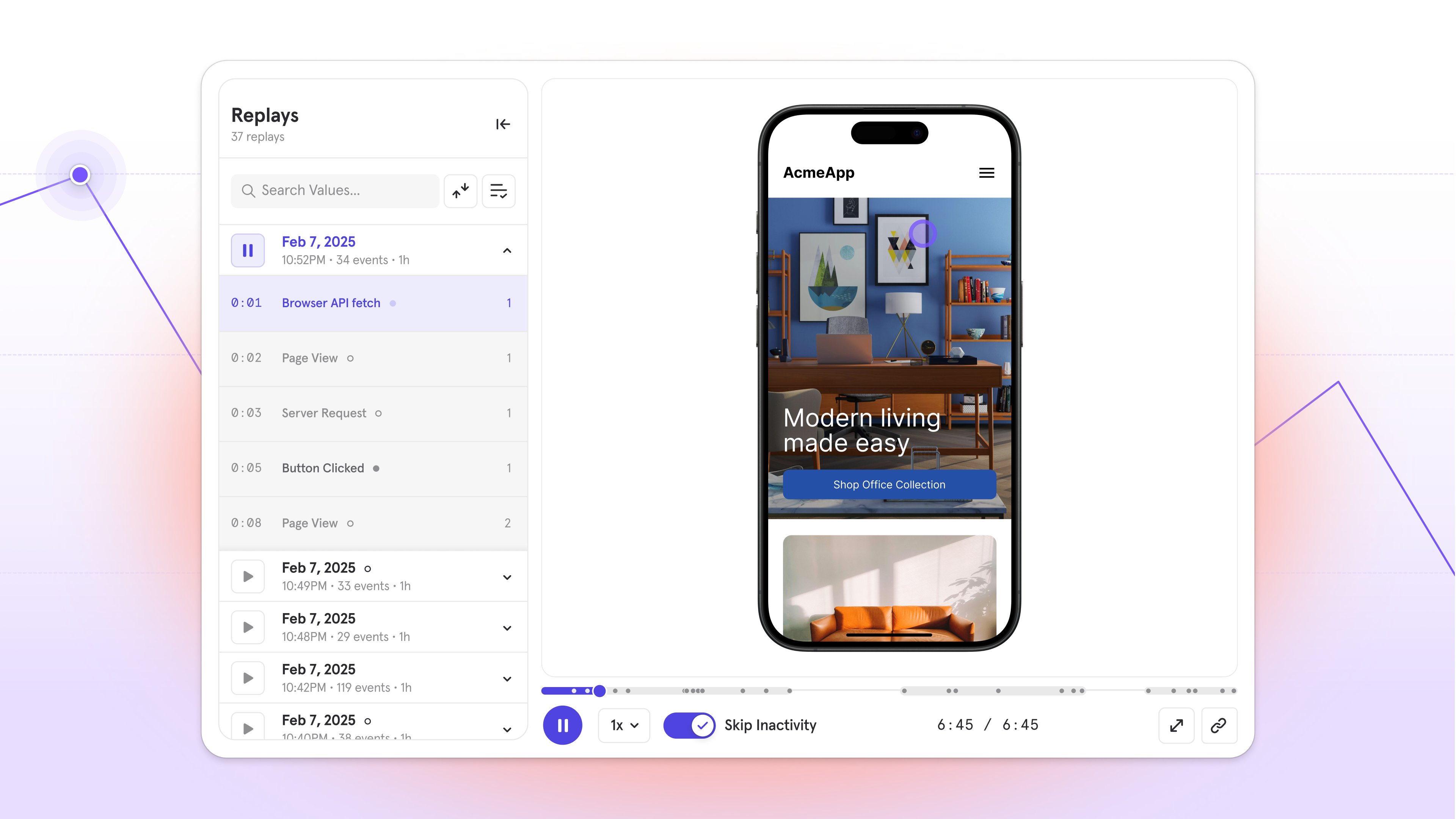
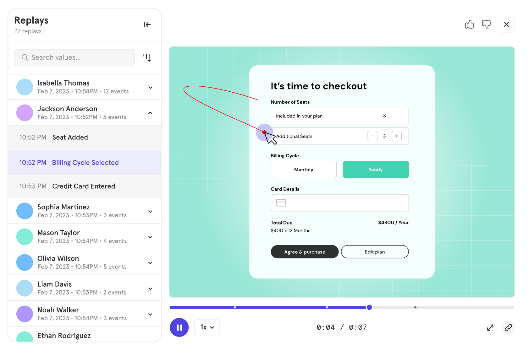
Session Replay: Bookmarked Replays
Save the replays that matter. Until now, Session Replay playlists only saved filters, not individual sessions — so there was no way to hold onto a specific replay inside Mixpanel.With Bookmarked Replays, you can save individual replays directly to a playlist for easy access later.With this update, you can:- Bookmark individual replays: Save any replay to a playlist so you can return to it without rebuilding filters or hunting through sessions.
- Keep expired replays visible: Bookmarked replays that fall outside your retention window stay accessible in a separate “Expired” section, so you can see what you’ve lost and evaluate whether a longer retention window is worth it.
Custom Roles: Granular project-level permissions
Custom Roles let you create specialized access profiles beyond the four default project roles (Owner, Admin, Analyst, Consumer). Define granular permissions tailored to specific job functions or workflows — each project supports up to 5 Custom Roles.With Custom Roles, you can:- Define precise access: Configure permissions across six categories — Analysis, Feature Flags and Experimentation, Data Management, Data Access/Exports/Alerts, Data Sources and Definitions, and Settings and Notifications.
- Start from templates: Use an existing role as a starting point and adjust permissions as needed.
- Copy roles across projects: Clone a Custom Role to another project in the same organization.
- Assign to project members, service accounts and teams: Custom Roles work with service accounts and organization-level teams for bulk role assignment.
Glean integration: Mixpanel insights inside your enterprise AI
- Root-cause incidents faster: Ask “conversion dropped last Thursday — what happened?” and get Mixpanel’s event-level breakdown alongside the deploy log and the Slack thread about the bug, all in one answer.
- Analyze launches in context: Ask how a new flow is performing and Glean auto-brackets the right date range based on when it shipped — no manual date-picking required.
- Put data in reach of everyone: Non-analysts — CS leads, marketing, execs — can get product metrics in the tools they already live in, without learning the query builder.
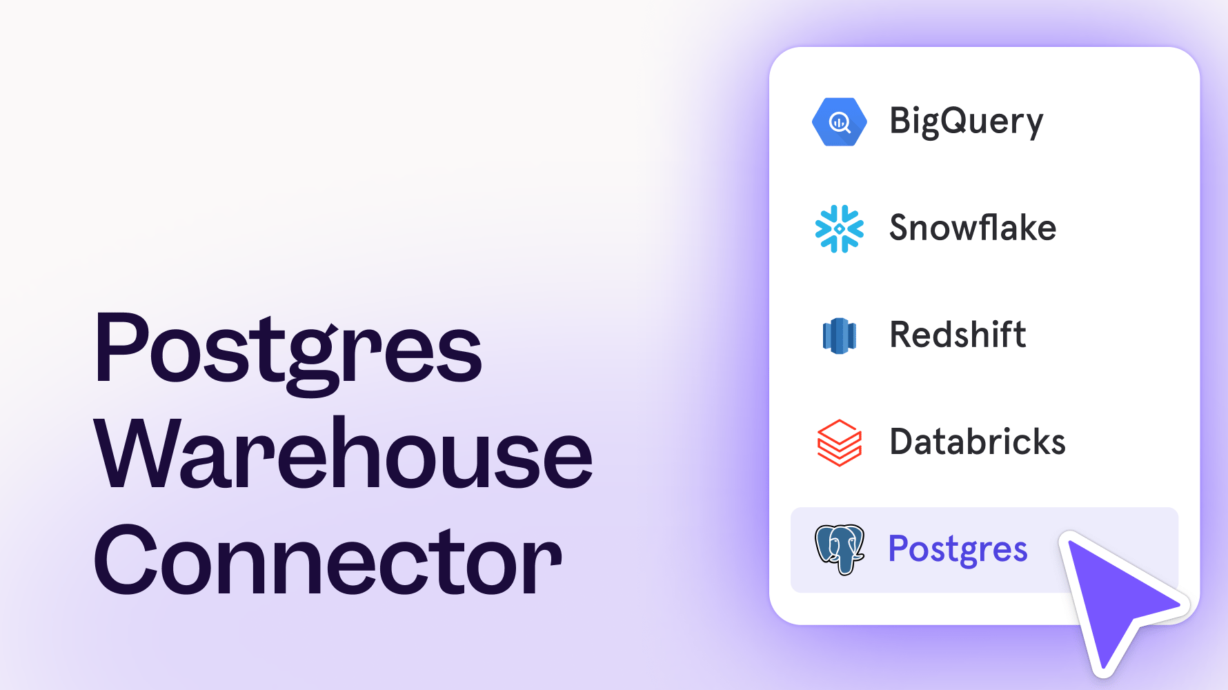
Postgres Connector is now Generally Available
The Postgres Connector is now Generally Available.Since launching in Public Beta earlier this year, we’ve worked closely with early users to refine reliability, performance, and setup experience. It’s ready for production.What you can do with it
Connect your Postgres database directly to Mixpanel and start analyzing your transactional data alongside your product usage — no ETL pipelines, no CDPs, no custom scripts required.This is especially useful if your most important data (user records, subscription state, AI model logs) lives in a transactional database and hasn’t been making it into your analytics. The Postgres Connector closes that gap with minimal setup.Works with all major managed Postgres providers, including Amazon RDS, Google Cloud SQL, Supabase, Neon, and DigitalOcean Managed PostgreSQL.Get started with the Postgres Connector.Alerts: Take control with scheduling, history, and webhooks
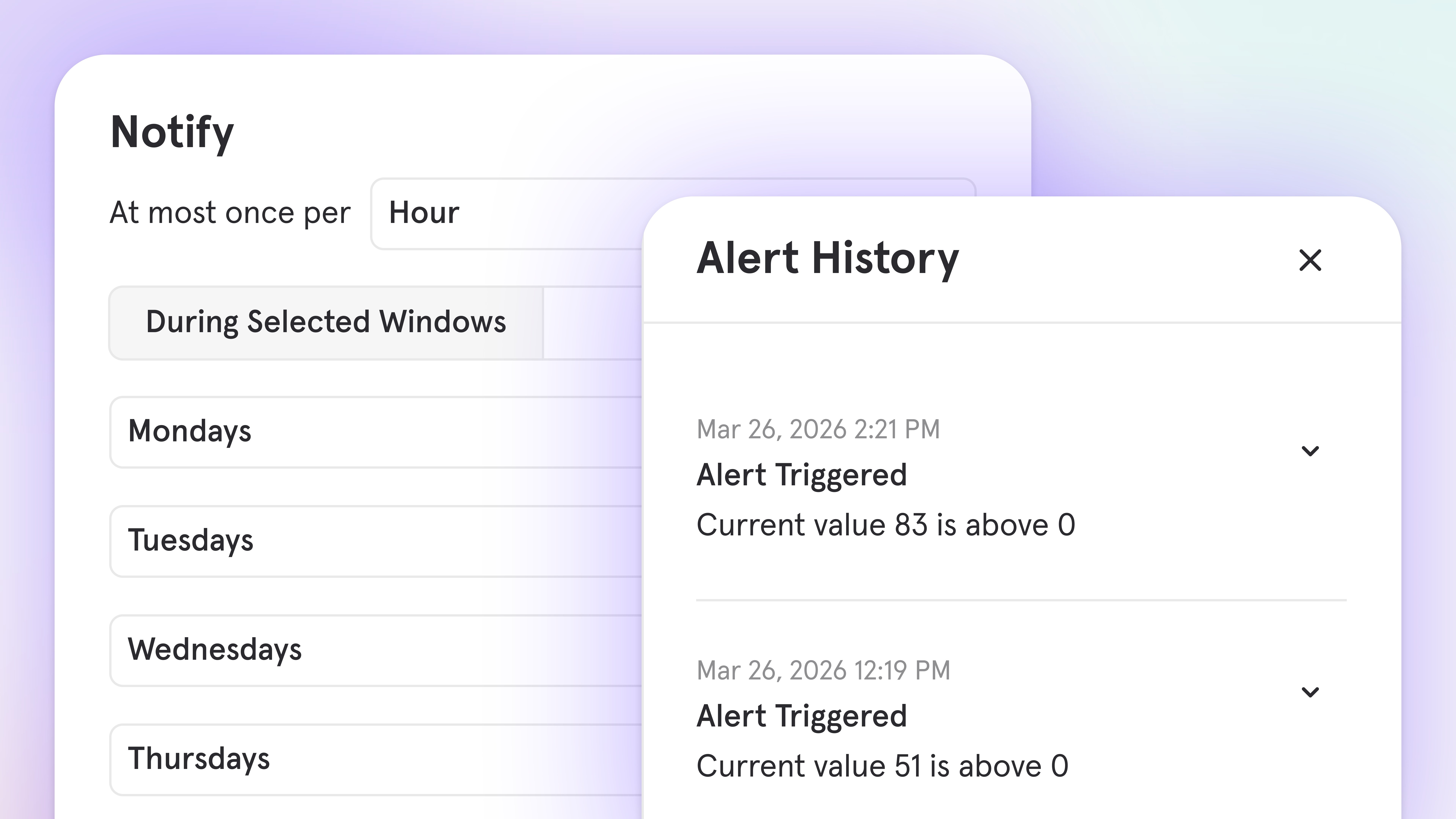
- Schedule when alerts evaluate: Notification windows let you define specific days, time ranges, or multiple schedules with different thresholds, so alerts fire when something is genuinely unexpected — not when your data follows its normal pattern
- Test before you enable: Run a retroactive simulation over any time window to see how often an alert would have fired and at what values, before it reaches anyone’s inbox
- See the full trigger history: Every alert trigger is now logged with the exact metric value at that moment, so you can spot patterns without digging through email or Slack
- Manage everything in one place: The enhanced alerts management hub shows status, last triggered time, trigger count, and sync health for every alert in your project
- Know when alerts break: When a report change breaks an alert, Mixpanel notifies the owner immediately rather than going dark
- Route notifications via webhook: Send alerts to any HTTP endpoint in your stack: incident management platforms, workflow tools like Zapier or Make, and custom dashboards
- More context in every notification: Alert emails and Slack messages now include a trend chart at trigger time
Audit Log: Track activity across your organization and projects
We’ve introduced Audit log to help you maintain visibility, security, and compliance across your Mixpanel organization and projects.Audit log provides a record of activity — who made changes, when they occurred, and what was modified. Whether you’re investigating an issue, ensuring compliance, or monitoring security, audit log gives you the transparency you need.What’s tracked:- Alerts, Boards, Cohorts, & Reports: Creation, updates, and deletions
- Data management: Event deletions, data exports, and user data requests
- Access & security: User authentication, service account management, and role changes
- Integrations: Data pipeline and warehouse source configuration changes
- CSV export: Download audit logs for analysis
- Event filtering: Quickly find specific actions or changes by event type or user
- Retention: 90 days for Free and Growth plans, 2 years for Enterprise plans
Mixpanel MCP: Talk to Your Data

What you can do
- Build boards and reports in natural language. Ask a question, get an answer — and a Mixpanel report to go with it.
- Combine behavioral data with qualitative context in a single conversation. Pull up a specific user’s replays alongside their event history to understand not just what they did, but how they experienced it.
- Project Owners and Admins can manage event and property metadata directly through MCP — generating descriptions, verifying data, tagging events, and hiding or dropping properties at scale.
Try these prompts
- “In the last three months, which channels have driven the most new users?”
- “User X submitted negative feedback on [date]. Analyze their session replays to understand what happened.”
- “Show me signup conversion rates by acquisition source for the last 30 days.”
- “Generate event descriptions for all of my events in Lexicon.”
Feature Flags + Experiments: Now on Go and Flutter
Feature Flags and Experiments are now supported in Go (server-side) and Flutter (client-side) SDKs.Mixpanel Feature Flags help you control rollouts, deliver variants for A/B tests, and change application behavior without redeploying code. Experiments build on those variants with measurement and analysis.Now, Feature Flags and Experiments are available in the Go and Flutter SDKs:- Go (server-side): Use the Mixpanel Go SDK to evaluate flags on the backend. Choose local evaluation for low-latency use cases, or remote evaluation when you want server-side evaluation with Mixpanel cohort targeting and sticky variants.
- Flutter (client-side): Use the Mixpanel Flutter SDK across iOS, Android, and Web to fetch flag variants, evaluate gates, and automatically track exposure events for experiment analysis.
Metric Trees: Build your first draft instantly with AI
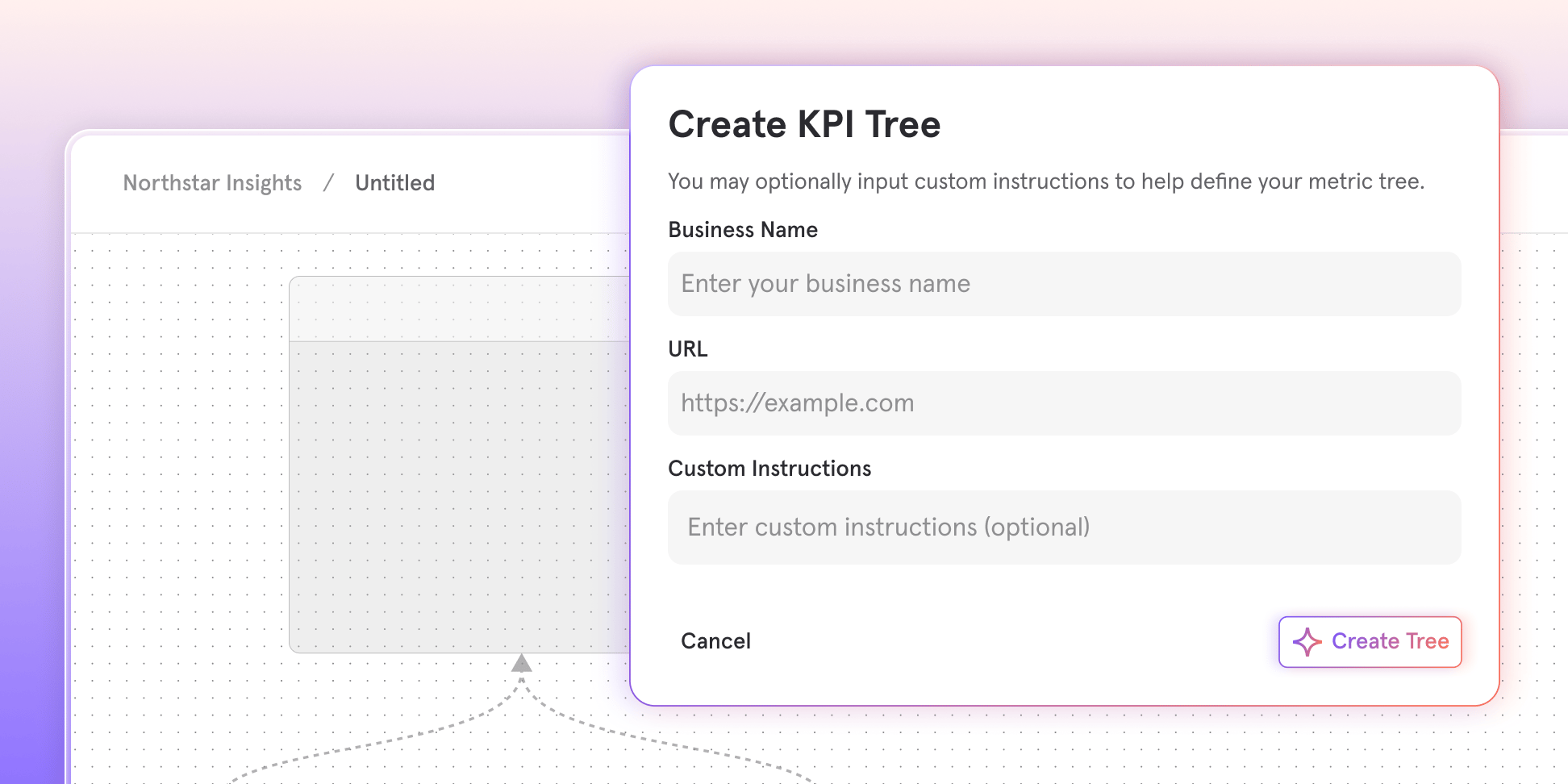
With AI Metric Trees, you can:
- Discover metrics you might miss: Surface drivers, bets, and input metrics you may not have considered, organized around your growth model
- Start in seconds: Just enter your company website and an optional description of your business or growth focus
- Get a thoughtful structure: Receive a first draft with your north star, outputs, strategic bets, and input metrics
- Make it yours: Edit the structure and connect nodes to your real Mixpanel metrics
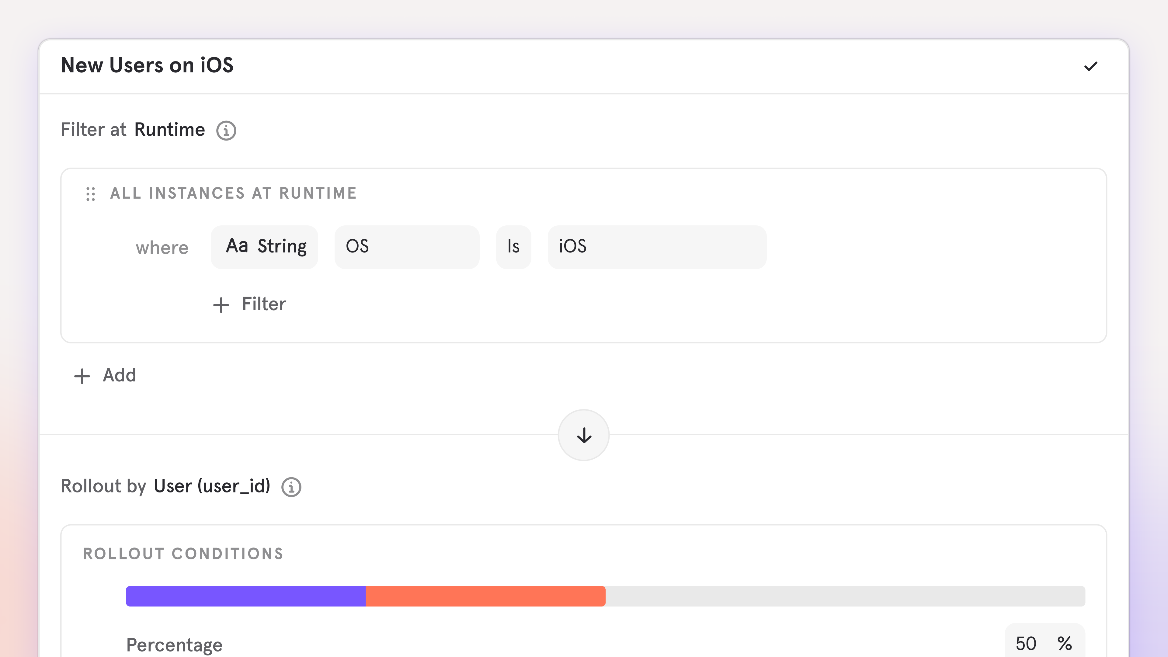
Feature Flags: Target users using real-time behavior with Runtime Events
Target feature variants based on what users do, not just who they are.Mixpanel Feature Flags supports several targeting options, including cohorts (audiences based on behavior or attributes) and runtime properties (conditions like OS, app version, or browser).With Runtime Events, you can target users based on specific Mixpanel events in real time. When a user triggers a designated event, they receive the active variant on the next flag evaluation, without waiting for a cohort refresh.This unlocks serving features based on time-sensitive, behavior-driven patterns such as:- Onboarding flows: Show tutorial content after a user completes their first action
- Progressive feature unlocking: Unlock advanced features after users complete key milestones
- Conditional promotions: Display special offers after a user makes their first purchase
- Behavior-gated experiments: Run experiments only on users who have demonstrated engagement
- Web SDK: available now
- Mobile SDKs: coming soon
Feature Flags: Exposures on User Profiles
See which feature flags a user was exposed to — and which variant they saw — directly on their profile.With Mixpanel Feature Flags, you can target users via Dynamic Configs, Experiments, and Feature Gates. When something looks off, the fastest way to debug is knowing exactly which flags a user saw and which variant they were served.Until now, validating targeting or troubleshooting support issues often meant digging through reports and stitching together the answer manually.Now, User Profiles include a new Feature Flags section that shows the enabled flags a user was most recently exposed to, including:- Variant assignment
- Flag type (Experiment, Feature Gate, Dynamic Config)
- A searchable table that loads progressively as you scroll
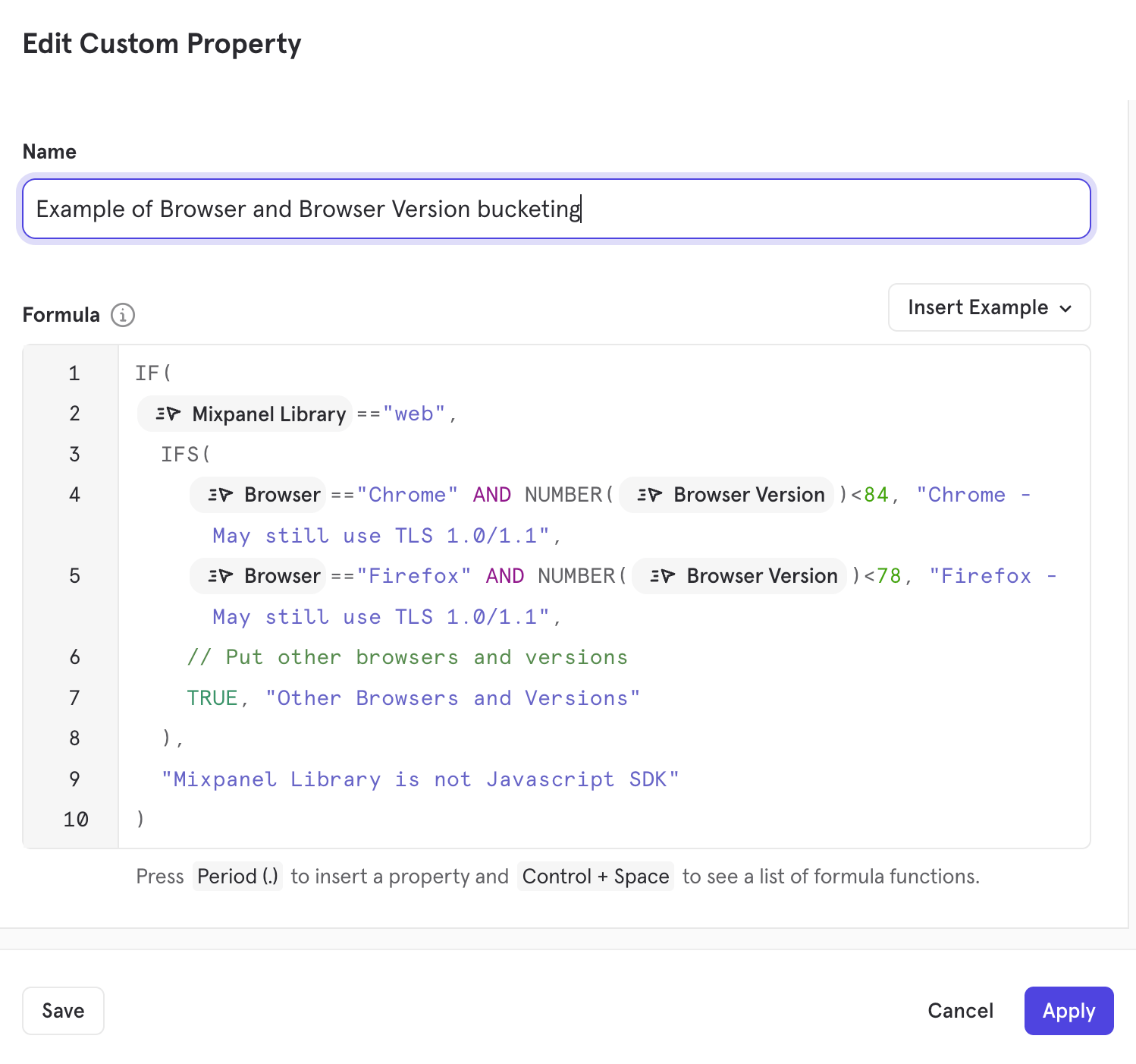
Security Protocol Update: Phasing Out TLS 1.0 and 1.1
To ensure we provide the most robust protection against evolving threats, we are upgrading our network security configuration.Starting April 2026, we will be deprecating support for legacy TLS 1.0 and 1.1 protocols and configuring TLS in accordance with NIST SP 800-52 Rev 2 across our APIs and web app.After this date, all API requests must use at least TLS 1.2. Using at least TLS 1.2 is a recommended security best practice to improve data integrity and maintain compliance with industry standards.Updated TLS Protocols Support
Updated Mixpanel Cipher Suite Support by TLS version
Mixpanel will also mirror the commonly accepted standards for TLS 1.2 and TLS 1.3 Cipher Suite compatibility, as listed in this external resource.What’s the impact of this change?
Any data sent to Mixpanel’s Ingestion API endpoints after April 1, 2026 via TLS 1.0 and 1.1 will not be accepted, meaning you will not receive analytics information from users who engage with your applications using the 1.0 and 1.1 versions of TLS.While the vast majority of modern traffic uses TLS 1.2 or 1.3, data can be sent to Mixpanel via TLS 1.0 and 1.1 when end-users access your application from older browsers or devices with operating systems that don’t support or enforce modern TLS versions.Commonly Affected Examples
The following browsers and OS may still use TLS 1.0 or 1.1:Please Note: While we’ve listed some common versions above, compatibility can vary. For example, Chrome 30-32 started supporting TLS 1.2.For a comprehensive list of environments that may still use TLS 1.0/1.1, we recommend visiting the Browser/OS Official Documentation or referring to the TLS Support Version History (External Resource).
How to identify affected users
More than 99% of Mixpanel Web and API Traffic use TLS 1.2+; however, to assess how many users are potentially affected by this change in your projects:- In an Insights report, select
All Eventsas the primary metric - Break down by the following properties, depending on your tracking SDK(s)
- JavaScript (Web): Browser (
$browser) and Browser Version ($browser_version) - Mobile: Operating System (
$os), OS Version ($os_version)
- JavaScript (Web): Browser (
Recommended Actions
- Client-Side Tracking: Where possible, we recommend encouraging users to update their browsers or OS to a version that communicates using TLS 1.2+.
- Server-Side Tracking: Verify your server environments are configured to use TLS 1.2+.
- Protocol Migration: If your application currently utilizes legacy TLS versions, we recommend deprecating them in favor of TLS 1.2+ to ensure long-term security and compatibility.
- Proxying: We understand that some devices have hardware/software limitations that may not be able to use TLS 1.2+. In these cases, if you would like to maintain tracking for these devices, you could consider implementing a proxy server that accepts TLS 1.0/1.1 from end users and forwards the tracking data to Mixpanel Ingestion APIs via TLS 1.2+.
Support & Inquiries
We have notified users whose projects were detected receiving legacy TLS 1.0/1.1 Ingestion traffic. If you have questions about your project’s compatibility or need general assistance, please reach out to Mixpanel Support.For technical questions about TLS protocols or broader security questions, please contact our GRC Team at grc@mixpanel.com.Postgres Connectors now in Public Beta
New: Postgres Connector (Public Beta)
We’re pleased to announce the Postgres Connector, now available in Public Beta — a simpler way to bring your transactional data into Mixpanel.What it does
The Postgres Connector enables you to connect your Postgres database directly to Mixpanel and begin analyzing your data without needing intermediate tools or custom pipelines. This means you can get your most important user and product data into Mixpanel much faster and with less engineering effort.Unlike traditional ingestion approaches that require CDPs, ETL tools, or custom scripts, the Postgres Connector is built to work right from your database to Mixpanel. Early-stage teams, especially those without a data warehouse, can now include more complete data in their analytics workflows with minimal setup.Why this matters
Many small and growing customers have told us it’s hard to get complete user context into Mixpanel because:- Existing options often require costly third-party tools.
- Building custom sync scripts takes significant engineering time.
- Important data lives only in transactional databases.
How it works
- Connect your Postgres database directly from the Mixpanel UI.
- Sync tables from Postgres into Mixpanel without intermediate services.
- Compatible with all Postgres versions and major managed providers including:
- DigitalOcean Managed PostgreSQL
- Google Cloud SQL
- Supabase
- Neon
- Amazon RDS
- and more!
Try it today
The Postgres Connector is now available in Public Beta. We encourage you to give it a try. It’s designed to make your data ingestion smoother and your analytics richer, with less friction.SSO, Data Views, and Sensitive Data Classification now available on Growth Plans

What’s now included in Growth?
Secure access with SSO
Strengthen authentication and simplify user management with Single Sign-On across your organization. Learn more here.Control visibility with Data Views
Create tailored views of your data so teams see exactly what they need — while maintaining appropriate boundaries. Learn more here.Protect data with Sensitive Data Classification
Identify and manage sensitive data with greater precision to support compliance and responsible data practices. Learn more here.Raising the standard for self-serve analytics
Security and governance shouldn’t be an afterthought — or an obstacle to growth.By bringing these capabilities to all Growth plans, we’re raising the bar for what teams should expect from a self-serve analytics platform. Organizations no longer have to choose between ease of use and robust data controls.At the same time, our Enterprise plans continue to provide even deeper levels of governance, customization, support, and scale for organizations with the most advanced requirements.This update ensures that as our customers grow, Mixpanel grows with them, delivering strong security foundations at every stage.If you’re on Growth, these features are available now.You can find more details on our growth plans here.AI-Powered Event Suggestions for Templates
Setting up a new board just got a little easier.We’ve introduced AI-Powered Event Suggestions for Templates to help streamline the process of mapping your events to templates, reducing guesswork and saving time during setup.Smarter event recommendations
When selecting a template, it’s not always obvious which events in your project correspond to each slot. Now, Mixpanel automatically suggests the best-fit events based on your existing data.You can accept the recommendations as-is or swap in different events at any time, you’re always in control.This update is designed to smooth out one of the more common onboarding friction points: figuring out what events you have and how to use them. With AI-powered suggestions, getting from setup to insight takes less manual effort, and less second-guessing.You can give it a try the next time you create a board from a template.Deprecation Notice: Legacy US-to-EU Data Forwarding ends July 2026 for EU Projects
🚨 UPDATE: July 1, 2026 – US-to-EU Data Forwarding has officially ended.Starting July 2026, we will be sunsetting the legacy automated US-to-EU Data Forwarding process for EU Data Residency projects to align with data residency best practices and improve ingestion performance. After this date, data sent to our US Ingestion Servers for EU Data Residency projects will no longer be forwarded, which can result in data loss.
As scheduled, we have sunset US-to-EU data forwarding.
For EU Projects that still send data to the US, to help you assess the impact, events sent to US endpoints will be temporarily hidden from your UI and Query API endpoints until August 1, 2026.
How events are being filtered
[July 1, 2026 - August 1, 2026]: New US->EU Forwarded events have not been deleted. However, they are temporarily hidden from the UI and Query API endpoints if they match all of the following criteria:These events are not deleted — they remain accessible via the Raw Export API during this period, and will be un-hidden on August 1, 2026, so your reporting counts may change at that time.
- The event was processed after July 1st (UTC) (
mp_processing_time_ms><July 1st UTC>).- The event was forwarded from the US (
$mp_is_forwardedis defined).
Events that are still being sent to the US after August 1, 2026 for EU Projects will not be accepted.
If you are affected, please ensure your implementation is updated to point to Mixpanel’s EU Serversapi-eu.mixpanel.comimmediately to prevent permanent data loss after August 1, 2026.
Need help or want to opt out? If you wish to opt out of this UI preview and un-hide your forwarded events early, please contact support.⏳ Note: Some projects have an extended timeline through December 31, 2026. These projects are not affected by the temporary event-hiding described above. If this applies to your project, we’ve already reached out with a notification. If you did not receive a notification, your deadline is August 1, 2026.
Is my project affected?
- EU Projects created before August 18, 2025: If your implementation sends data to Mixpanel’s US Ingestion Servers (
api.mixpanel.com), you may be affected by this change. Please review the action required below. - EU Projects created on or after August 18, 2025: These projects already require direct ingestion to our EU Servers. No action is needed.
Required Action for EU Projects sending data to US Servers
To avoid any disruption to data ingestion for your EU Projects, please review and update your implementations to use the dedicated Ingestion API EU Subdomain (api-eu.mixpanel.com). This ensures your data is routed directly to its intended destination.Guidance- Verify which projects have EU Data Residency: Navigate to Organization Settings > Projects and click into each Project to confirm whether Data Residency is set to EU.
- Identify Traffic: In your EU Project(s), create an Insights Report and break down “All Events” by the API Endpoint (
$mp_api_endpoint) event property to determine which Ingestion Servers your events came from.$mp_api_endpoint=api-eu.mixpanel.comis EU and$mp_api_endpoint=api.mixpanel.comorapi-js.mixpanel.comis US. - Update and Review Implementation: If your project has EU Data Residency, please follow the guides below that apply to your setup to ensure your data routes to our EU Servers.
- Javascript
- React Native
- Android
- iOS (Objective-C)
- iOS (Swift)
- Flutter
- Unity
- Python
- Node.js
- Ruby
- PHP
- Go
- Java
- Please update your Ingestion API Base URL to the EU Residency Server:
api-eu.mixpanel.com
- Please contact the Partner’s Support Team for instructions on how to set the integration to point to Mixpanel’s EU Server URL.
Feature Flags — Group Cohort Targeting
- Target groups, not just users: When a flag’s Variant Assignment Key is set to a group key (e.g.,
company_id), the cohort builder automatically shifts its identity-dimension to that group (instead of users). - B2B-ready rollouts: Build cohorts like “Enterprise companies with >50 seats” or “Organizations on the Pro plan” and target them directly for rollouts.
- Same cohort builder: Group cohorts are created in the existing cohort builder, scoped to the relevant group key — no new tools to learn.
- Combine with runtime targeting: Layer runtime properties (e.g., platform, region) on top of group cohort targeting with AND conditions for precise control.
Custom Alerts via webhook
Custom Alerts can now send notifications via webhooks, enabling you to integrate Mixpanel alerts with any third-party platform or custom system in your stack.Previously, alerts were limited to Email and Slack notifications. With webhook support, you can now route alert notifications to incident management tools, custom dashboards, monitoring systems, or any HTTP endpoint you configure.What’s new:- Project-level webhook configuration: Add and manage webhook endpoints in Settings > Integrations > Webhooks
- HTTP Basic Authentication: Secure your webhooks with username and password authentication
- Test connection: Verify webhook connectivity before saving your configuration
- Easy alert integration: Select your configured webhook from the “via Webhook” dropdown when creating or editing alerts
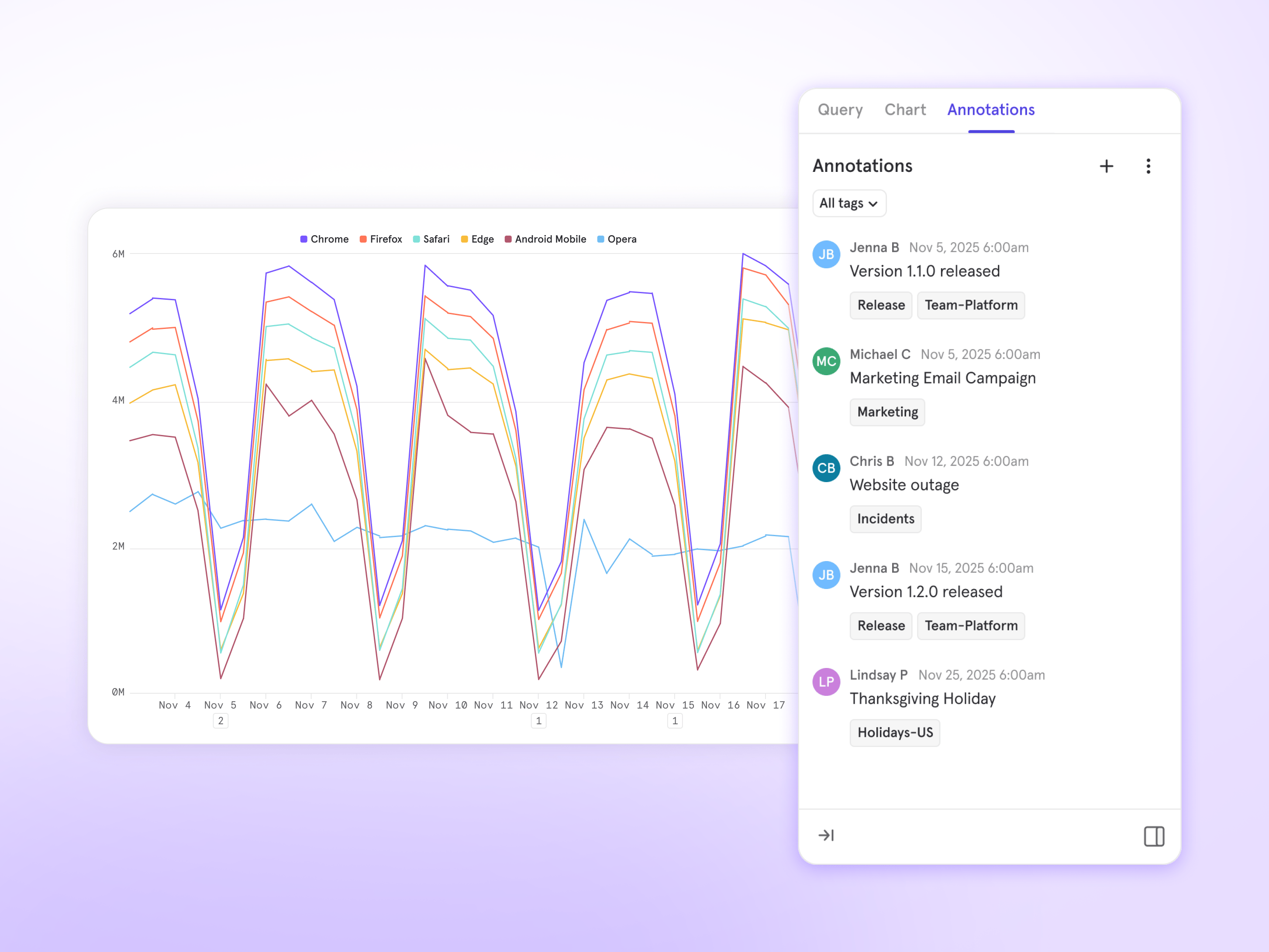
Annotations Timeline: Visualize Your Business Context
Annotations enable you to add time-stamped notes, allowing you to view metrics with the context that matters to you. We’ve seen teams add valuable context about everything from product launches, marketing campaigns, outages, and holidays.Now, you can visualize all your annotations in a dedicated timeline view that shows how different types of events align across your data.Timeline Visualization
A new chart view displays annotations grouped by tag in separate rows, making it easy to see patterns and relationships across different event types. See at a glance when your Marketing campaigns overlapped with Product releases, or how Outages coincided with traffic spikes.Automatic Alignment
The timeline automatically syncs with your main chart, working seamlessly with both line and column visualizations to show annotations exactly where events occurred. No manual configuration needed - the timeline stays perfectly aligned as you zoom, change date ranges, or switch chart types.Interactive Exploration
- Hover over any annotation to preview its details
- Click to view the full annotation list, edit existing notes, or create new ones right from the timeline
- Filter by tag to focus on specific event types and hide the rest
Tag-Based Organization
Use the tag filter to quickly analyze how particular categories of events impact your metrics. Focus on just Marketing campaigns, just Product releases, or any combination of tags that helps you tell your story.Learn more →If you have any questions or need assistance, please reach out to our Support Team.Data Volume Monitoring Default On for New Enterprise Customers

Retiring /decide Endpoint Used in Older Mixpanel SDK Versions
Starting April 2026, we will be fully retiring the/decide endpoint, which was used in older versions of Mixpanel SDKs. We began deprecating this in 2022; newer SDK versions no longer rely on it.If you’re running an SDK version from 2022 or earlier, please review the details below.How to check your project’s current SDK Version:
- In an Insights Report, select “All Events” as your primary metric
- Break down by “Mixpanel Library” and “Library Version” event properties
Mobile SDKs
The/decide endpoint controlled whether Legacy Automatically Tracked Mobile Events $ae_first_open, $ae_updated, $ae_crashed, $ae_session, and $ae_iap were enabled or disabled for a Mixpanel Project.If you currently collect these events and your Mobile SDK version does not meet the minimum versions listed below, your application will stop tracking the Automatic Mobile events after April 2026. To keep collecting the Automatic Mobile events, please complete the following:- Update to at least the minimum SDK versions listed below and
- Explicitly enable this tracking in your initialization code via
trackAutomaticEvents
- Android: v7.0.0+ | Initialization Guide
- React Native: v.2.0.0+ | Initialization Guide
- iOS (Objective-C): v.5.0.0+ | Initialization Guide
- iOS (Swift): v.4.0.0+ | Initialization Guide
- Flutter: v.2.0.0+ | Initialization Guide
JavaScript (Web) SDK
If your JavaScript SDK version is older than the minimum version below, there will be no functionality change; however, your application will begin receiving410 Response Error Codes from this endpoint. We strongly recommend updating to the minimum version below.Minimum Version:- JavaScript: v.2.45.0+
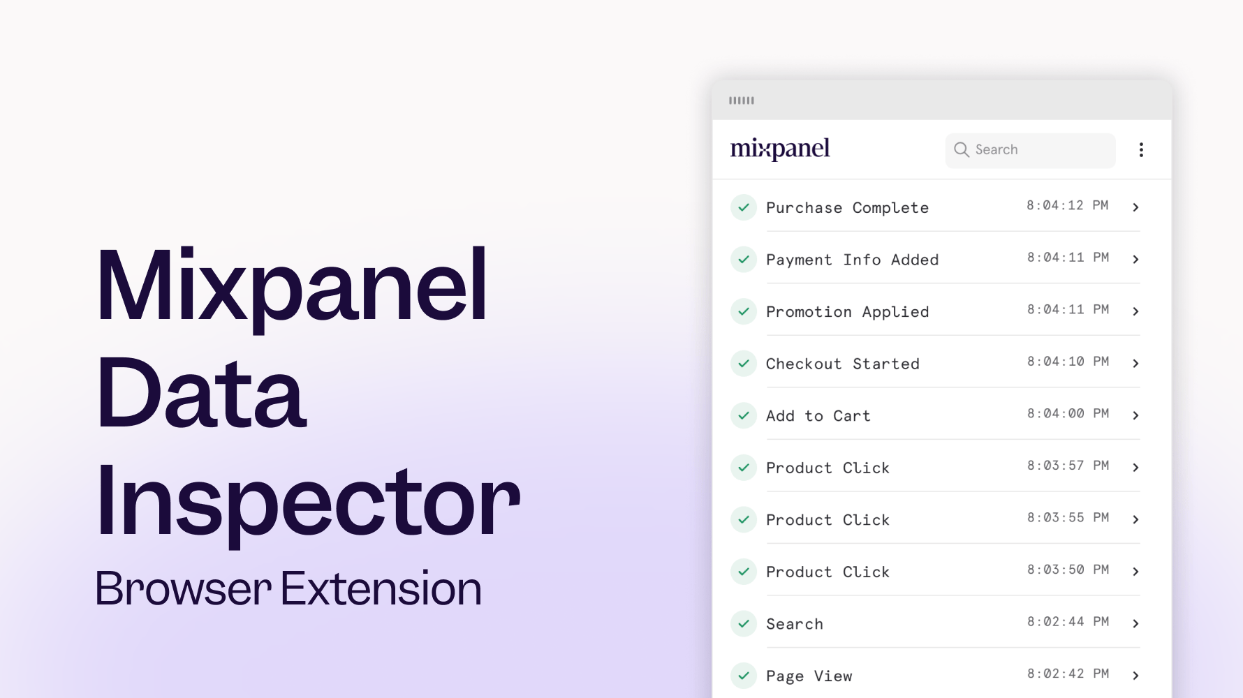
Mixpanel Data Inspector, now available for all Mixpanel JavaScript SDK users
📱 Session Replay is now available for React Native
- Answer the what and why in one place by moving seamlessly between reports and replays
- Find what matters faster by filtering replays with trusted Mixpanel events, properties, or cohorts
- Watch the complete user journey across your React Native iOS and Android apps
Feature Flagging: Runtime Targeting
- Target instantly: Evaluate flags using runtime properties like plan, device, or platform, or when they perform specific events tracked at runtime
- Stay accurate: Ensure flag decisions always reflect a user’s current state
- Reduce overhead: No persistence, no backfills, no user history required
Updated Date Range and Metric Block Guardrails for Insights Reports
To enable a great self-serve experience and quick queries, we have updated guardrails for Insights Reports as described below.Updated Date Range Guardrails for ‘All Events’ and Line & Column Charts
- For Line/Columns charts using “Hour” Unit, the report date range can be a maximum of 31 days
- For Line/Columns charts using “Day” Unit, the report date range can be a maximum of 12 Months
- For Insights Reports using “All Events”, the report date range can be a maximum of 93 days
- For Insights Reports using “Cohort Over Time” with Line/Column charts, the report date range can be a maximum of 93 Unit Intervals (i.e., 93 Days for Day Unit, 93 Weeks for Week Unit)
- Combine events into Custom Events or Saved Behaviors, which are not subject to the 93-day “All Events” limit.
- Utilize Time Period Comparisons for year-over-year analysis.
- Reduce the report date range, or create multiple reports with smaller date ranges in a single Board.
Updated Metric Block Guardrails
Insights Reports will have a 40 metric/behavior block limit. This includes all metric and behavior blocks, such as hidden metrics and formulas.If you hit this limit, you can:- Migrate some metrics to a new report.
- Utilize Saved Formulas if your report contains formulas.
- Combine multiple events into Saved Behaviors.
Dynamic Config for Flexible Feature Rollouts
Use dynamic config to update your application in real-time and target users with different experiences, without changing code, all from one JSON payload. With dynamic config, you can:- Go beyond on/off: Control UI, logic, and defaults with structured parameters
- Iterate faster: Update configuration instantly without redeploys
- Deliver tailored experiences: Serve different configurations to different users
- Reduce risk: Adjust behavior in production with minimal blast radius
Dynamic Segments
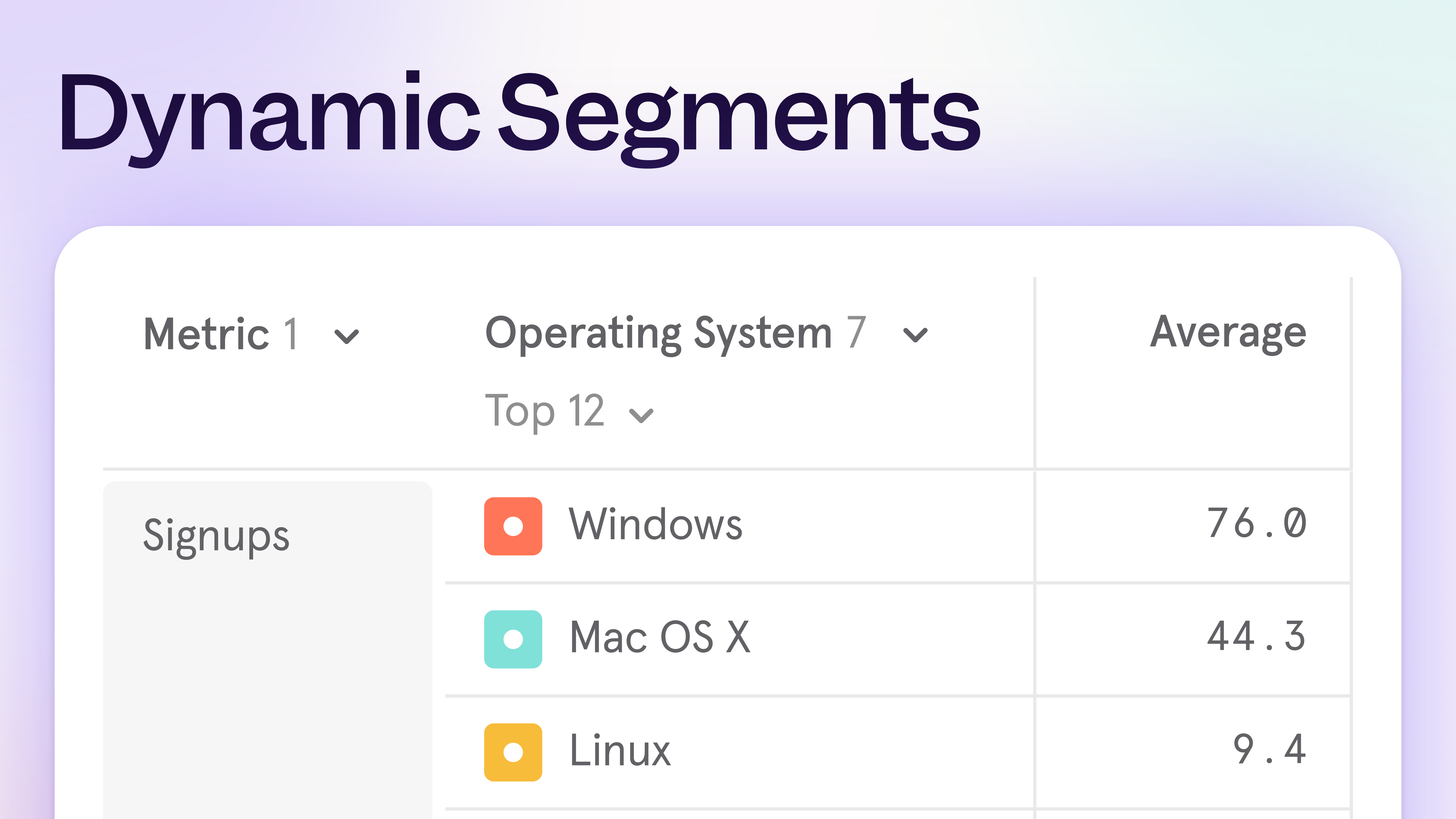
- Funnels broken down by your top 5 app versions
- Top 15 brands by weekly purchases
- Bottom 10 pages by visits
Expanded regional support for MCP

MCP Support for India and EU Projects
The Mixpanel MCP Server is now available for projects hosted in India and the EU. Teams in these regions can now access the MCP server to talk with their data in natural language and democratize analytics across their organization, all while complying to local regulations.Getting Started
Organization administrators can enable MCP Server access in Settings > Organization > Overview.Learn more about the MCP Server and how to get started in our documentation.Session Replay: Heatmap Comparison Mode
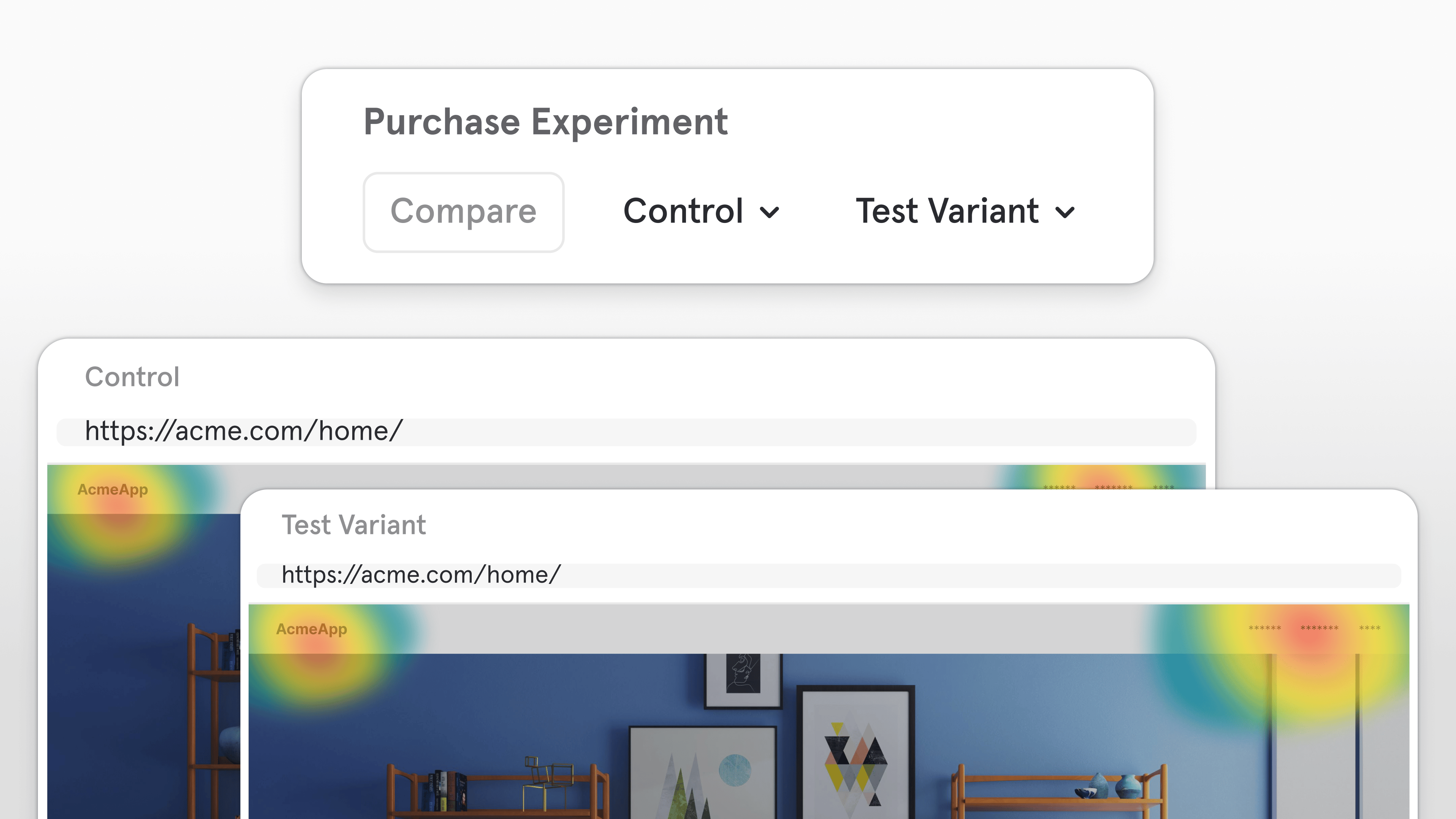
See engagement differences at a glance with side-by-side heatmap comparisons
Now you can compare two Heatmaps (web only) side by side to see how user engagement differs across any cut of your data, including:- Cohort: Free vs. Paid
- Experiment Group: Test vs. Control
- Browser: Chrome vs. Safari
- Time: Current quarter vs. Last quarter
Compare in the top-right corner of your Heatmap.With Heatmap Comparison Mode, it’s easier than ever to validate design changes, spot patterns, and identify what drives better engagement, all within Mixpanel.Note: Heatmaps are currently only available on web.Session Replay: Frustration Signals
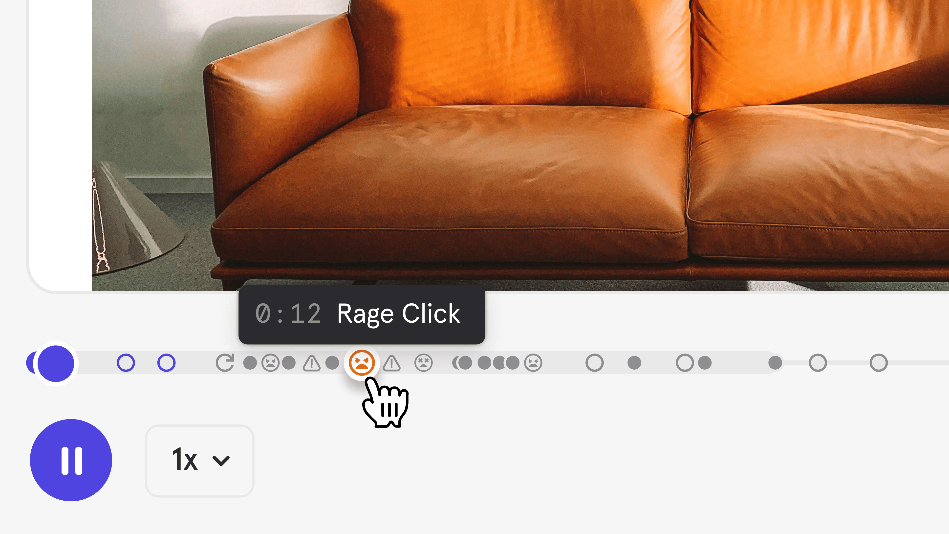
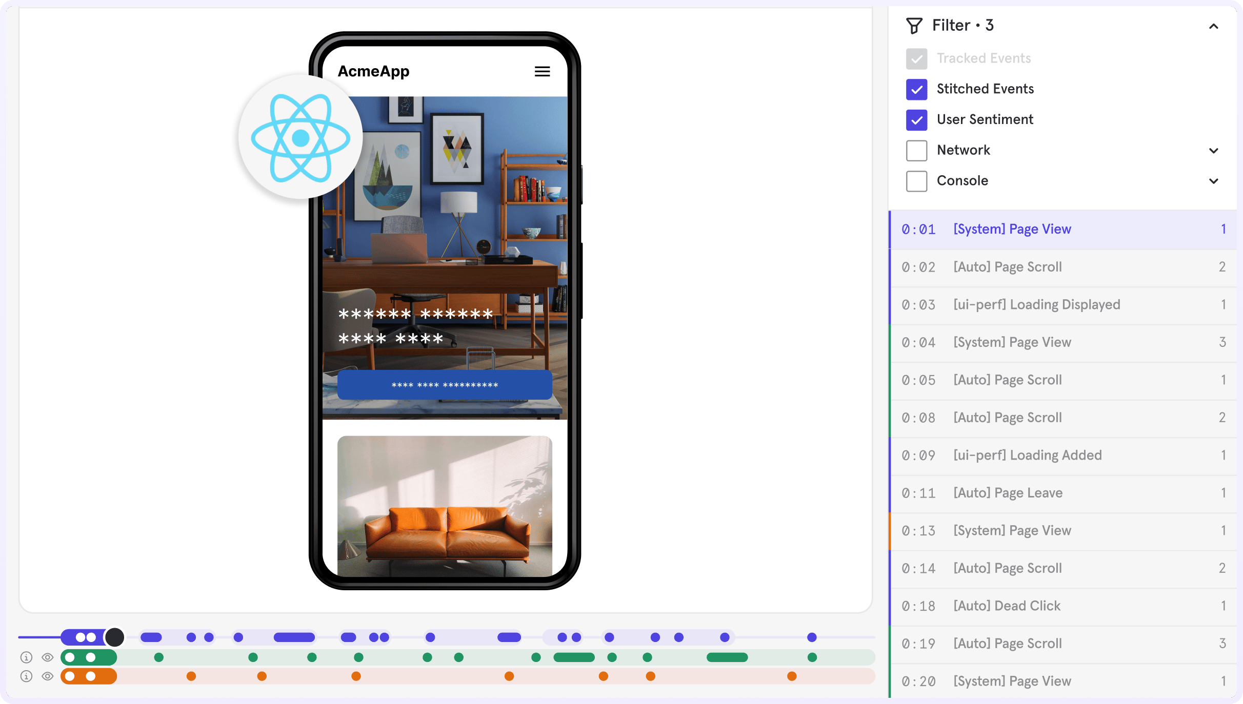
Find user friction fast—view frustration signals in replays and analyze them in your reports
Mixpanel now detects Rage Clicks and Dead Clicks automatically in Session Replay (web only), helping you instantly see where users experience friction.- Rage Click: When a user clicks the same spot multiple times in quick succession
- Dead Click: When a user clicks an interactive element that produces no visible response
[Auto] Dead Click[Auto] Rage Click
Session Replay: AI Summaries
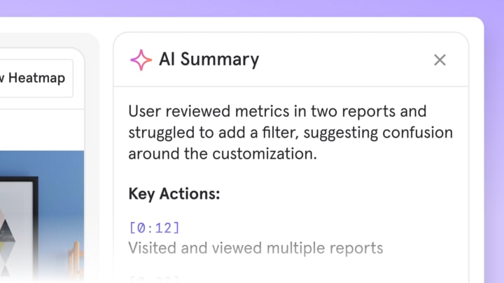
Let AI do the watching for you with accurate summaries that help you understand the “why” instantly
Skip the manual replay review. With AI Summaries, Mixpanel automatically highlights key moments and summarizes every session, helping you get the “so what” behind user behavior in seconds.Summaries appear right beside your replays, giving you an instant read on what happened and why. Powered by your governed event data, they’re uniquely accurate, so you can trust the insights and move faster from understanding to action.Filter at Item Level
Connect Your LLM Metrics to Mixpanel with Langfuse
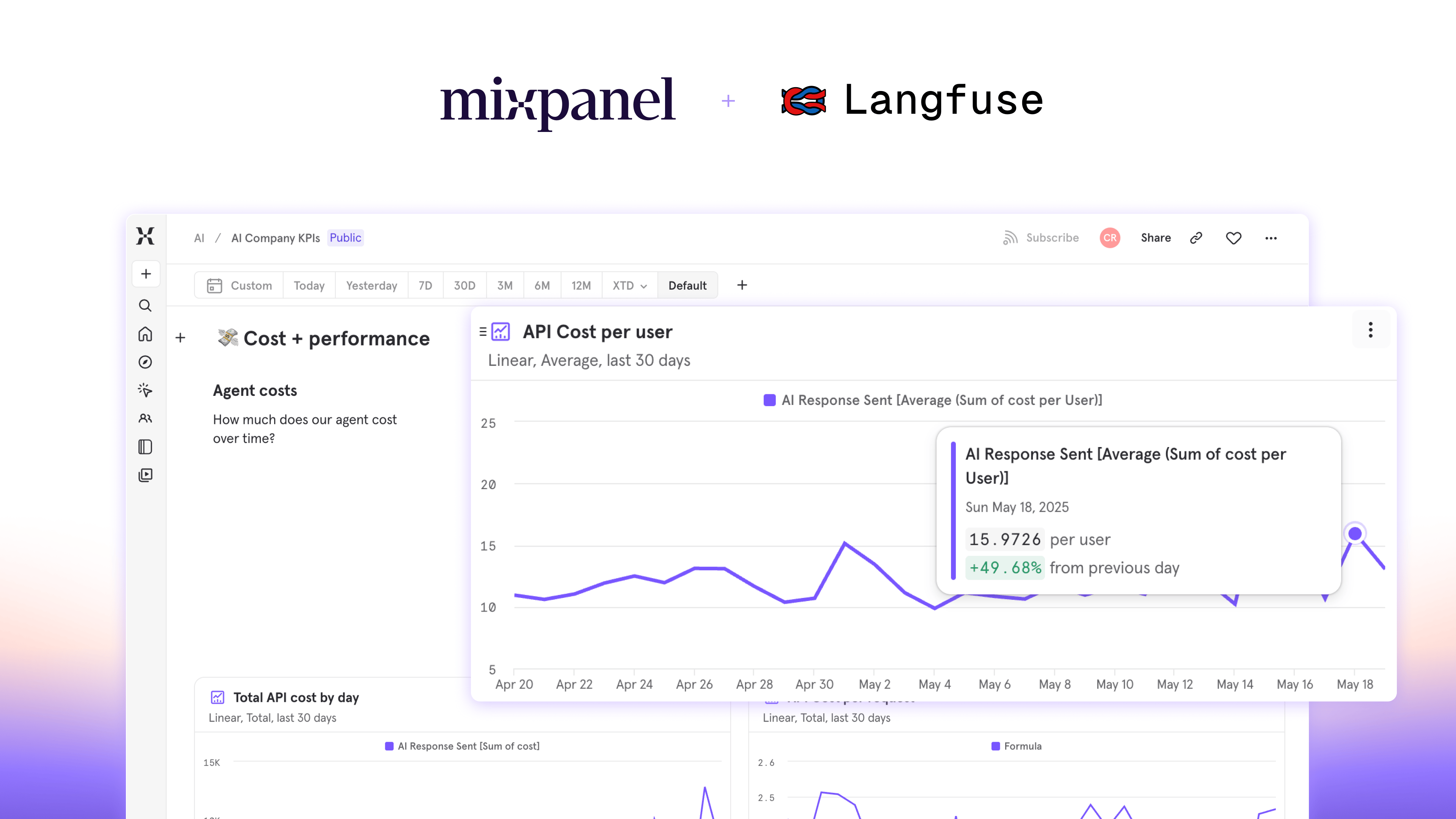
[Langfuse] Trace- Complete LLM interactions with cost, latency, and observation counts[Langfuse] Generation- Individual model calls with token usage and performance metrics[Langfuse] Score- User feedback and quality evaluations
- How do AI interactions impact user retention and conversion?
- Which users are driving the most LLM costs?
- Does user feedback on AI outputs correlate with product engagement?
- Add your Mixpanel Project Token in Langfuse project settings
- Select your Mixpanel region (US, EU, or India)
- Enable the integration
Feature Flagging — Precision control for every rollout
- Own every stage of your rollout: Target specific audiences and ship with confidence. Start small, expand gradually, and stay in control at every phase of your release.
- Launch what matters, to who matters most: Gate features by subscription tier, geography, or behavior — using dynamic Mixpanel cohorts that update automatically as users engage.
- Move fast without breaking things: Safeguard reliability with kill switches, throttles, and instant rollbacks — plus audit trails, QA testers, and special role-based permissions to ensure stability and confidence at scale.
- One place to launch, learn, and grow: Run roll outs and experiments, analyze results, watch replays and tie them directly to real user behavior — all without leaving Mixpanel.
Mixpanel Data Inspector Browser Extension
Session Replay automatically appears in Event Metadata
Annotations, Now with Tags & Filters
- Tag & Filter: Add tags to your Annotations to categorize them and filter in your report so you only see what’s relevant.
- New Annotations sidebar: See all annotations for your report’s date range in one place.
- Annotations on all chart types: Previously, Annotations were restricted to time-based charts. Now, you can access this valuable context from any of your reports.
Mixpanel Model Context Protocol (MCP) Beta
How It Works
The MCP Server serves as a bridge between AI tools (i.e., Claude) and your Mixpanel data. Connect your AI assistant and ask questions in plain English, such as “What’s the retention rate for users who completed onboarding?” or “Show me our top converting events this quarter”.Key Benefits
Chat with your data like your most helpful coworker. Improve time-to-insight from “let me build you a dashboard” to “here is your answer”. Empower non-technical team members to ask data questions without requiring analytics support.Getting Started
Organization administrators enable MCP Server access in Settings > Organization > Overview. Then connect your AI tool and start asking questions in natural language. Learn more in our documentation.Cohorts now in Lexicon
Updated Billing & Data Retention: Simpler Pricing, Enhanced Privacy
Expand Event Images in Context Panel
Growth customers can now buy custom volumes of session replay
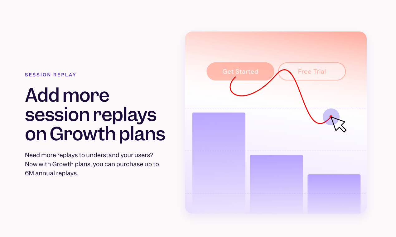
- Existing customers: you can manage your plan directly, including purchasing additional replays, from the pricing page or from your organization details page.
- New customers: during your plan purchase, you can now directly add additional replays as you build your plan.
📱 Session Replay is now available for iOS and Android
- Answer the what and why in one place by moving seamlessly between reports and replays
- Find what matters faster by filtering replays with trusted Mixpanel events, properties, or cohorts
- Watch the complete user journey for web, iOS, and Android
Metric Trees
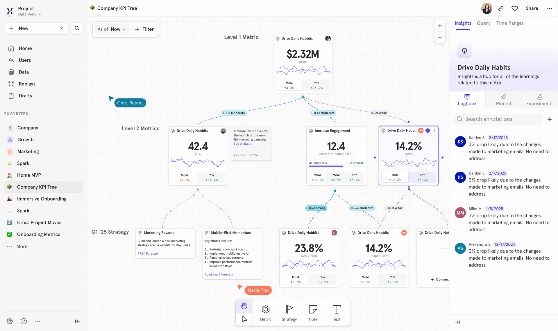
- Rally around KPIs: Align leaders to contributors on how every initiative ladders up to impact
- See impact instantly: Spot what’s changed, and why, from inputs to outputs
- Create accountability: Assign clear owners to each key metric and track progress
- Adapt with your strategy: Keep your tree up-to-date as priorities shift
- Drive action: Jump from metrics to contextual reports, discuss in real time, and log insights for traceability
Experimentation Reporting 2.0 - Trusted Insights, Maximum Impact
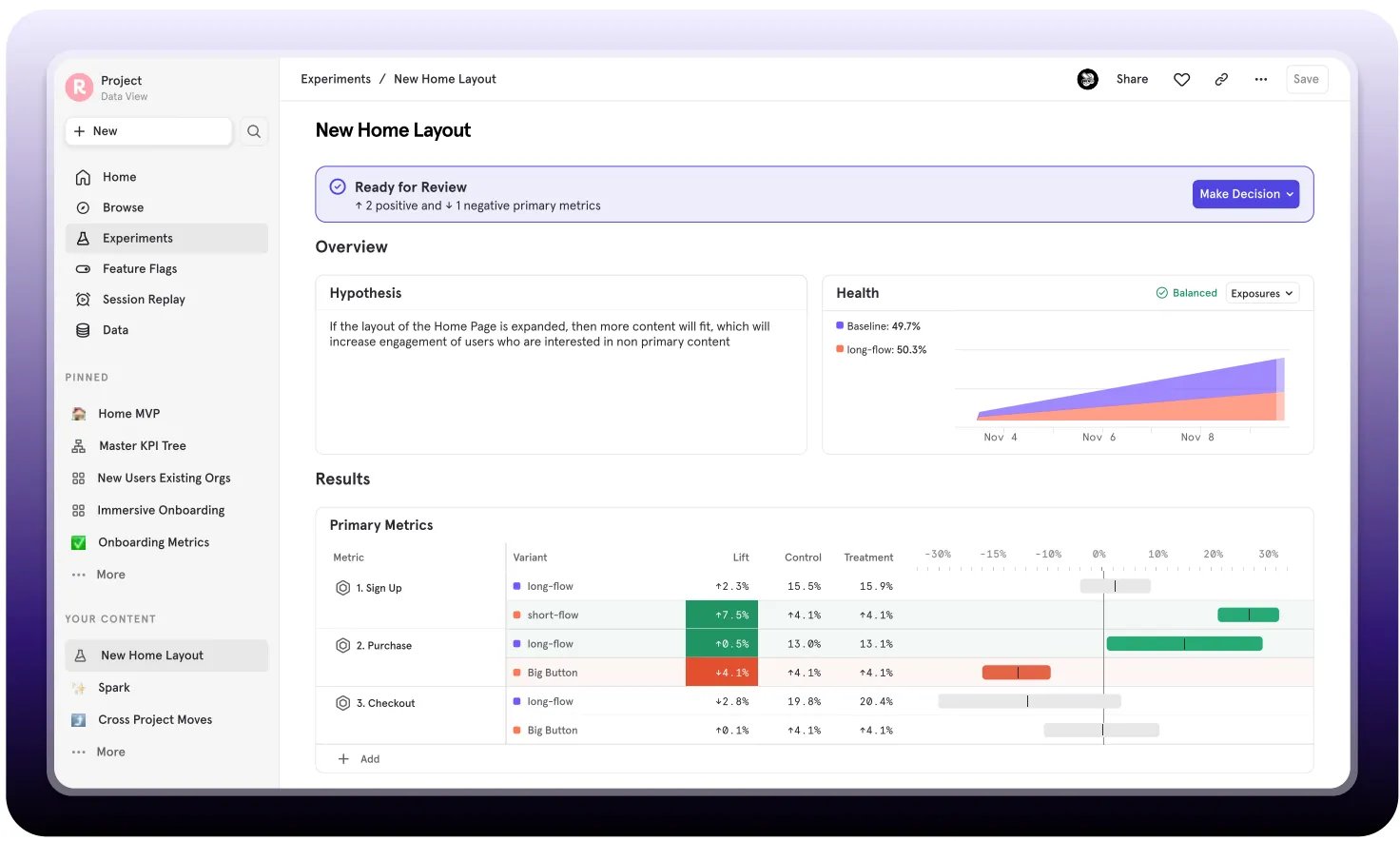
- All metrics supported: Measure impact on any new or existing Mixpanel metric
- Decisions you can trust: Analyze multi-variant experiments with robust statistical significance.
- Diagnose results: See the “why” with integrated experiment data in your behavioral analytics flow.
- One place for all your experiments: View and filter all active and past experiments, their results, and decisions made.
- See the complete picture: Link results with user behavior, cohorts, and session replays for the complete picture.
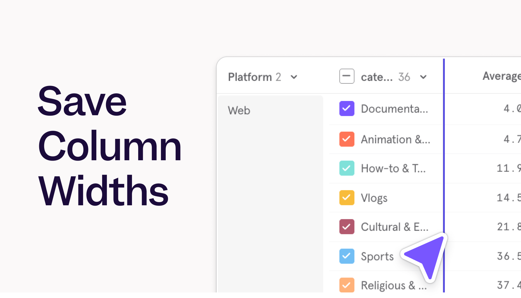
Save Column Widths in Tables
Saved Metrics
- Standardize Definitions: Define and save a metric definition once
- Share Metrics: Share your saved metrics with specific teams, individuals, or across your entire project to ensure everyone is using the same metric
- Reuse Across Workflows: Apply saved metrics across your reports, boards, and other Mixpanel features. Save time by using the source of truth.
- Update with a Click: When a metric’s definition changes, update it once and those changes will automatically reflect everywhere the metric is used.
- Clear Context: Automatically see more details about what’s in a metric definition before you select it
- Multi-Group Analysis: For customers with the Groups Add-on, you can now analyze metrics across different groups in the same report. More details here.
Heatmaps for Web
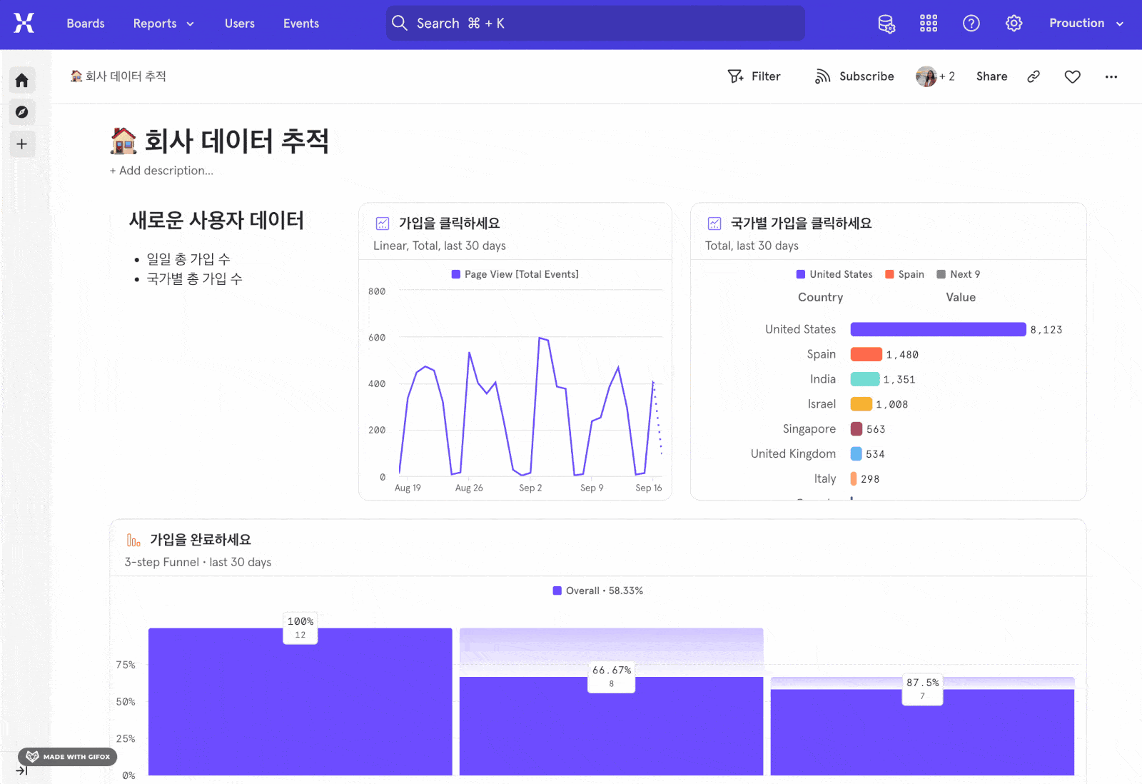
Now available in Mixpanel: Heatmaps, a better way to visually understand your customers.Quickly see where users are clicking (and where they aren’t), spot friction points, and identify hot spots and dead zones at a glance. Use these insights to optimize page layouts, CTAs, and content based on real user interactions.Heatmaps come included with Session Replay and are easy to enable - just change one line of code (Read more). Don’t have Session Replay enabled yet? Learn more, or reach out to your account team to get started.Customize Your Project Homepage
- Access Key Information: Direct your team to important documentation, onboarding guides, or key project data.
- Streamline Onboarding: Guide new users to intro reports and content that’s specific to your organization.
- Highlight KPIs: Put key KPIs front and center for your team by adding them to the Homepage Board.
Track key AI metrics
- Are customers even using my chatbot?
- How much value do they get from AI outputs?
- Do improvements to my agent drive higher retention?
Optimized Funnel Re-entry
When Optimized Re-entry mode is enabled, we actively evaluate all funnel entry attempts - even if the user’s previous funnel is still in progress. This allows us to capture potential conversions which might occur from subsequent entries, maximizing total conversions. If any user funnel entries within the report date range result in a conversion, we count the user as converted.With this mode, we are able to answer- How many unique users converted irrespective of if it was their first attempt or not?
- How many total conversions were there, while counting simultaneous ongoing funnels?
- Which webpages led to drop-offs?
Global Sidenav
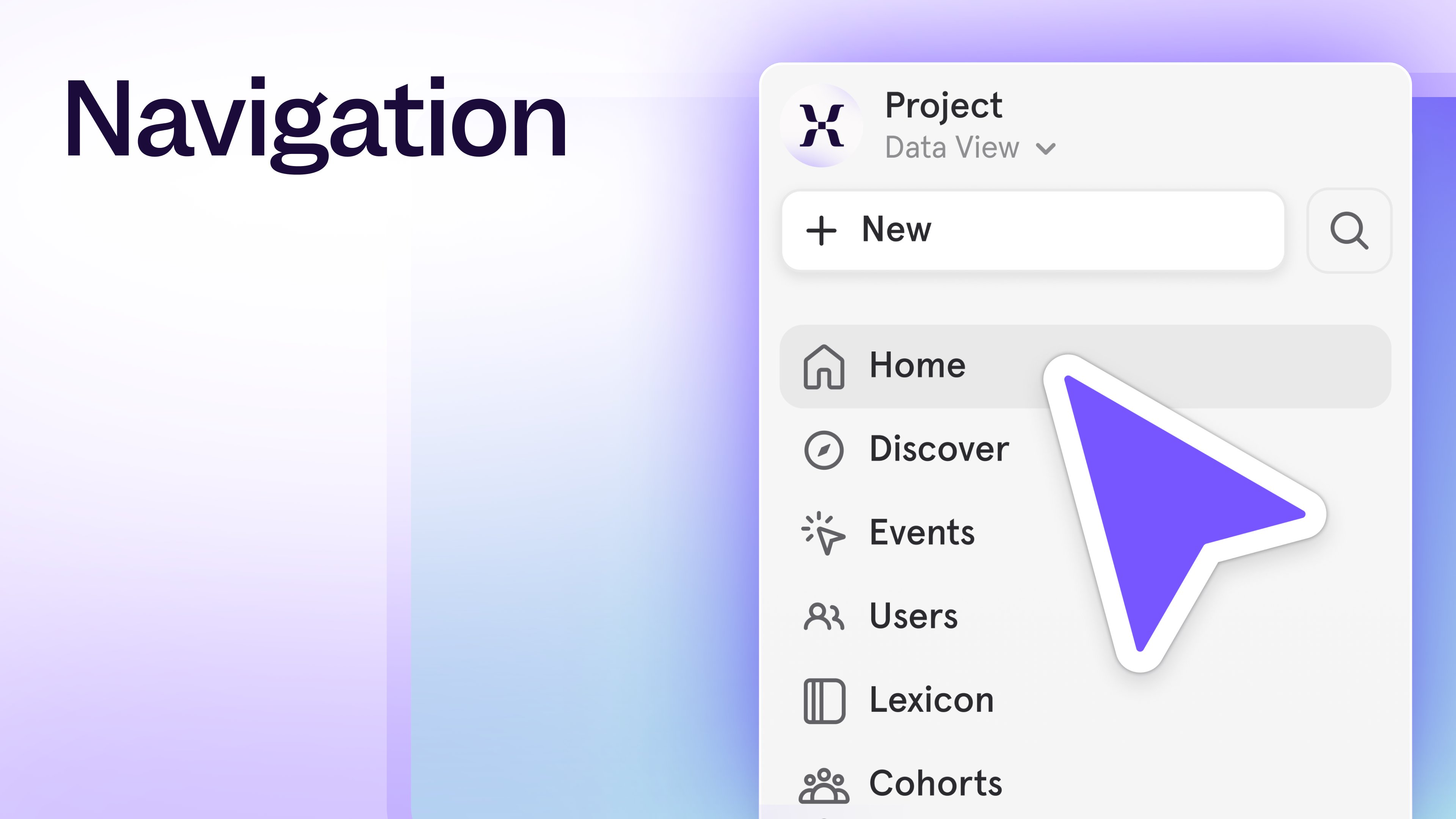
- More Screen Space: We’ve removed the top navigation bar to give you more space to work.
- Effortless Navigation: All your navigation is now on the left - making it easier to switch projects, create new content, and access Events, Users, Lexicon, and Cohorts seamlessly.
- Always Accessible: The navigation panel is always available as your navigate through Mixpanel - making it easier to get around.
- Top: Project switching, creating new content, search, and quick links to Events, Users, Lexicon, and Cohorts
- Middle: Boards - grouped into Pinned, Favorites, and Your Boards
- Bottom: Settings, Help, and advanced reporting features.
CMD + K Open search, ``` Expand or collapse the side navigation, Esc Close a report to return to your BoardEnforce better governance with Data Standards
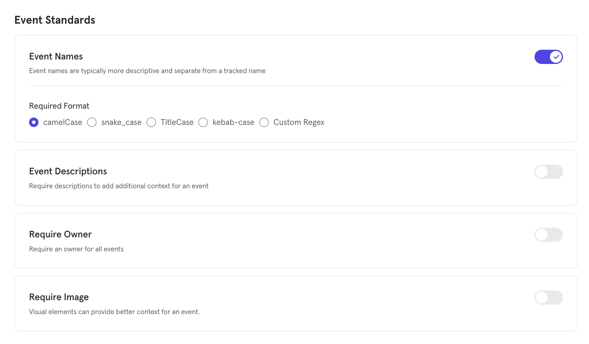
Enforce better governance with Data Standards
We’ve made it easier than ever for teams to enforce trustworthy, consistent data with our new Data Standards feature — now available for Enterprise customers. This update empowers Data Governors to define event naming and metadata requirements for their projects, and instantly spot events that don’t comply.The new Data Standards feature includes:- Custom Rules: Define rules for naming conventions, event owners, descriptions, and uploaded images — all from the new Data Standards tab in Lexicon.
- Compliance Statuses in Lexicon: Events are automatically evaluated and flagged as compliant or non-compliant, with visual indicators for events that are misnamed or missing metadata
- Filters for Fast Cleanup: Quickly surface and fix non-compliant events using a new, dedicated filter view in Lexicon
Mirror Sync Mode for Redshift Warehouse Connectors
Mirror — a sync mode keeps your data in Mixpanel fully in sync with any changes that occur in the warehouse — is now generally available for the Redshift Warehouse Connector.With Mirror, any time data is modified in your underlying warehouse table, that change is automatically reflected in Mixpanel through change data capture (CDC). You can iteratively implement, rename or remove columns, or reconcile transactions in your warehouse without any worry of data divergence in Mixpanel. This sync enables accurate analysis for all data types, including business data that changes often such as purchases.The Redshift Warehouse Connector is an add-on for Enterprise plans. Contact your account team to inquire about accessNew features for enhanced B2B account analytics!
- Who are the power users within our strategic accounts?
- How active are users within our strategic accounts?
- How are users within our strategic accounts flowing through our activation funnels?
- What are potential upsell opportunities for our strategic accounts?
We have also deprecated the Revenue App as of Dec. 31, 2024. Thanks to our recently released Revenue Analytics, you can rebuild this report (and more) and save anything you create to dashboards. This help document guides you through step-by-step.*Requires ingesting revenue data from Data Warehouse Connectors.
Introducing Autocapture from Mixpanel

Our Growth plan just got 100x more generous

Watch replays for any event — even backend events
Watch replays for any event—even server-side
Coming soon on all plans, exclusively at Mixpanel: Server-Side Stitching!Session Replays now work for all your data, not just client-side or front-end events. That means you can jump straight from reports to replays, even for events tracked via APIs, sent from your data warehouse, or sent from the server-side.Here’s what’s new:- Replays for your most important events like purchases or signups—events typically tracked server-side or sent from the data warehouse. Now, you can see exactly what users did leading up to those moments.
- No more dead ends – Product teams track data in many ways, and now, instead of hitting empty playlists for many of your events, you can watch replays seamlessly across all data sources.
- Complete view of the user journey – Diagnose issues, optimize funnels, and improve your product experience with replays that work across client-side and server-side data.
Mixpanel for Startups now provides over $150k in value

- Advanced analytics capabilities
- No feature gates
- 500K Session Replay recordings
- 1B annual events
- Unlimited team seats
- World-class support
- And more!
Pin Filters to Boards
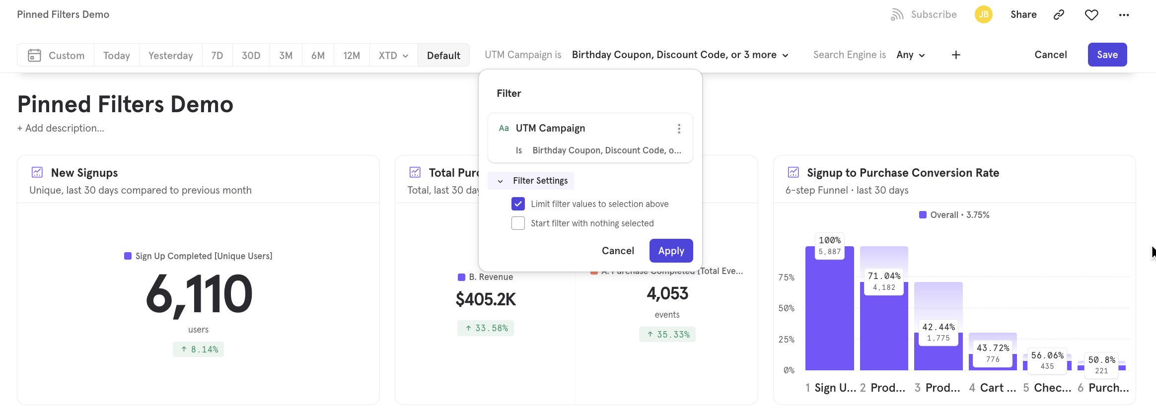
- Limit Filter Values: Improve Board clarity by limiting the number of filter values displayed. This is particularly helpful when you have a filter with a large number of values, allowing you to show only the most relevant options. For example, limit a “Country” filter to only include countries within a specific region.
- Start Filter with Nothing Selected: Guide users towards specific filtering options by pinning a filter option to the top of a board without applying any filter values. This gives anyone using the Board quick access to a filter without automatically updating the data in the Board for all users. For example, pin a “Region” filter to a board with nothing selected. By default, users will see global data and will have quick access to filter the reports down to a particular region.
Session Replay is now available on Free and Growth plans
- Customers on the Free plan have access to 10k free replays per month.
- Customers on the Growth and Enterprise plans have access to 20k free replays per month.
- Additional custom volumes of Session Replay are available as an add-on purchase for Enterprise plans.
- Switch your plan to the latest Free plan, which includes 1M monthly events and 10k session replays. You can make this switch directly from the pricing page.
- You’re on the latest plan if you purchased or edited your plan after April 2024. If you’re not sure if you’re on the latest plan, you confirm on the pricing page - if you see ‘Make the Switch’ on the Growth plan, then you are on an older version.
- You can make the switch to our latest plan directly from the pricing page.
Add verification tags to your data
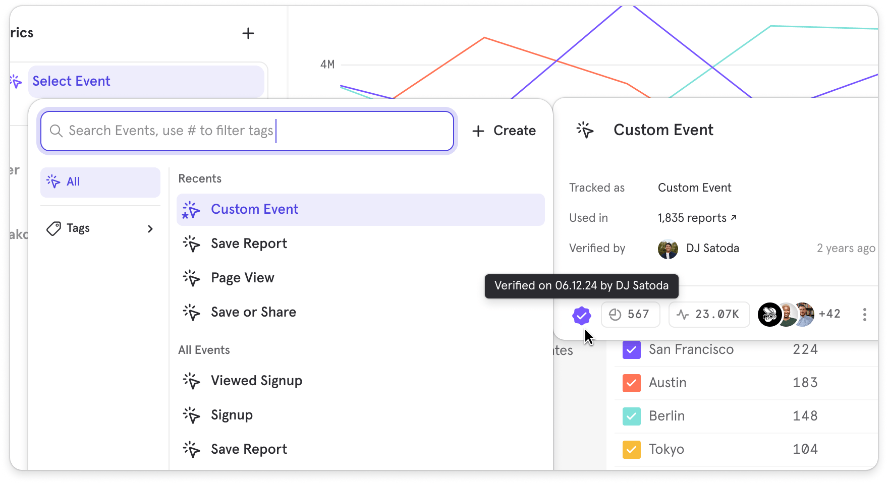
- Badges in Lexicon: We’ve added a badge next to verified Events, Behaviors, Formulas, and Custom Events
- Verification Context: Hovering over badges displays who verified the item and when, adding accountability and transparency
- Verification Button in Details Page: On each item’s details page, you can verify it with a single click
- Dedicated Category in Query Builder: We introduced a Verified category in Query Builder so users can quickly filter to see only trusted content
- Verified Badge in Query Builder Context Panel: In the footer of the Query Builder’s context panel, the verified badge shows up, reassuring users that they’re working with golden metrics
India Data Residency for Mixpanel

Choose colors for your segments
- Highlight a particular segment for emphasis
- On boards with the same breakdown repeatedly, set the colors for segments so they can be aligned across the board
Set units for your metrics
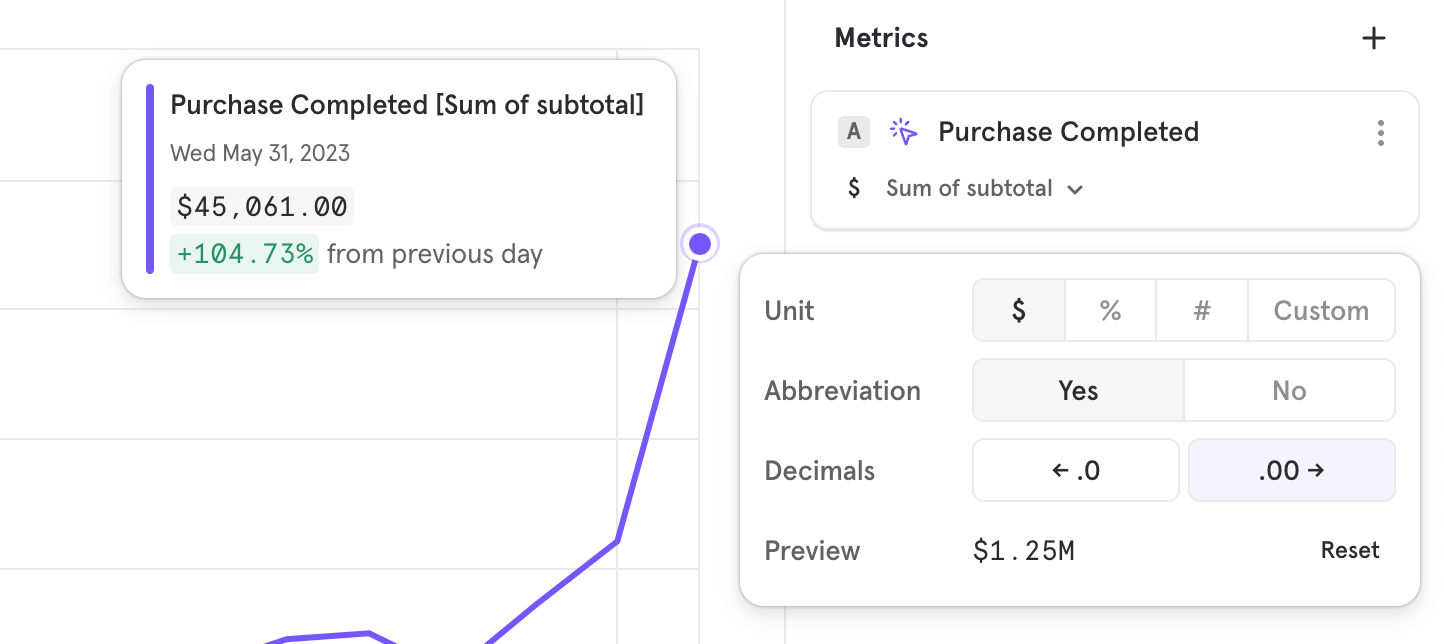
- Create a % based formula, and add the % unit so it’s clear what the metric is measuring
- Revenue based metrics, adding a $ symbol to know what currency is involved
Mixpanel Revenue Analytics
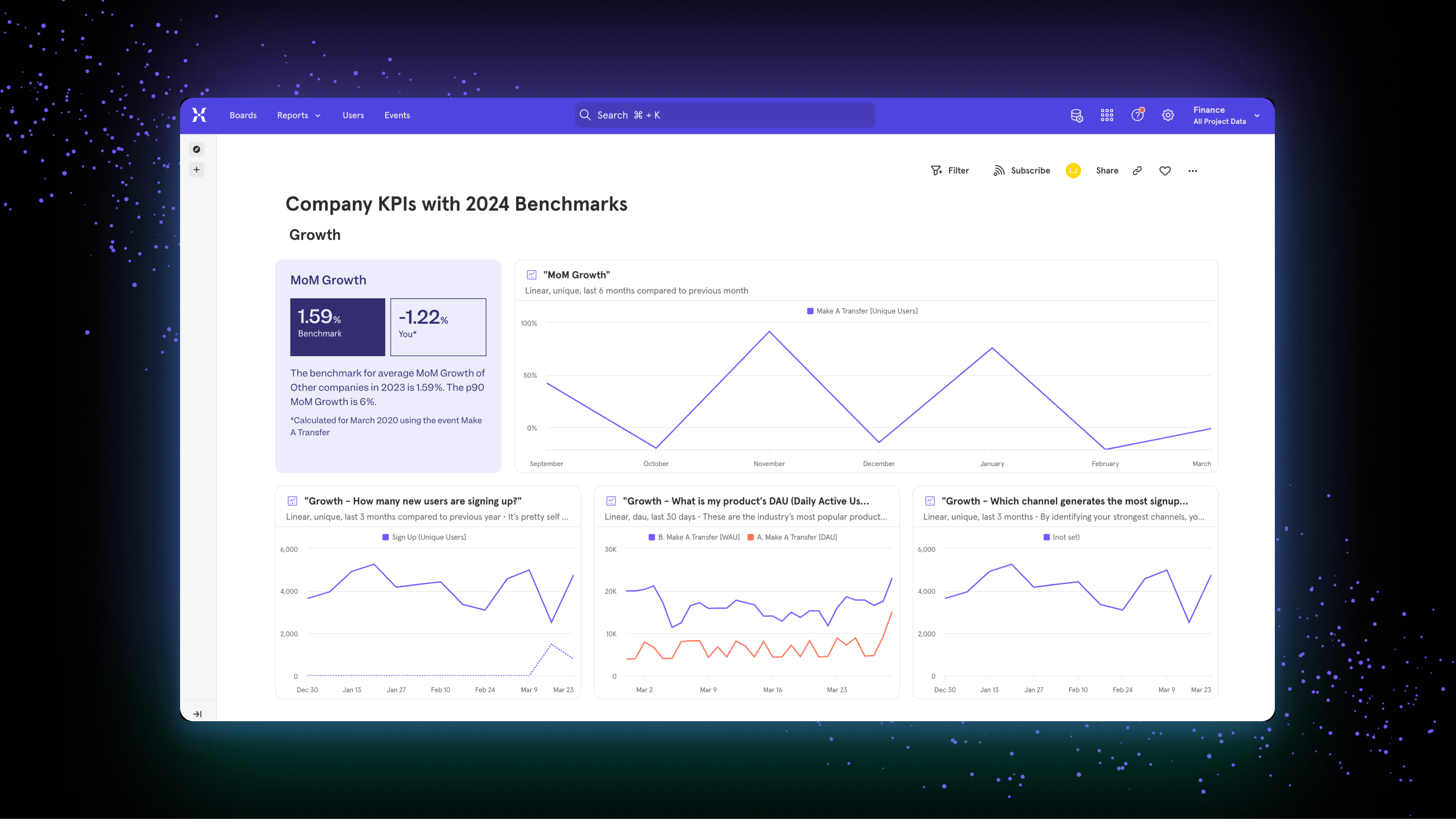
Mixpanel now helps you analyze the impact of your product and marketing initiatives on your key company revenue metrics. You can now answer questions like- How much new revenue has been generated by this product launch? Has it grown by more than 5%?
- Why has LTV/CAC reduced, i.e why has cost of acquiring a valuable customer gone up? Which user segments are driving this?
- Which product SKUs is contributing to the most upsell revenue? Is NRR (net revenue retention) also going up accordingly? Does it differ by company size?
Mixpanel in your language

Mixpanel Session Replay is Now Available
Pick time ranges down to the minute
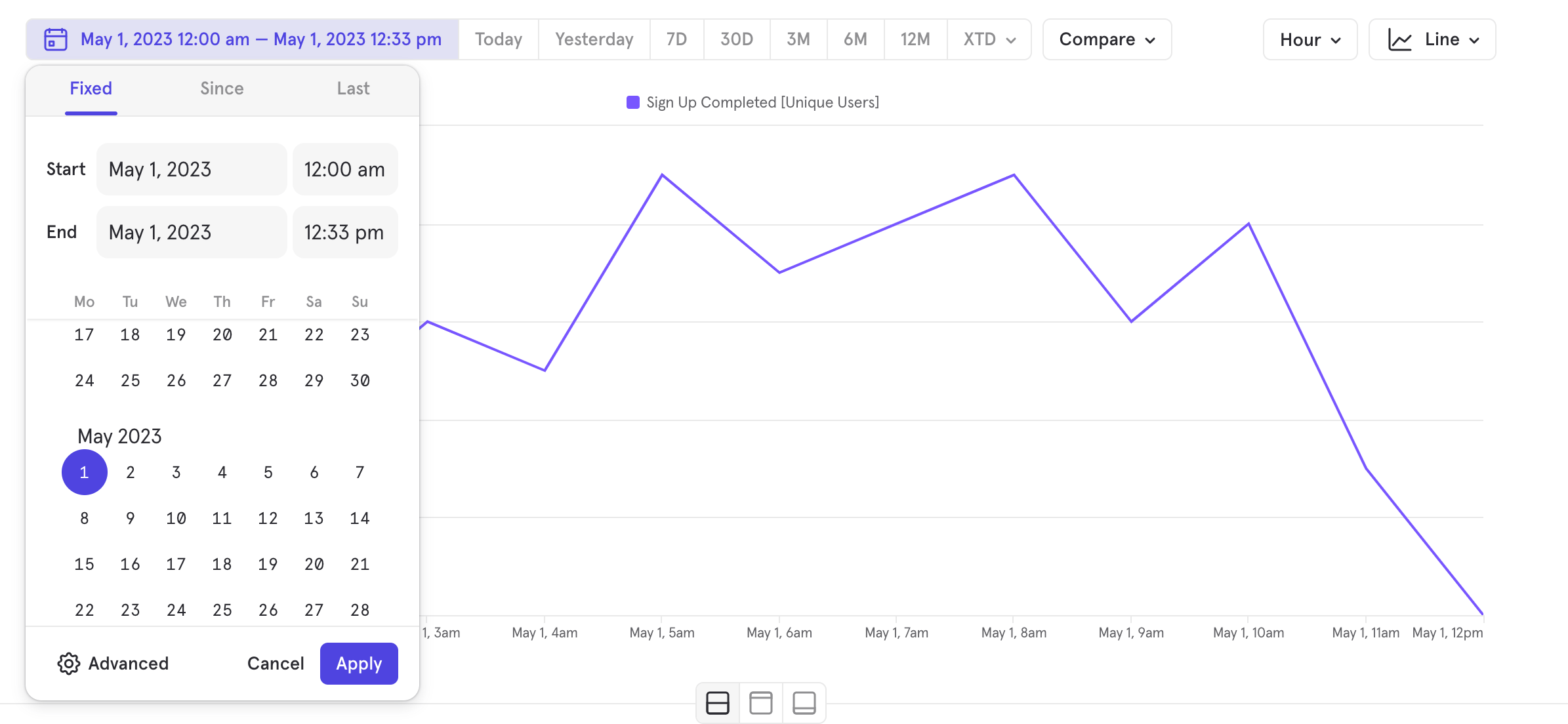
- Look at a metric as a trend for under a day
- Zoom into your data on trends
- Share insights on a smaller timeframe without having to zoom in again
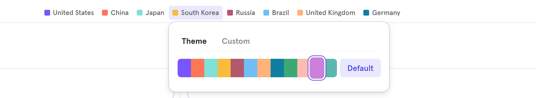
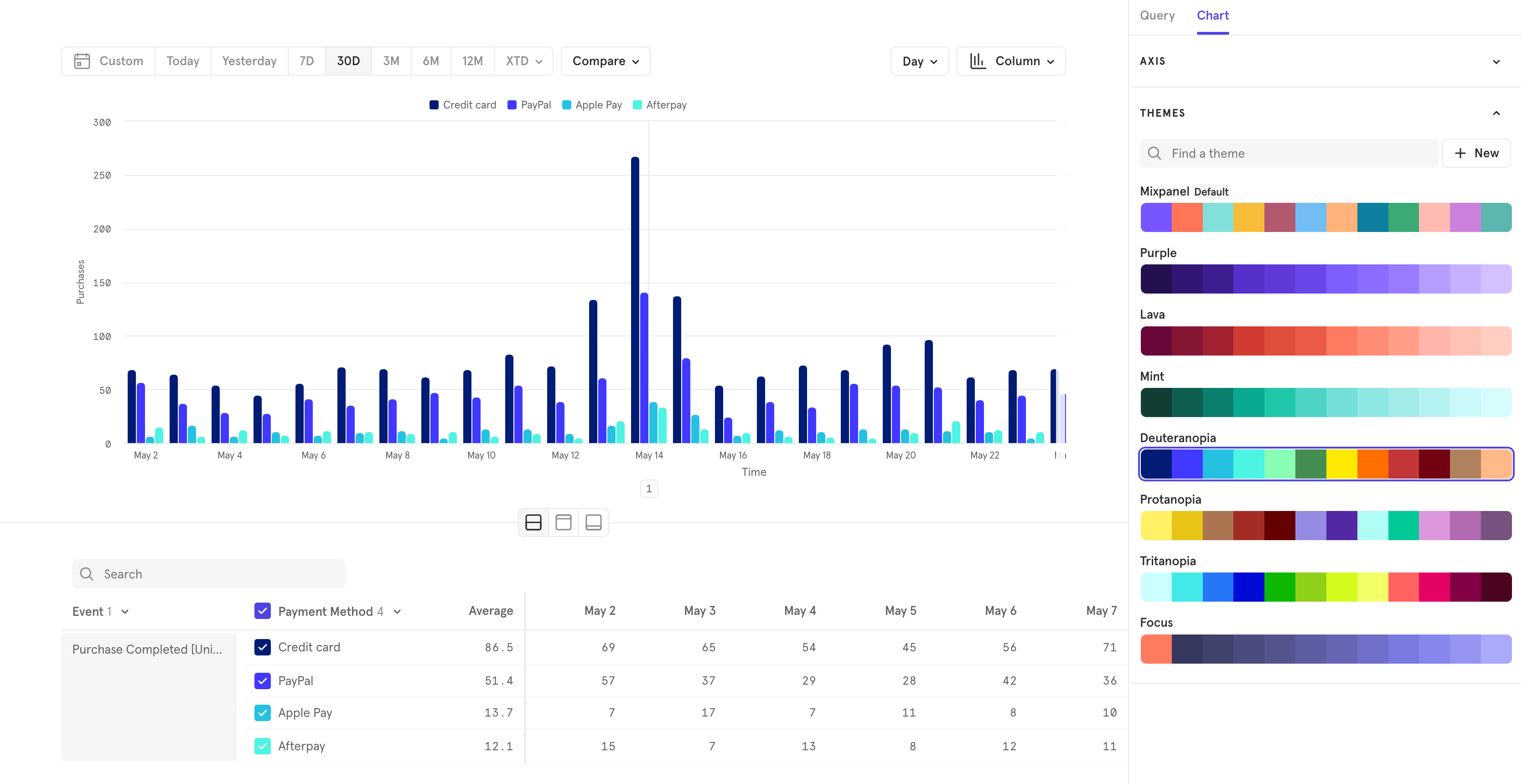
Color Themes
Axis Customization
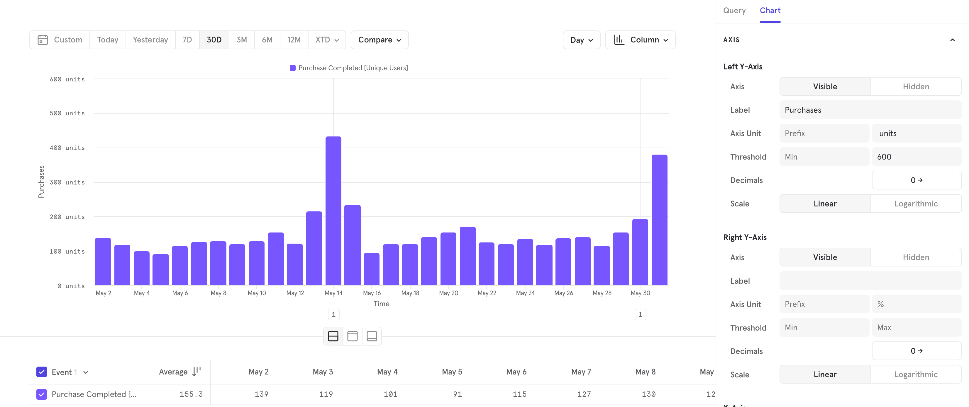
- create a secondary y axis on the right hand side to show data of different scales
- determine the axis thresholds, so you can zoom in or out
- add labels to make what you’re measuring more clear
- determine the unit and decimal precision of your axes
Know where you are with a persistent navigation panel
Esc to close out of a report and return the your Board.Mirror Sync Mode for Warehouse Connectors
Mirror is a new mode on Warehouse Connectors that keeps Mixpanel in perfect sync with your warehouse. Any time data is modified in your underlying warehouse table, that change is automatically reflected in Mixpanel through change data capture (CDC). You can iteratively implement, rename or remove columns, or reconcile transactions in your warehouse without any worry of data divergence in Mixpanel. This sync enables accurate analysis for all data types, including business data that changes often like purchases.Supported for BigQuery and Snowflake today. Contact your account team to get access.Home
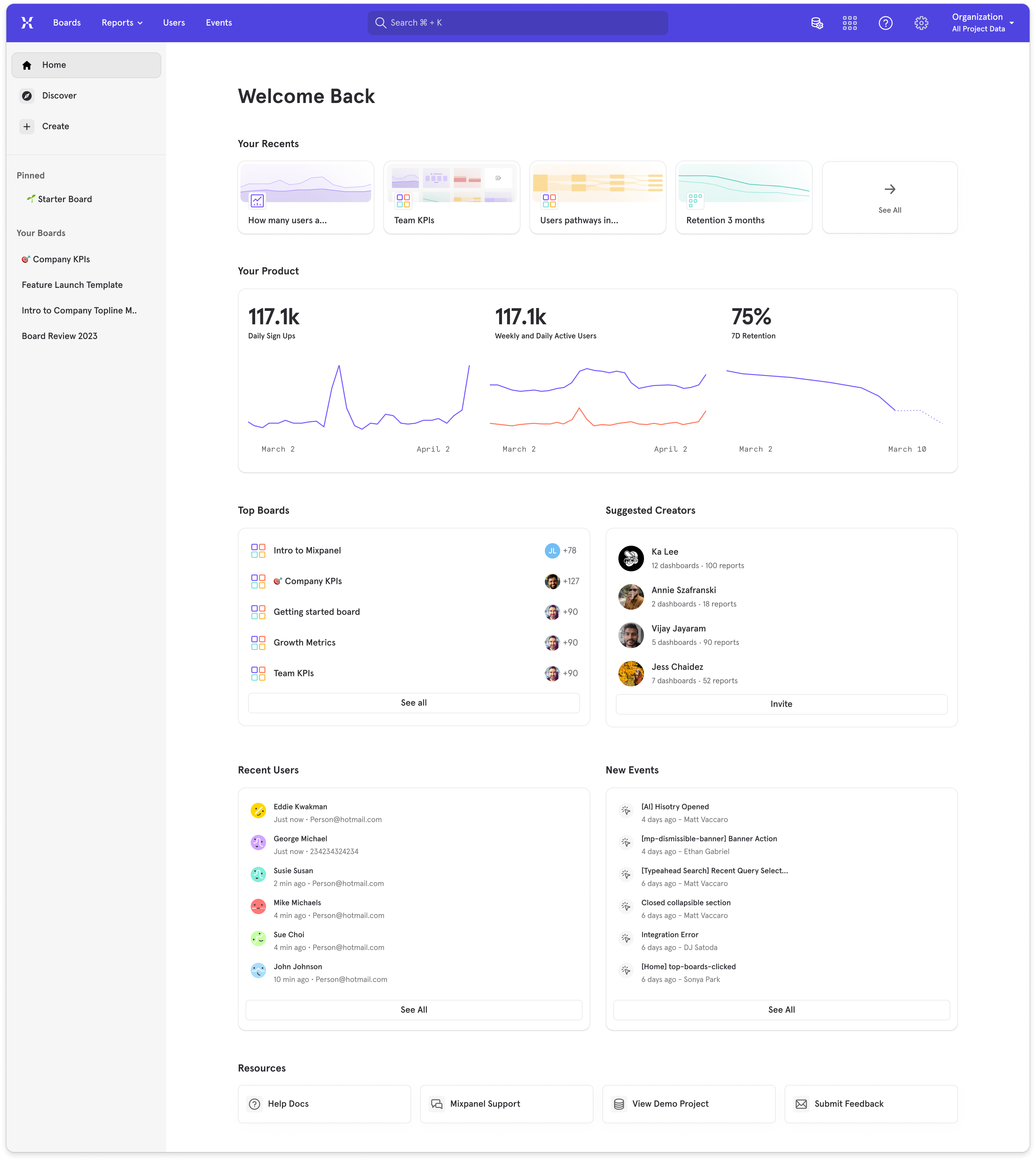
- Your Recents: your most recently viewed reports and boards
- Your Product: this section is default populated with the top insights reports in your project, you can customize and change which insight report you’d like to display on Home
- Top Boards: the most popular boards in your project
- Suggested Creators: people in Mixpanel who are building boards and reports that we recommend checking out
- Recent Users: a list of recently seen users on your product
- New Events: a list of newly tracked events in your project
- Resources: a list of resources that are also available in the top navigation
Column Chart Visualization
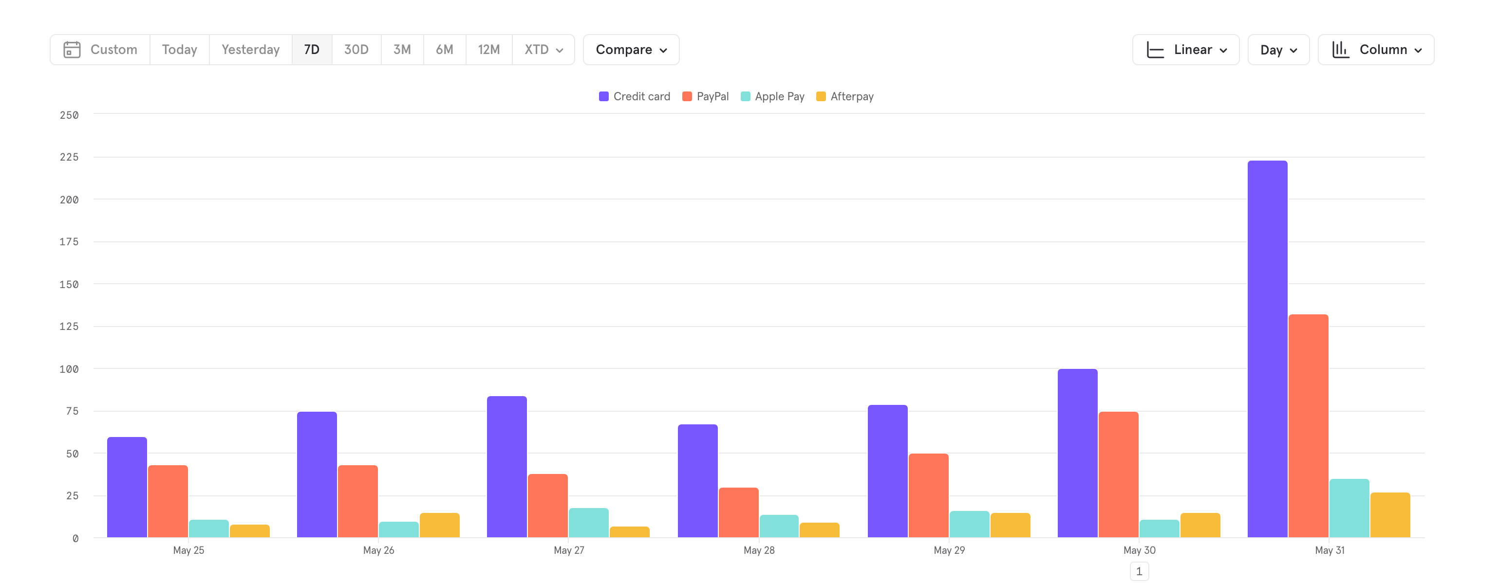
- Visualize and compare customer segments by behaviors or engagement over time
- Compare product sales performance across different regions or customer types
- Compare funnels or retention metrics
- Visualize monthly new sign-ups, active users, and churn rates
- Present financial trends and health over time
AI Chatbot and Search in Mixpanel Docs
Link to DemoMixpanel has added AI to the search tool in our docs! Now, get instant AI answers to technical questions about Mixpanel, any time you’d like. Try it now with questions like:- What should be the first event I track?
- How do I migrate off Google Analytics?
- How do I calculate time spent?
- How do I import Snowflake data?
Save and Reuse Funnel and Retention Behavior definitions
Link to DemoYou can now save a funnel or retention behavior definition, and reuse it across your reports. This allows you standardize on a definition and feel confident in not missing any changes if you need to update a definition. This also saves time from not having to redefine your funnel or retention behavior for every report.Note that the behavior is saved, and not the metric, so you can use the same funnel to in your conversion rate metric, as well as your time to convert metric.You can save and share your behavior definitions just like a custom event or custom property. You’ll be able to see all saved behaviors in Lexicon. See docs for more information on saved behaviors.Plot Insights, Funnels, and Retention on the same chart
Link to DemoYou can now plot any funnel or retention metric in Insights, and you can plot any combination of them together. Insights is where you can see how any of your metrics are doing and how different metrics are doing side by side.With these changes you can now:- compare retention of different actions on the same retention curve chart
- see how the conversion rate for different steps in a funnel trend over time in the same chart
- see funnel and retention metrics in a table visualization of your board
- use table, pie, stacked bar and stacked line visualizations for funnel and retention metrics
- build a detailed table of funnel metrics in one space
- plot different types of metrics on the same line chart
- make formulas that use funnel and retention metrics
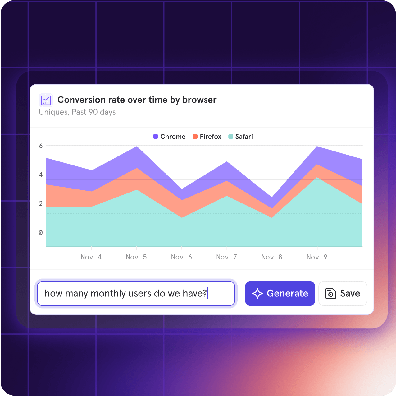
Ask your questions in natural language with Spark AI
Merge data from different events on-the-fly with Borrowed Properties
Link to DemoIntroducing Borrowed Properties, where you can ‘borrow’ a property from another event on-the-fly and leverage it for analysis as though you’ve tracked it all along. No re-tracking or complicated joins required.Here’s some scenarios where Borrowed Properties makes life a whole lot easier:Merging data from client-side to server-side
- Scenario: You want to understand which restaurant category leads to the most confirmed purchases.
- “Order placed” is a client-side event that has a property called restaurant category.
- “Transaction completed” is the server-side event of interest that you’d like to break down by restaurant category.
- Solution: Borrow the restaurant category property from “Order placed” onto “Transaction completed” and poof! It’s like “Transaction completed” always had the restaurant category property.
Analyzing across two different teams
- Scenario: One team created a “Speed Mode” feature that runs the app faster. There’s a “Speed Mode” event with the property Speed Mode Enabled.
- Another team wants to know how Speed Mode impacts how many pages are viewed. But the “Page View” event doesn’t have the Speed Mode Enabled property.
- Solution: Borrow the Speed Mode Enabled property onto “Page View” and teams can instantly understand how page views differed when Speed Mode was turned on.
Subscribe to Boards for ongoing notifications on metrics
Boards are a useful tool to collect a series of reports in one place, but they shouldn’t be a set and forget experience. It’s important to stay in the loop with how these key metrics are moving.To keep you and your team up to date on how much progress you’re making towards your metrics, you can Subscribe to a Board.All it takes is setting the schedule of how often you want to receive this information and selecting where you want to read it (email or Slack). Teams that are collectively informed on their data can stay on the same page, and using Subscribe to Boards can help them get there.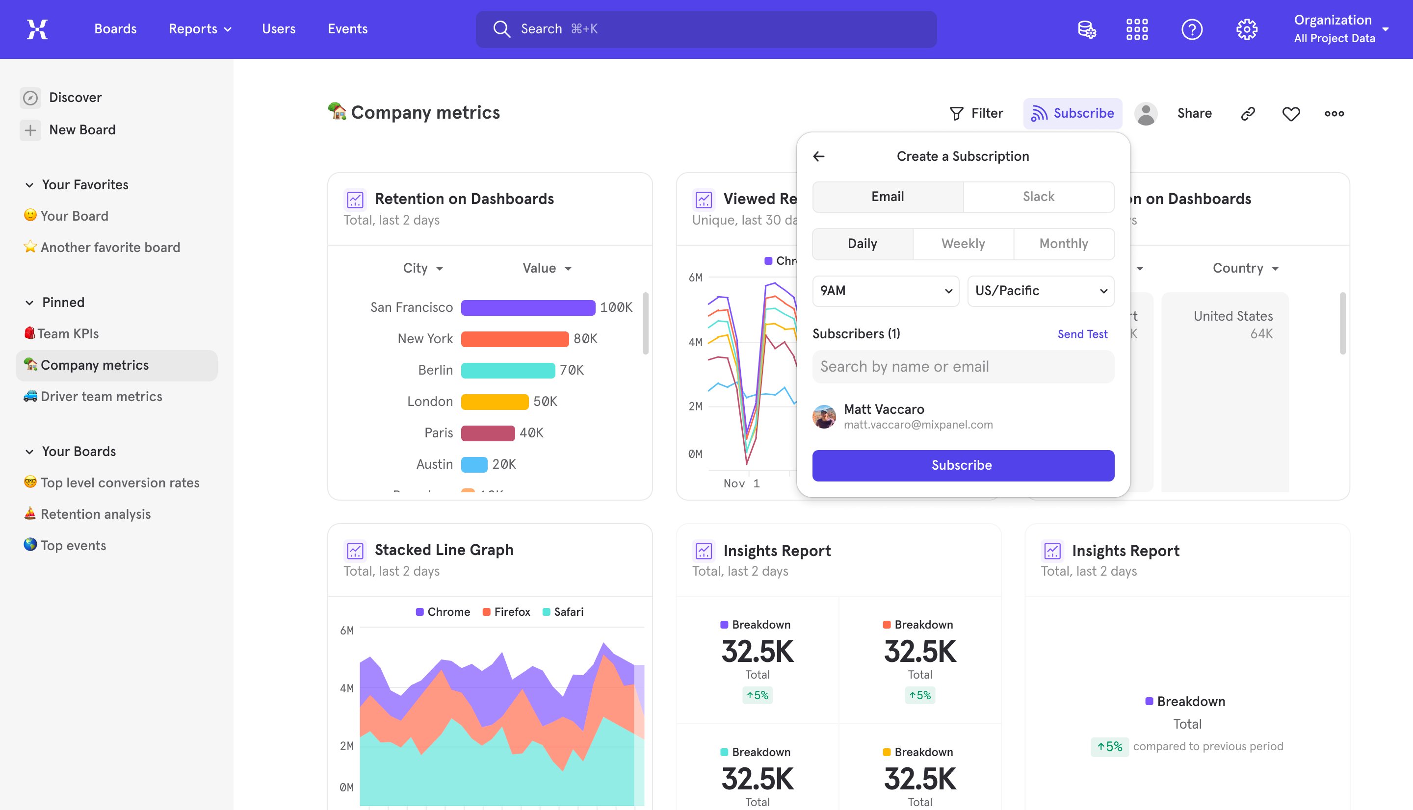
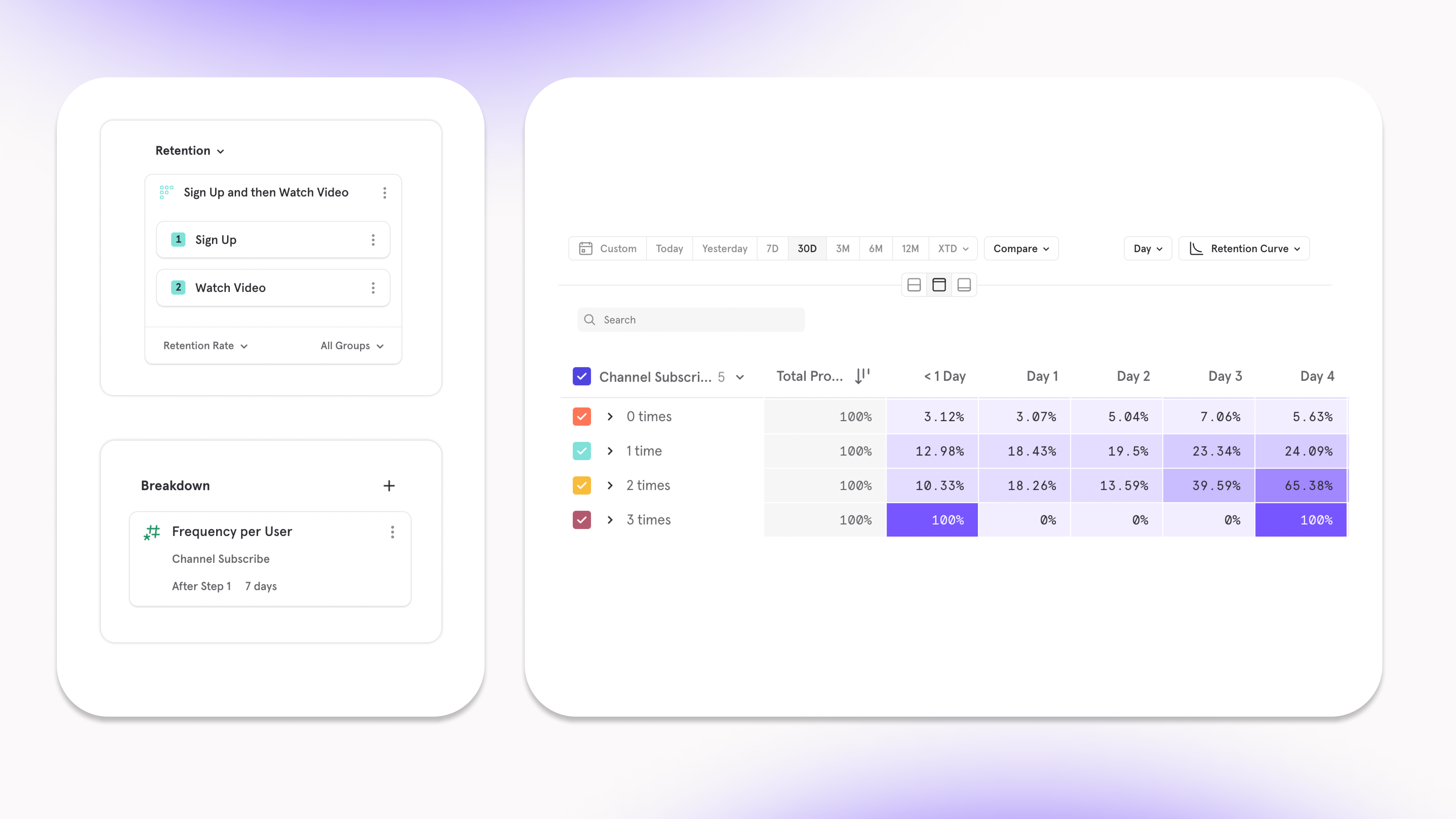
See what actions lead to retention with Behavioral Properties in Retention
Link to DemoNow in Retention, we’ve made it possible to breakdown users by what they do, not just who they are. This unlocks the ability to find the actions you can influence that will increase the long term retention of a user finding value. At its core, Behavioral Properties in Retention allows you to:- Summarize user activity after the starting event, whether it is a count of events, or a summary of properties on those events.
- Set that summary of activity in a timeframe, for example, the number of times a user does the specified activity within 7 days / 1 hour / 30 minutes of the starting event.
- Uncover what activities within a certain timeframe correlate with the how often your users do the action you want them to do in the long term.
Compare against the best with the Benchmarks 2024 Report
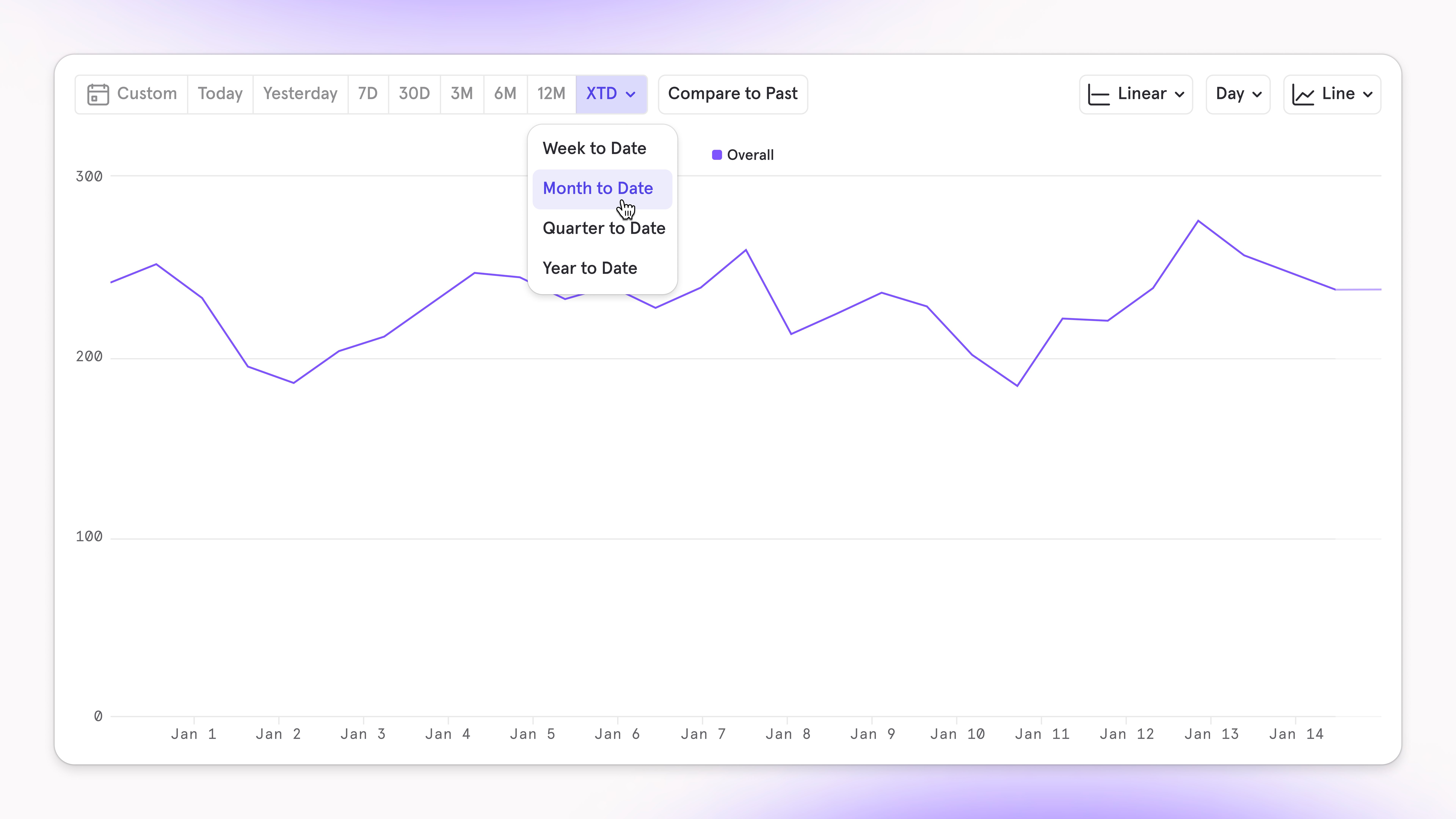
Set your visualization to WTD/MTD/QTD/YTD
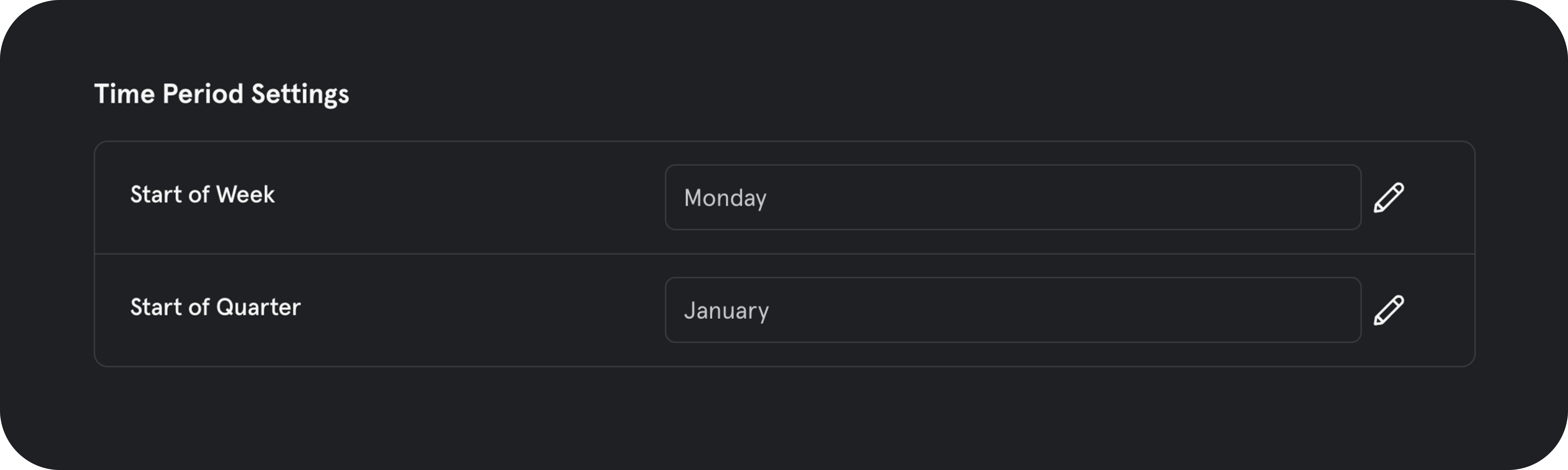
Mixpanel now supports the ability to set the timeframe of your visualization by “X”-to-date:- Week to Date (WTD): The period from the beginning of the current week up to the present day.
- Month to Date (MTD): The interval starting from the first day of the current month up until the current date.
- Quarter to Date (QTD): The time span from the start of the current quarter (three-month period) to today.
- Year to Date (YTD): The duration from the beginning of the current calendar year to the present day.
Measure revenue drop-off at each funnel step
Link to DemoIt’s always been possible to view a series of events through a funnel, but now, we’ve added the functionality to sum a property on those events and visualize those values through a funnel. This type of analysis sets the focus on the outcome of the funnel being completed, not just that the conversion rate of the funnel is high.The most exciting use case unlocked from being able to view the sum of a property moving through a funnel is what we call Revenue Conversion. This analysis can help answer the question: “a segment of users might all convert, but how much dollar value of items did they have at each step, at which steps was this money lost, and how much did they ultimately convert with?”.png?fit=max&auto=format&n=qosfcyvqREDownRB&q=85&s=d8065214b6fbe7eee8c0e1482d21a1f6) A couple instances where Revenue Conversion analysis can be useful are:
A couple instances where Revenue Conversion analysis can be useful are:- Can determine which page a user lands on (sale, men’s wear, etc) ends up with the most money spent at checkout. All pages might have similar conversion rate to purchase, but some might drive more revenue at checkout.
- Can shift marketing spend to the industry (Healthcare, Fintech, etc) that have the highest average revenue when they purchase.
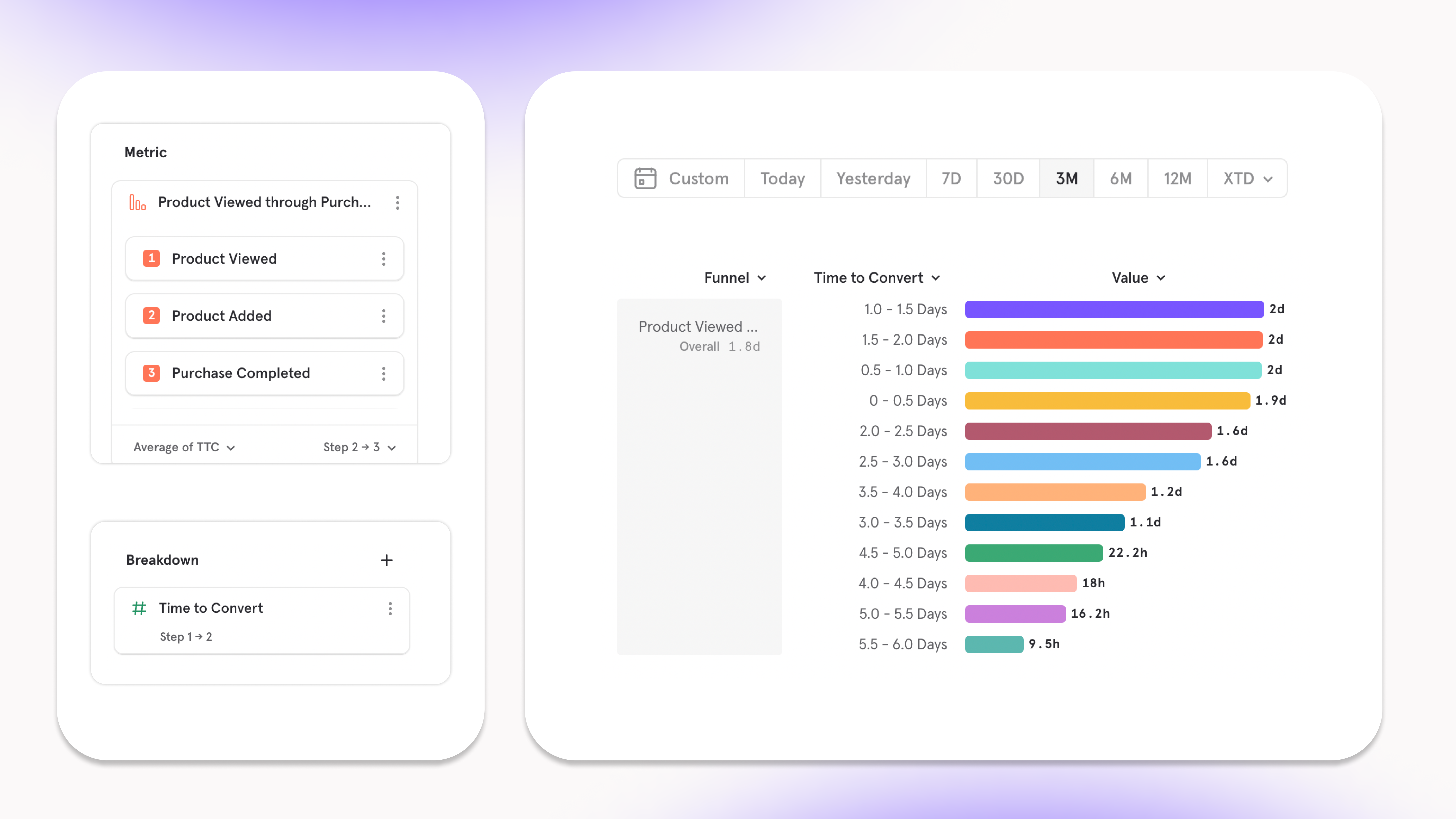
Expanded Time To Convert functionality in Funnels
Link to DemoUnderstanding how long it takes users to do actions or convert is key in building an efficient product that gets users to value fast, or, timing marketing strategies. We’ve improved this analysis by opening up new ways to answer questions on the time it takes users to complete a series of actions — this is made possible with our new expanded functionality of TTC in Funnels.Now, you can measure the amount of time it takes a user to convert in all of our aggregations (Average, Median, Percentile, Min & Max) to learn whether the adjustments to a workflow are decreasing the friction it takes to get to a moment of value.- Who are the users that look the lowest amount of time to signup after viewing our new landing page?
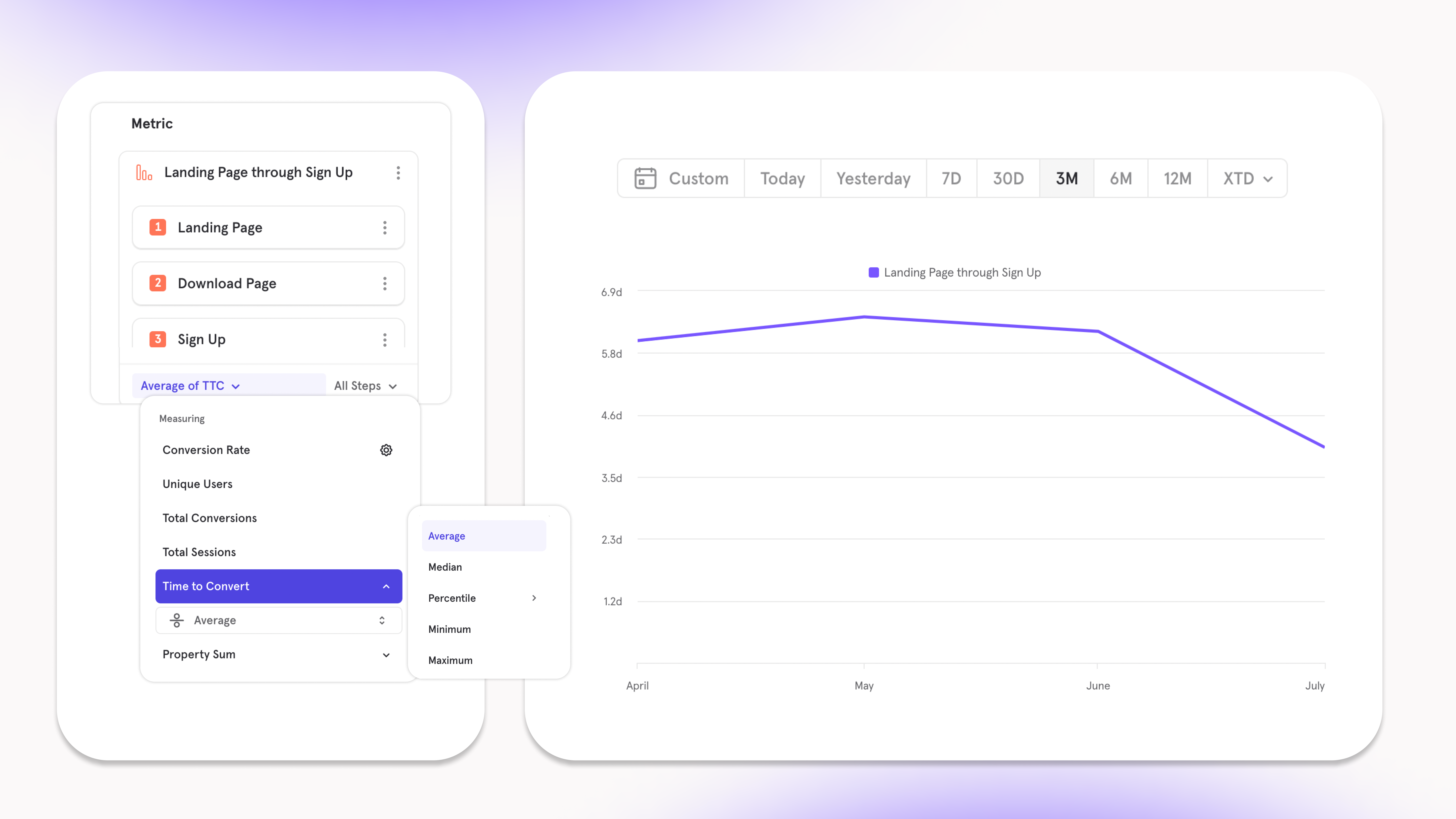
- How many users converted through our signup funnel based on how quickly they went from step 3 (Upload Media) to step 4 (Invite Friends)?
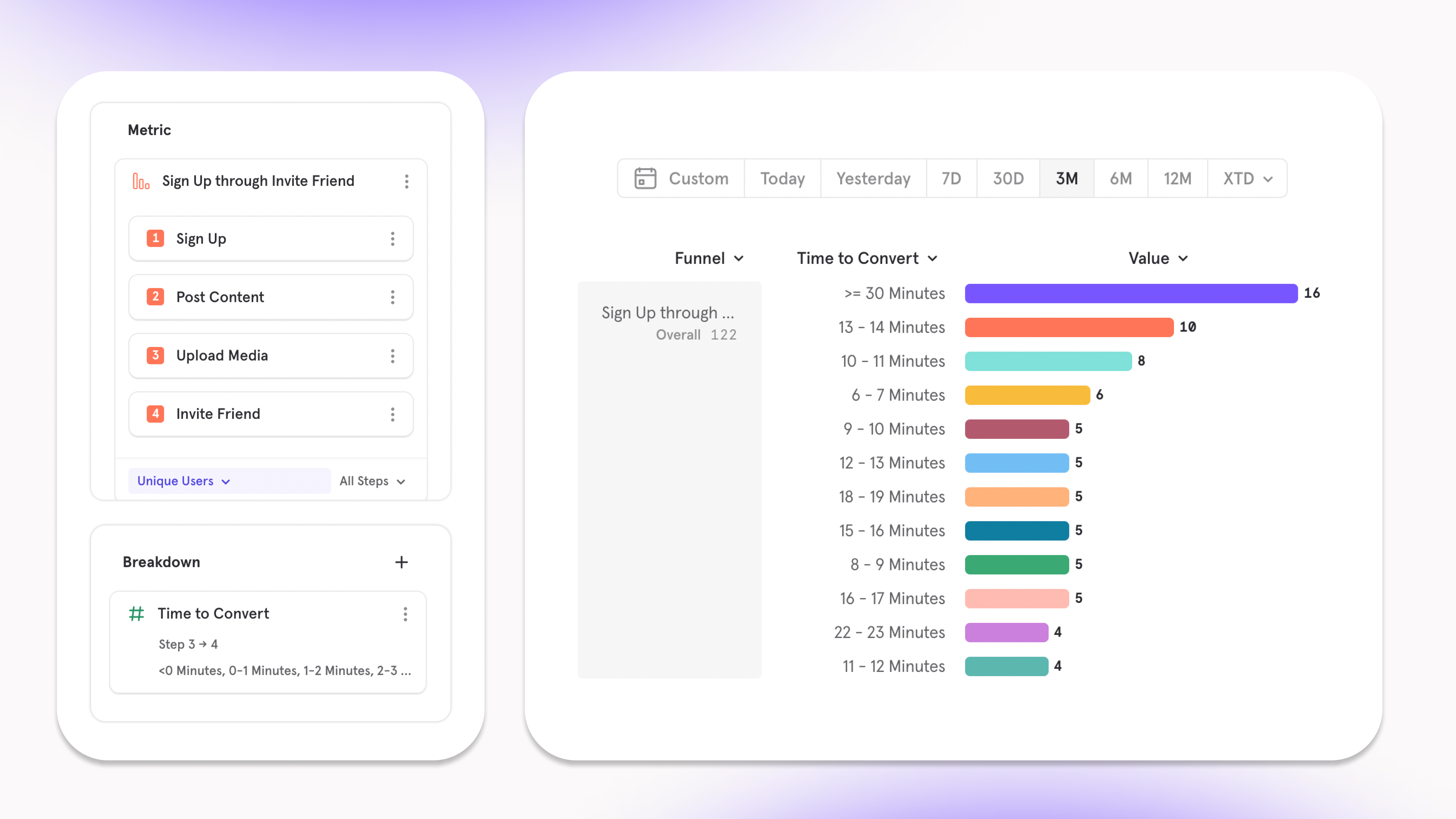
- Do prospects purchase faster when their time to convert from viewing a product to adding it to cart is quick?
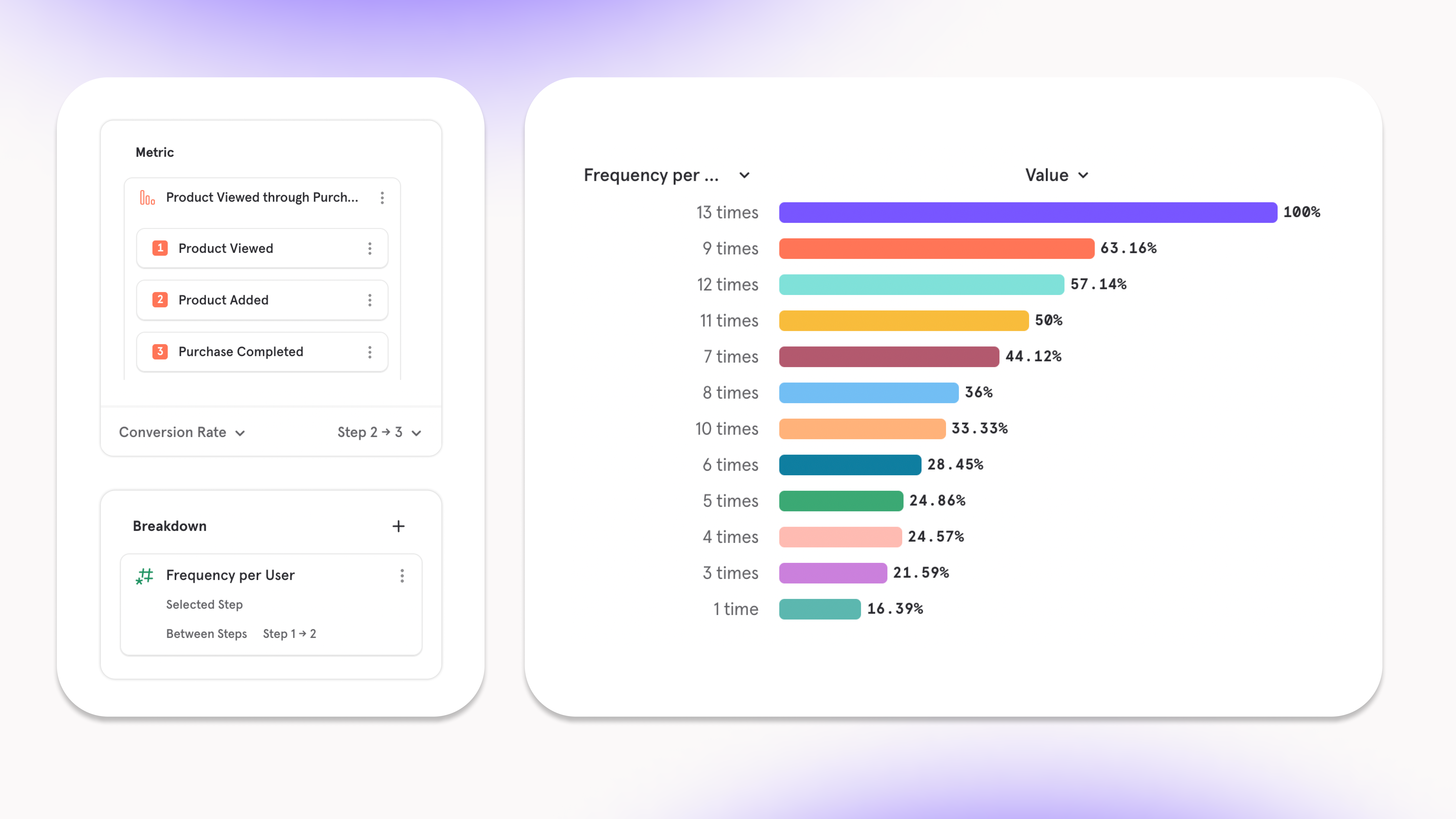
Segment users by their behaviors in Funnels
Link to DemoNow in Funnels, we’ve made it possible to breakdown users by what they do, not just who they are. This unlocks the ability to find the actions you can influence that will increase the likelihood of users converting through a funnel or completing a specific step.The core functionality of Behavioral Properties in Funnels is as follows:- You can analyze how often one step of a funnel was done and how that contributes to overall conversion:
- Insight: users who watch more videos subscribe to channels at a faster rate.
- Result: when a user finishes a video, autoplay another similar video in an attempt to keep them watching more.
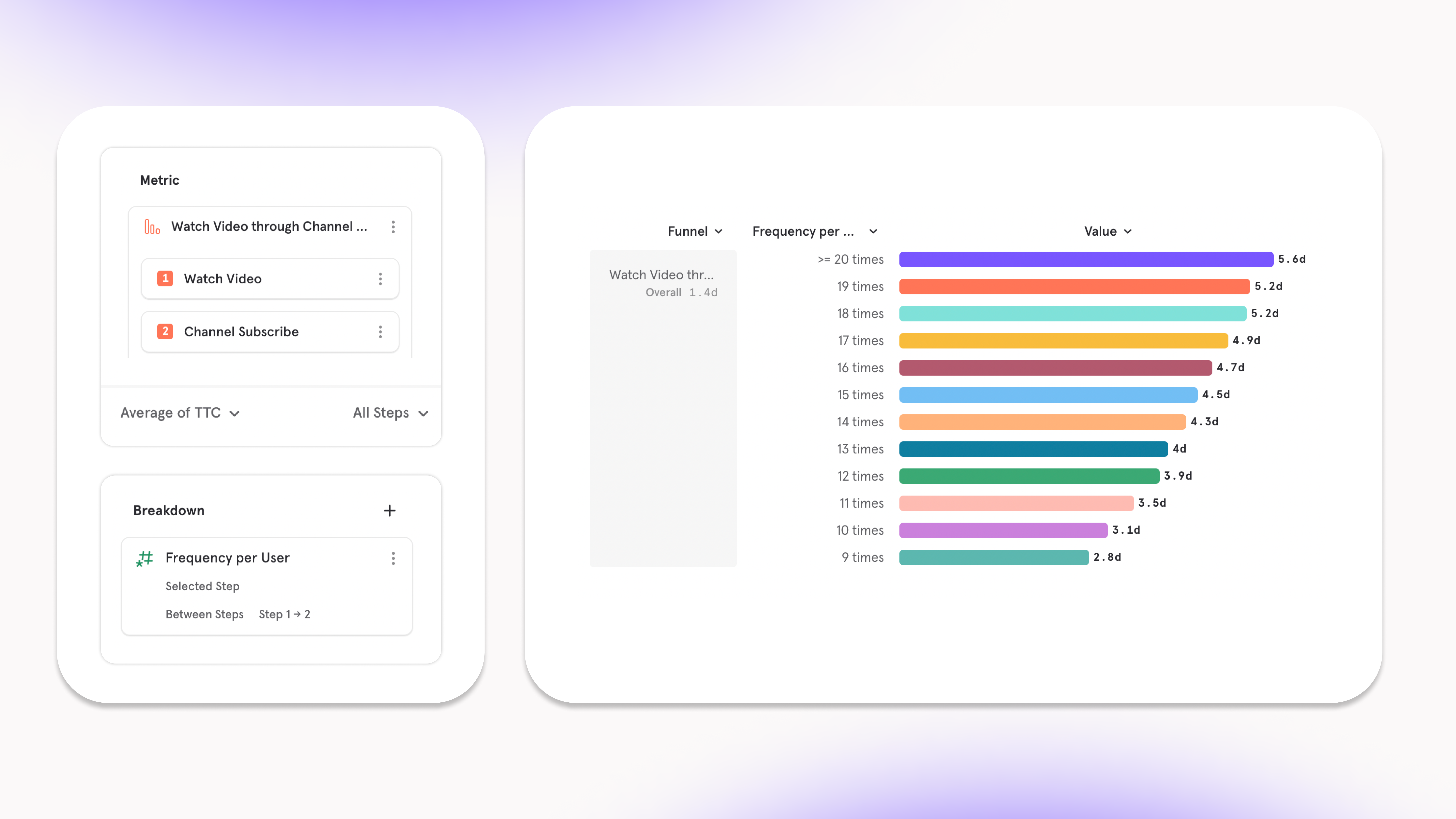
- It’s also possible to learn how actions outside of your funnel influence overall conversion or certain steps. We’ve built this workflow so that you don’t have to put arbitrary steps into your funnel:
- Insight: for the users who completed the signup funnel, most of them read help docs over 10 times before doing so.
- Result: make help docs more apparent at the beginning of the funnel.
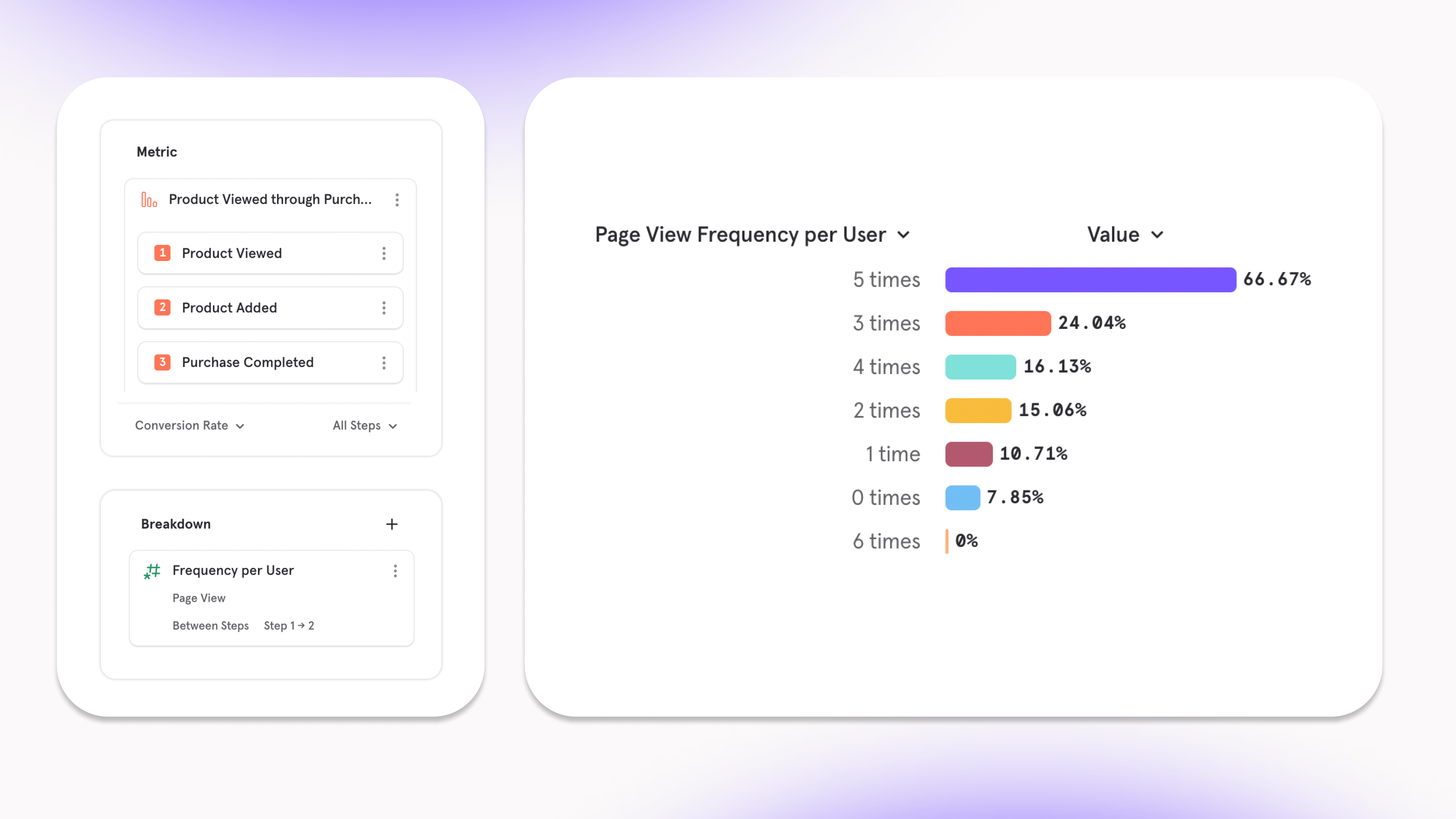
- The other unique functionality to Funnels Behavioral Properties is the ability to decouple the breakdown step from the metric step. This is useful to answer questions about whether the frequency of a step in a funnel influenced a different step:
- Insight: users ****who complete step 1 (product view) to step 2 (add to cart) more often have a higher rate of converting from step 2 (add to cart) to step 3 (purchase).
- Result: when a user adds an item to the cart, show them a pop up with other related items they might also want to add to cart.
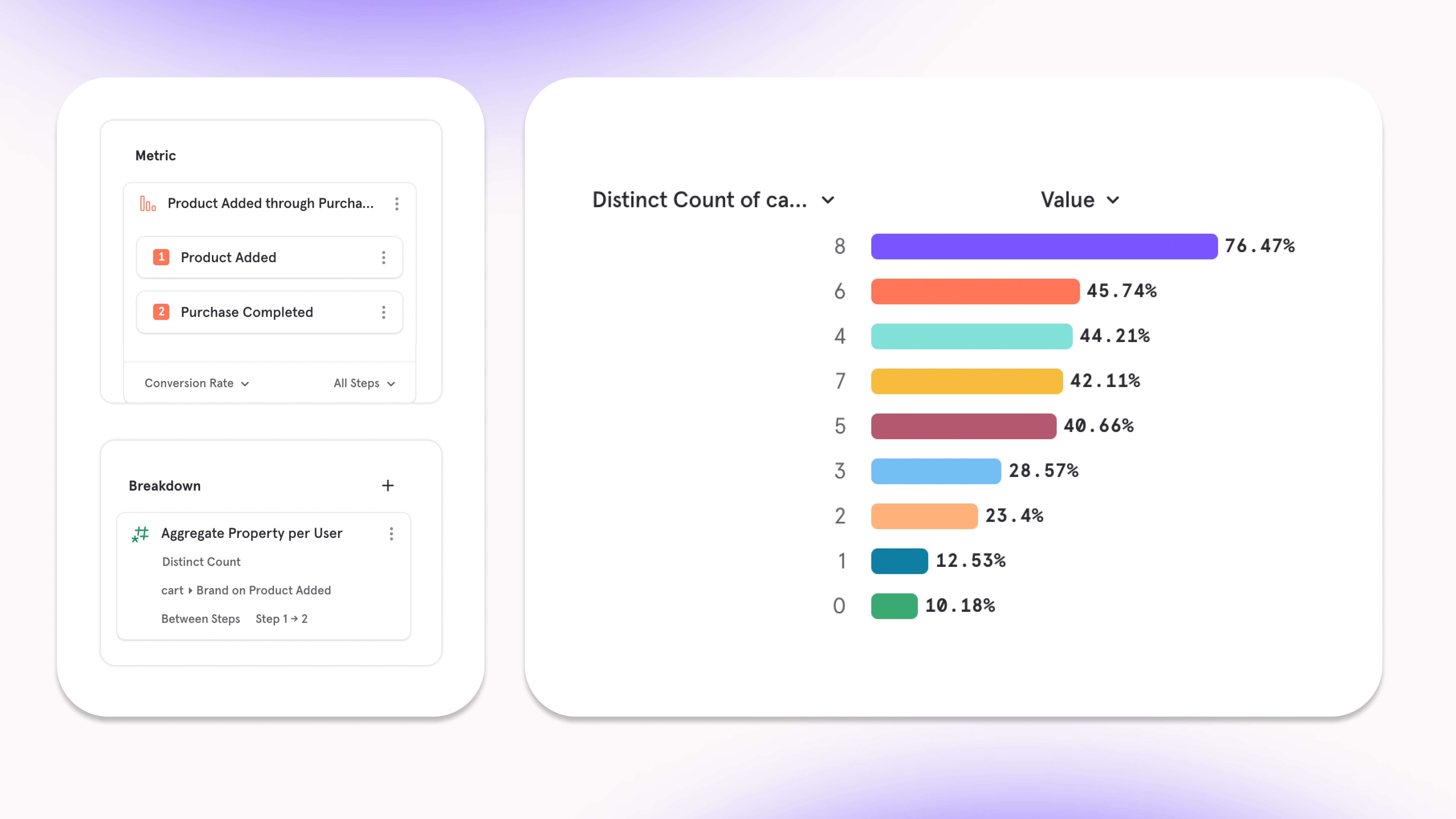
- Use the Aggregate Property per User breakdown to segment metrics by things like time, cost, or “variety”.
- Insight: Users who add a wider variety of brands to cart have a higher rate of purchase.
- Result: Create Black Friday landing page to have an assortment of goods rather than focused on one specific category.
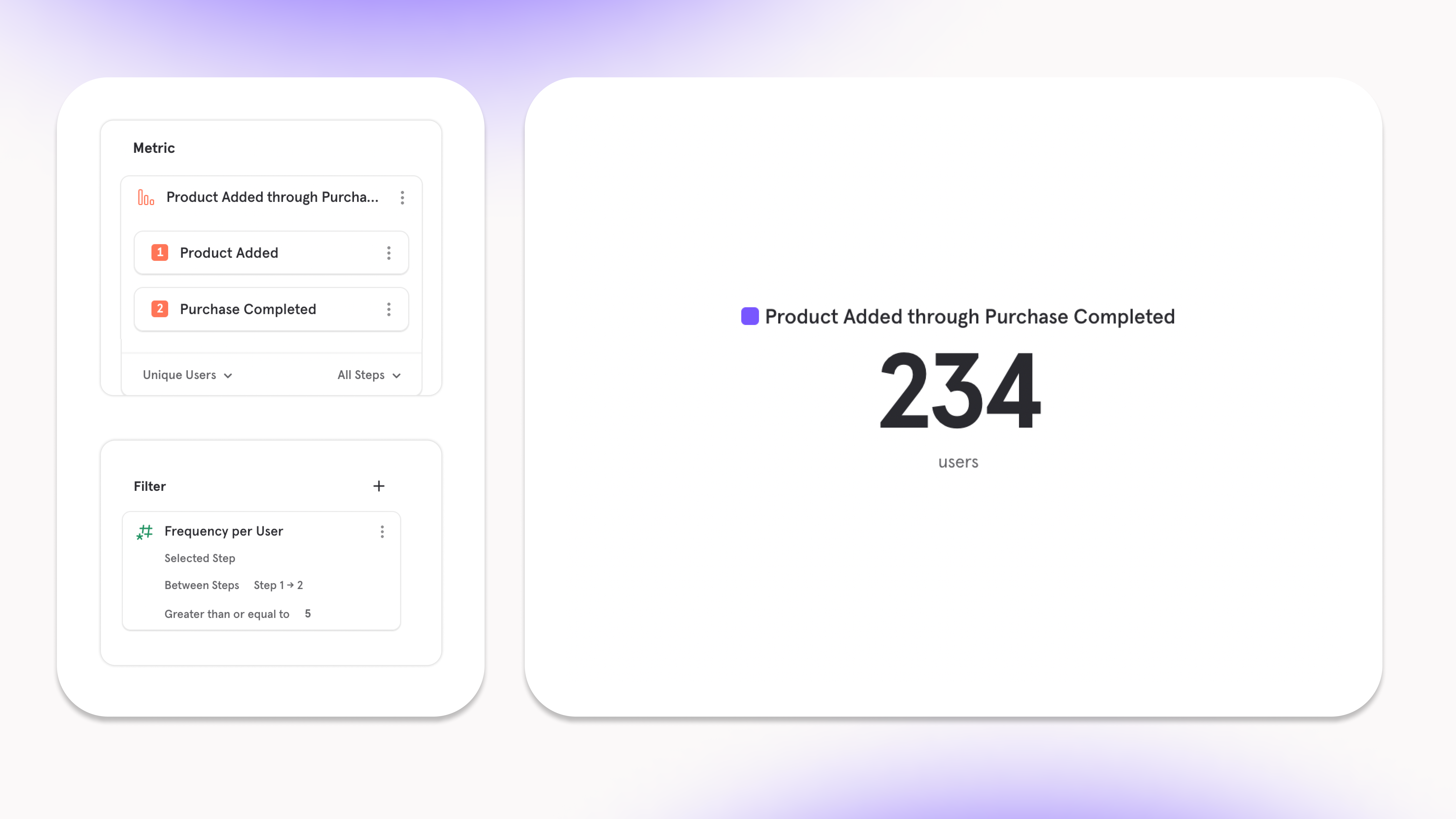
- Set a Behavioral Property as a filter to dig deep into a select group of users who are behaving a specific way in the funnel
- Metric: Users that added at least five items to their cart before purchasing.
- Result: Can grab their email and send them a note when there is an offer for another five items at a different date.
Get alerted when product experiences break
Link to DemoWe’ve expanded the amount of funnel metrics you can set an Alert on so you can have full coverage into knowing whether your product is running smoothly:- Conversion Rate
- Unique Converting Users
- Total Conversions
- Time to Convert
- Sum of a property
- The metrics above, but for specific step ranges in a funnel
Track your ad performance metrics in less than 10 minutes
Note: this is our latest offering for Mixpanel Marketing AnalyticsAd-performance metrics are key to help marketers adjust their marketing spend and create the most return on investment. On a daily basis, it’s important to measure ROAS, CPC, CPM and ad-spend — and now, Mixpanel has made it quick and easy to bring this data into Mixpanel.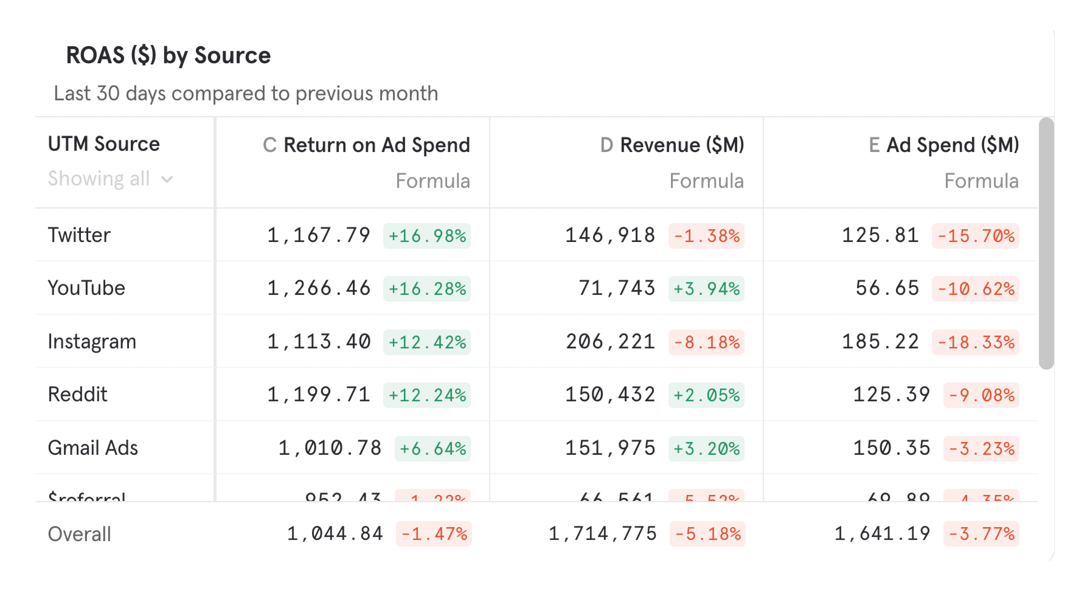
- The number of Ad platforms has grown, and marketers want to leverage these channels. Rarely do you advertise only on 2 platforms: Google and Meta.
- Warehouses have fast become the central location of housing all a company’s data. Considering this, ad-networks are making it easier to export ad performance data (spend, clicks, impressions) to the warehouse.
New Experience and Features in Funnels and Retention
Mixpanel’s funnels and retention reports are where you can see user behavior through a series of events. With our next set of changes, we are making funnels and retention reports more powerful, while making them easier to use and keeping our controls in a place consistent with insights.You can try the new funnels and retention experience in our demo projects, here.Funnels Report Changes
New Funnels Report WalkthroughHere is a quick summary of changes:- Funnels is getting revamped so that your funnel definition as well as the way you measure your funnel will be displayed in the query builder at all times.
- You can explicitly define which steps of the funnel you are interested in.
- More chart types are available across all different funnel metric measurements.
- Time to Convert is available as a measurement, if you are looking to see a trend or summary of your conversion times.
- Time to Convert is available as a breakdown, if you are interested in seeing something like a distribution of conversions, by their conversion time.
- Frequency per User is available as a breakdown.
Retention Report Changes
New Retention Report WalkthroughHere is a quick summary of changes:- Retention is getting updated so that your retention behavior definition as well as the way you measure your retention behavior will be displayed in the query builder at all times.
- You can explicitly define which retention group you are interested in.
New Analysis Capabilities
Build and Visualize More Metrics, Faster
Funnels and Retention Reports: Build and Visualize Metrics FasterInsights, Funnels and Retention now all follow the same structure. In the query builder on the left, you can define the behavior you want to measure, as well as the way to measure it. Each query builder now has its own self contained definition of a metric. We’ll be leveraging this concept more in the future. More chart types are available across funnels and retention, allowing you to visualize funnel and retention metrics in more way than before.See Revenue Drop off in Funnels
Revenue Funnel Drop-off for E-commerce CompaniesFor e-commerce companies, the most important thing is their sales funnel. Seeing how many users convert is great, but the real end goal is seeing how many dollars converted. With revenue drop off, you can now see the revenue at each stage in the funnel, and not just the users. This helps identify which steps are seeing the most lost dollars and which segments are performing or not.More Time to Convert Options
New Funnels Time to Convert Analysis CapabilitiesSee how your funnels are performing beyond just average time to convert over time, and median time to convert as a bar chart. We have added the ability to see median, average, P25, P75, P90, P99, min and max time to convert, using any visualization you’d like.You also have more power in Time to Convert breakdowns. You can choose the step range you would like the breakdown to apply to, while using a different step range for your measurement. This can allow you to see if converting quick on step 1 → 2 leads to higher conversion overall, and draw more insights from time to convert.Alerts of Funnel Metrics
Link to DemoAlerts are much more powerful in funnels now. Instead of only being able to alert on conversion rate, you can now alert on any funnel metric, such as time to convert, or the number of conversions. You also get the power of anomaly detection, if you’d like us to detect when there’s something strange happening.Behavioral Properties in Funnels
New Funnels Alerts FeaturesYou are no longer limited to only seeing the number of times a certain step was performed in a funnel. You can now choose any event, and see how that influences your funnel. This is especially useful if you have a set funnel definition, and you’re interested in how non-core actions might affect your conversion rate. You no longer have to add and remove steps in between your funnel to see how different events affect your funnel.You can also see how the properties of events done between funnel steps affects funnel conversion. For example, you can see how many different categories of items were viewed in a purchase funnel, which may be more telling than a raw count of items viewed.See more about Frequency Per User in Funnels.Behavioral Properties in Retention
New Funnels Alerts FeaturesHave you wondered if doing certain actions affect retention? With the new Frequency per User and Aggregate Property per User options available in breakdowns, you can summarize user activity and see how it affects retention. Mixpanel will summarize activity after the starting event, whether it is a count of events, or a summary of properties on those events. You can answer questions like: how many song plays does it take after sign up before my retention is 50%? Being able to analyze what actions correlate with retention will give you new insight on how to improve your product.Be notified of major shifts in data volume
Link to DemoOur new governance setting makes it easier to get ahead of data issues in your overall Mixpanel project. With data volume monitoring, you can be notified via Slack or email whenever any tracked event unexpectedly spikes or drops in volume.Instead of getting asked about suspicious data, you can jump in and resolve issues before anyone notices or loses trust.This setting is available for all organizations on an enterprise plan. For more information, check out our docs.Event Approval now supports new property detection
Event Approval now supports notifications for new properties on existing events, in addition to notifications for newly tracked events. You can turn on new property detection in project settings. For more information, check out our docs. Available for all enterprise plans today.Easier to use Event & Property Menus
Link to DemoThe Events Menu and Properties Menu is where you find the events and properties needed to craft your metrics, charts, or graphs. Mixpanel users spend a lot of time searching within these menus to find the right building blocks, so, we’ve made some adjustments to make the experience simpler and get you to value faster.Event Menu
An important feature we have available to organize your events is Tagging. In our old experience, it wasn’t clear as to where to find Tagged events. Now, Tags are easily discoverable on the left side of the menu. You can leverage Tagging to hone in on a set of behaviors you’re interested in analyzing (setup, mobile, payment, etc) and quickly find the events related to those behaviors.
Property Menu
Similar to tagging, we’ve categorized all of your properties on the left side of the Properties menu based on what they’re related to. For example, if you want to filter your metric by a property that’s on a user, you can simply click the User category and find all the related properties. A category you might not be familiar with is Computed - these will create a calculation of any property to frame your analysis in a unique way. The Computed Properties we have available today are:- Frequency per User: understand how often users did an action and correlate it to another action
- Aggregate Property per User: understand the value of an action and correlating it to another action
- Attributed by: understand which touchpoints in a user journey impacted conversion
- Duration: find the time spent between two continuous events, like Page View
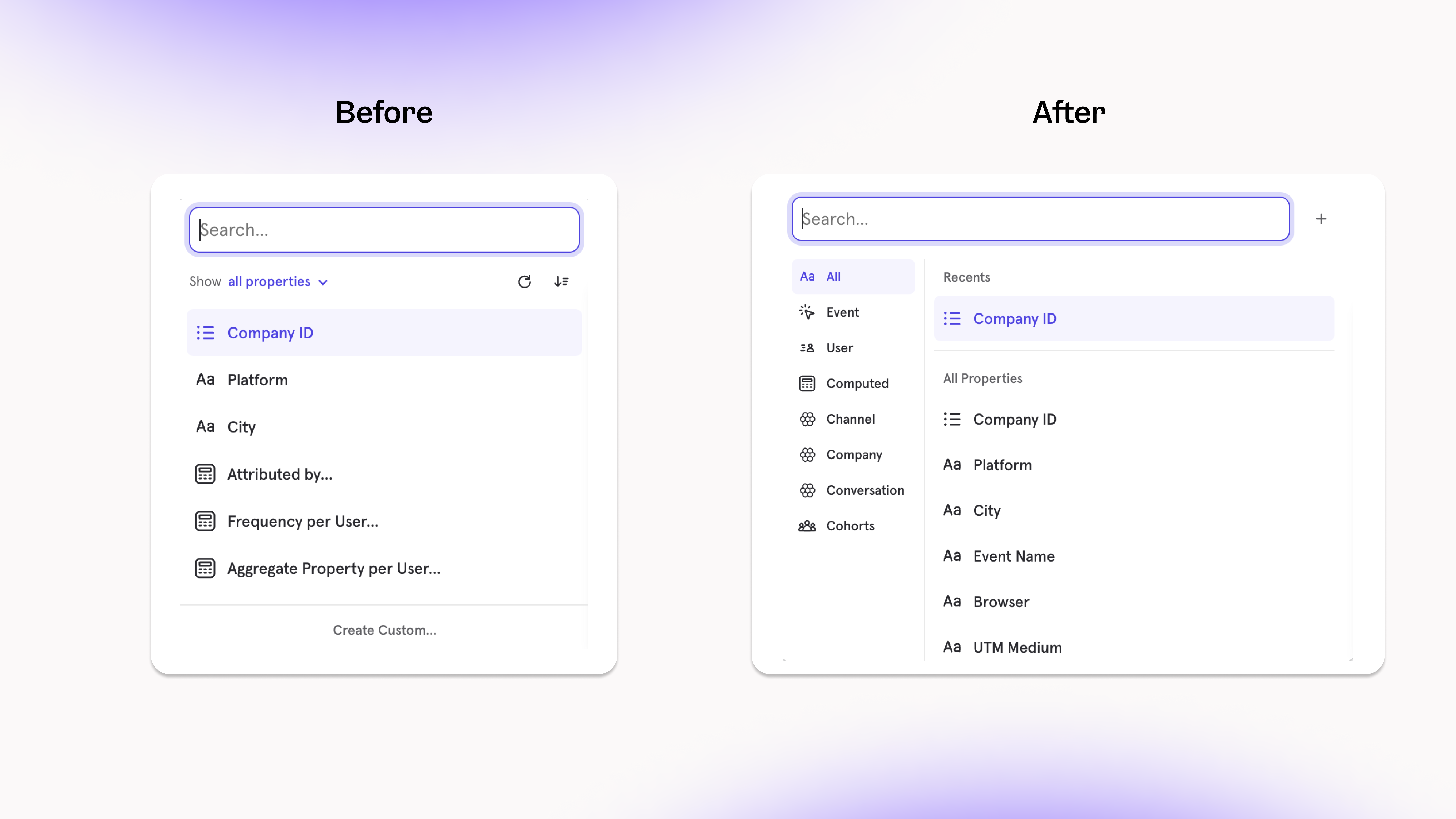
Find the right data more easily with Event Context
Link to DemoYou can now see rich context about an event, such as an image of the event, frequent users, reports that query it, or an owner for follow-up questions. With these contextual details, teams can build reports more quickly by trusting that they’re using the right event.Types of Event Context now available:- Embedded image of the event
- Teammates that recently queried the event
- Other reports that query the event
- Event Owner, who you can contact for follow-up questions
Track your Web Analytics on one Board
Link to DemoOur new Web Analytics Template gets you up and running with all your core website performance metrics in just a few seconds. You’ll be able to make informed decisions about what to highlight, improve, or remove from your site to build a more engaging & relevant user experience.Simply select your Page View event and Page Title property (note: these are automatically tracked if you implemented Mixpanel with the Javascript SDK) and you’ll get everything you need:- User Metrics: understand more about the users that visit your website (how many new users, how many returning users, where are they from, and more)
- Session Metrics: track all the key session metrics (session start/end, bounce rate, average session duration, what source did they come from, and more)
- Page Metrics: find which pages provide the most valuable and engaging content to users (page exits, average page views per user, and more)
Measure how long users view webpages
Link to DemoTracking the number of views your website pages get is a useful way to learn if users have landed on your page. But, it doesn’t tell the complete story of whether these users got value from their visit:- Your blog might have 100s of views, but how do you know if users are actually reading all the content?
- Users are reaching your signup page, but are they moving through that experience quickly or getting stuck?
- Two different pages are getting similar views, but one is converting more sales than the other - are users finding content more engaging on that page?
- What blog content are our users finding the most engaging? (find the average time spent on blog pages)
- Which pages are users not finding any value from? (find the pages that have an average visit time of less than 10 seconds)
Manage channel definitions with Channel Classifier
Link to DemoBreaking down your analysis by Channels is a useful way to answer key questions like:- which channels drive most of the traffic towards our website?
- which channels send users that are more likely to make a purchase?
- Add a new Breakdown and select “Create Custom”
- Select “Insert Example” in the next menu, and choose “Channel Classifier”
- Make any edits you need to channel definitions, change the title to “Channels”, and click save
Save Formulas for reuse and metric standardization
Link to DemoSometimes your analysis calls for a calculated metric, meaning a metric that’s computed from existing metrics or data. An example would be Bounce Rate (Total Sessions less than 10s / Total Session Starts), where we are trying to calculate the percent of site visitors who left without reaching any value. In analytics tools, a typical workflow is to use a “formula” to create a metric like Bounce Rate, but there are some issues with that route:- Every time you need to calculate Bounce Rate in a new report, you have to create a formula from scratch
- Other people in your organization don’t know how to define Bounce Rate, so they will figure out their own definition that might not fit the context of your business
- There’s no way for the person in your organization that manages the analytics tool to set a standardized Bounce Rate metric that everyone can trust is accurate
Databricks now supported with Warehouse Connectors
Link to DemoToday, all customers can leverage Warehouse Connectors to import data via Databricks, in addition to Snowflake, BigQuery, and Redshift. You can set up recurring syncs from Databricks and ensure that Mixpanel is always in sync with your trusted data. You can import event, User, Group profile, and lookup table data.Navigate to Project Settings > Warehouse Sources to get started today. For more information, check out our docs on Warehouse Connectors.Lookup Tables Import now supported with Warehouse Connectors
Today, all customers can use Warehouse Connectors to import Lookup Tables from their warehouse. For a list of supported warehouses, check out this list. This capability allows you to periodically enrich Mixpanel with data from your source-of-truth.For more information, check out our docs.Count a Unique user towards one segment
In the past, when breaking down an event counted by Uniques, you often came across this question: why is the sum of users in segments not equating the the overall uniques? In the below example, unique users is 1760, but sum of users in segments Chrome + Firefox + all others = 1900. Why don’t these numbers match?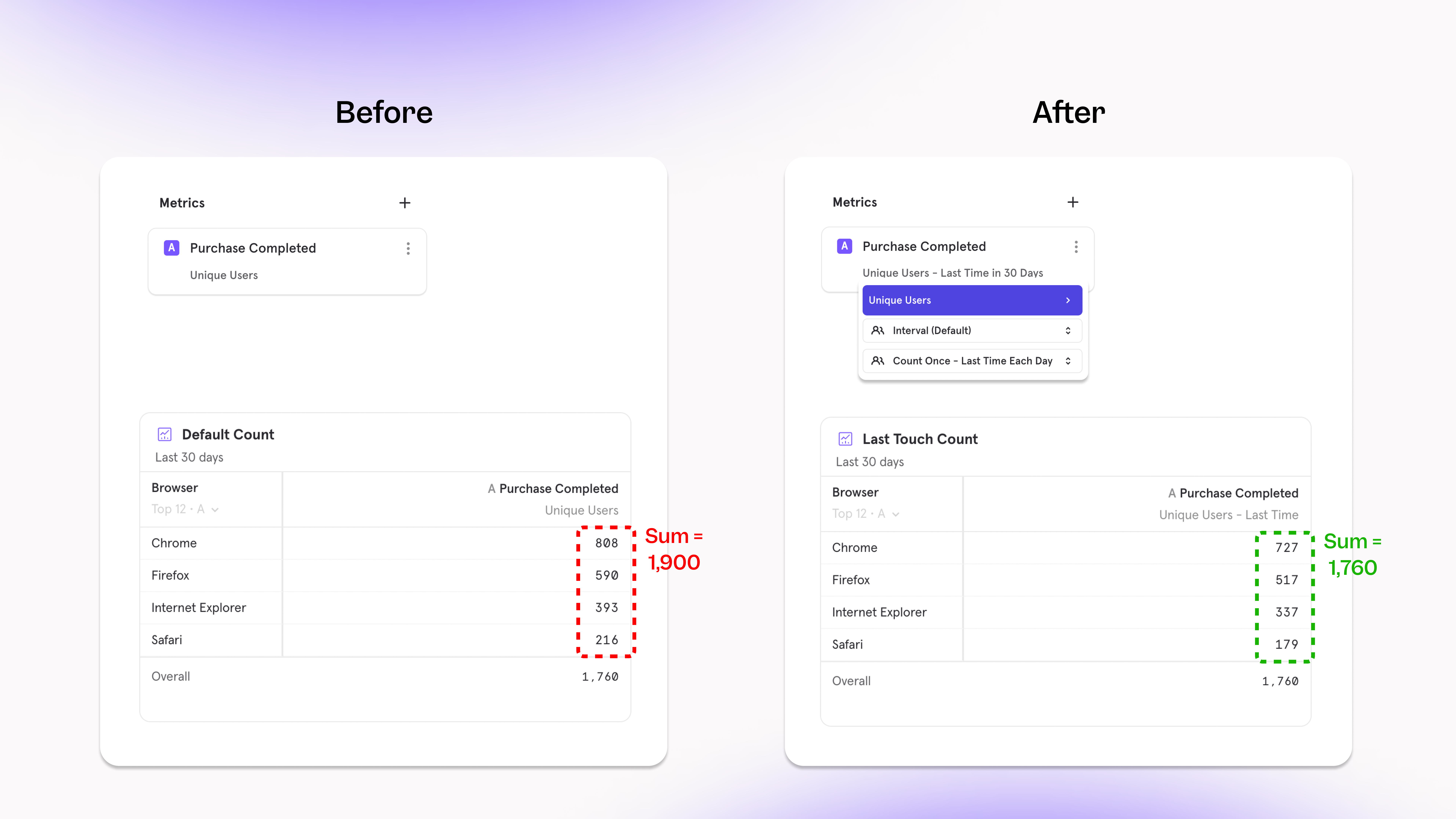
- If you are looking to answer questions focused on the segment - how many users watched Taylor Swift’s Movie or watched Squid Game, you want to count a user across every video they have watched. Choosing the count “per segment” option here
- If you want to understand the “last value of” - what was the last item that my users purchased in the past seven days? You would select the “last time” option within Uniques to answer this question.
- If you are looking to answer how your users are distributed across segments - I have 2000 users, how are they distributed across video category? Also, I’d like to consider their last watched category as their most recent preference to target them? Choose the count “last time” option here
Iterate on existing reports faster than ever with a new workflow
ßLink to DemoOur new report iteration workflow makes it easier to explore existing reports and save new iterations, through simplified duplication, clearer permissions, and better auto-naming. It’s now faster to build on existing work or go down exploratory deep-dives without losing your flow.An example streamlined workflow:- On an existing Board, you see a purchase conversion funnel filtered for United States in the last 60 days, and broken down by age group.
- You want to examine what the funnel looks like when broken down by city instead of age group.
- After changing the breakdown, the results look significant to track, so in 1 click you can save this iteration as a new saved report.
- On the original Board, the new report iteration is automatically added to the bottom of the Board.
Redshift now supported with Warehouse Connectors
Link to DemoToday, all customers can leverage Warehouse Connectors to import data via Redshift, in addition to Snowflake and BigQuery. You can set up recurring syncs from Redshift and ensure that Mixpanel is always in sync with your trusted data. You can import event, User, and Group profile data.Navigate to Project Settings > Warehouse Sources to get started today. For more information, check out our docs on setting up Redshift.Plot Profile Metrics alongside other Metrics
Profiles have always been a powerful tool to slice & dice your user-base to learn key insights about where your users are from, what browser they’re using, or any other property. The new functionality we’ve added to Profiles allows for more depth of analysis - specifically, you can compare these metrics alongside other events in the same view.In the past, Mixpanel was switched into a different “mode” in order to access Profile Metrics. While in this mode, you weren’t able to add other events or cohorts to your visualization, and you could not plot a Profile Metric as a trend (ex. line chart).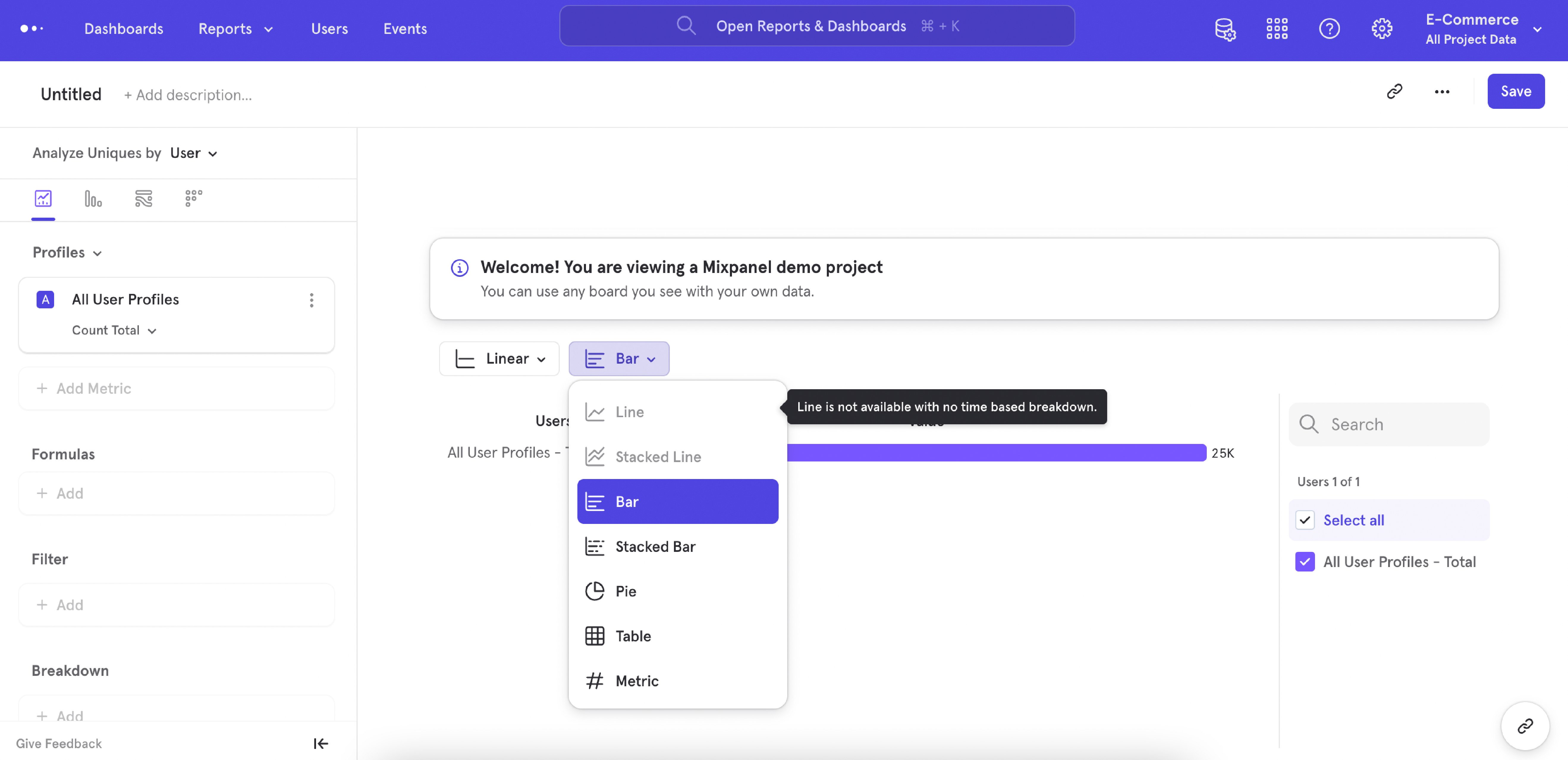
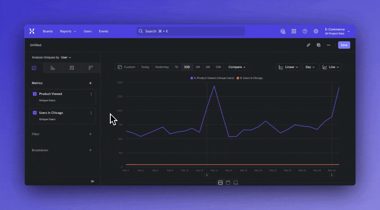
Workflow Improvements in Insights Report
Link to DemoRecently, we worked on improving upon some of the core workflows you could do in our Insights report. Some of these changes added metric building functionality that open up new analysis possibilities, and some of these changes refreshed existing workflows to help Mixpanel become simpler to use - all in all, we’ve working hard to polish our existing workflows and setup Mixpanel’s design for long term success.Improvements to the measurement menu- The default measurement has changed from Total Events to Unique Users
- Total Per User has been updated to Frequency Per User
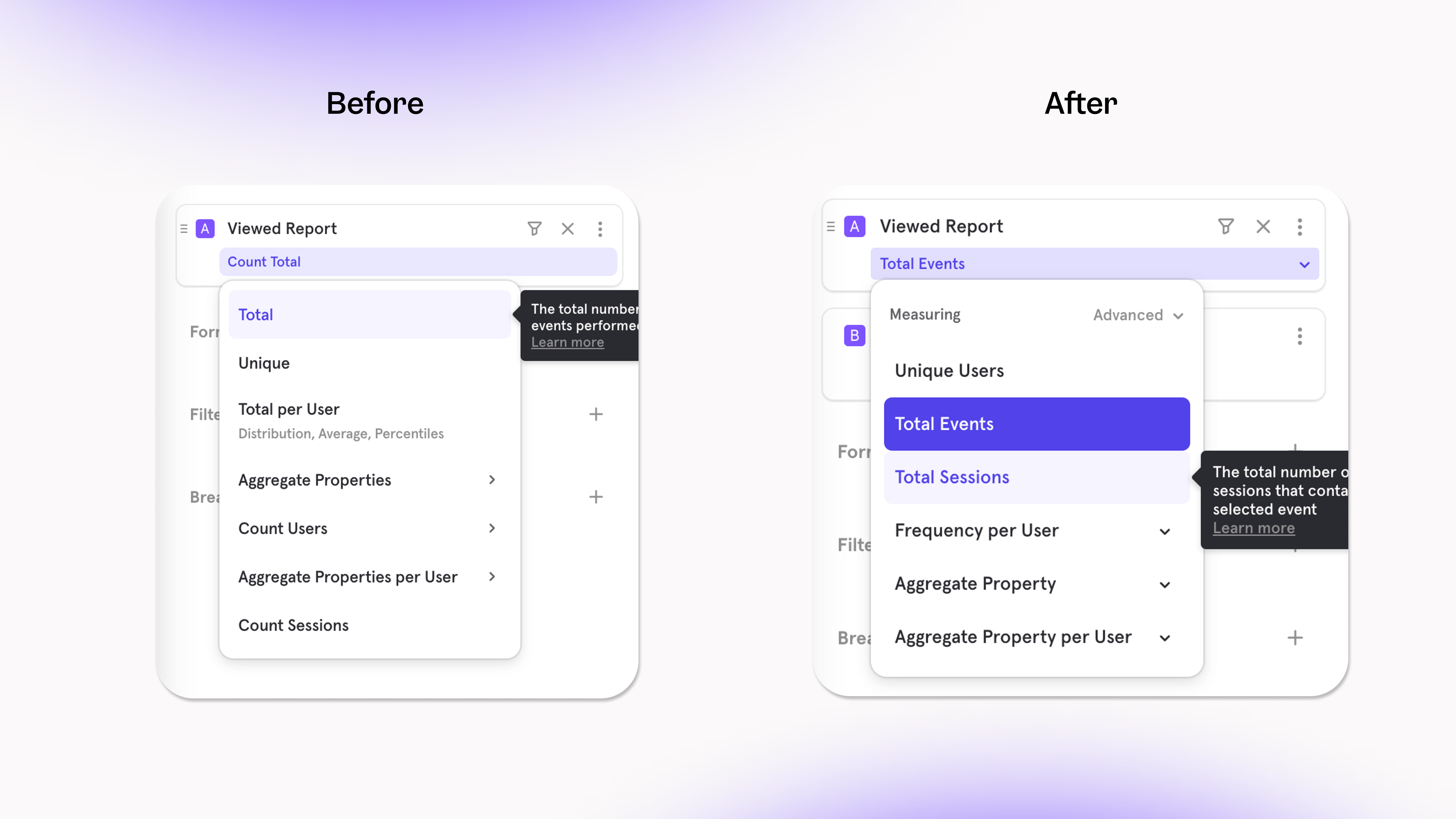
- DAU/WAU/MAU has moved under Unique Users (click on the “>” button)
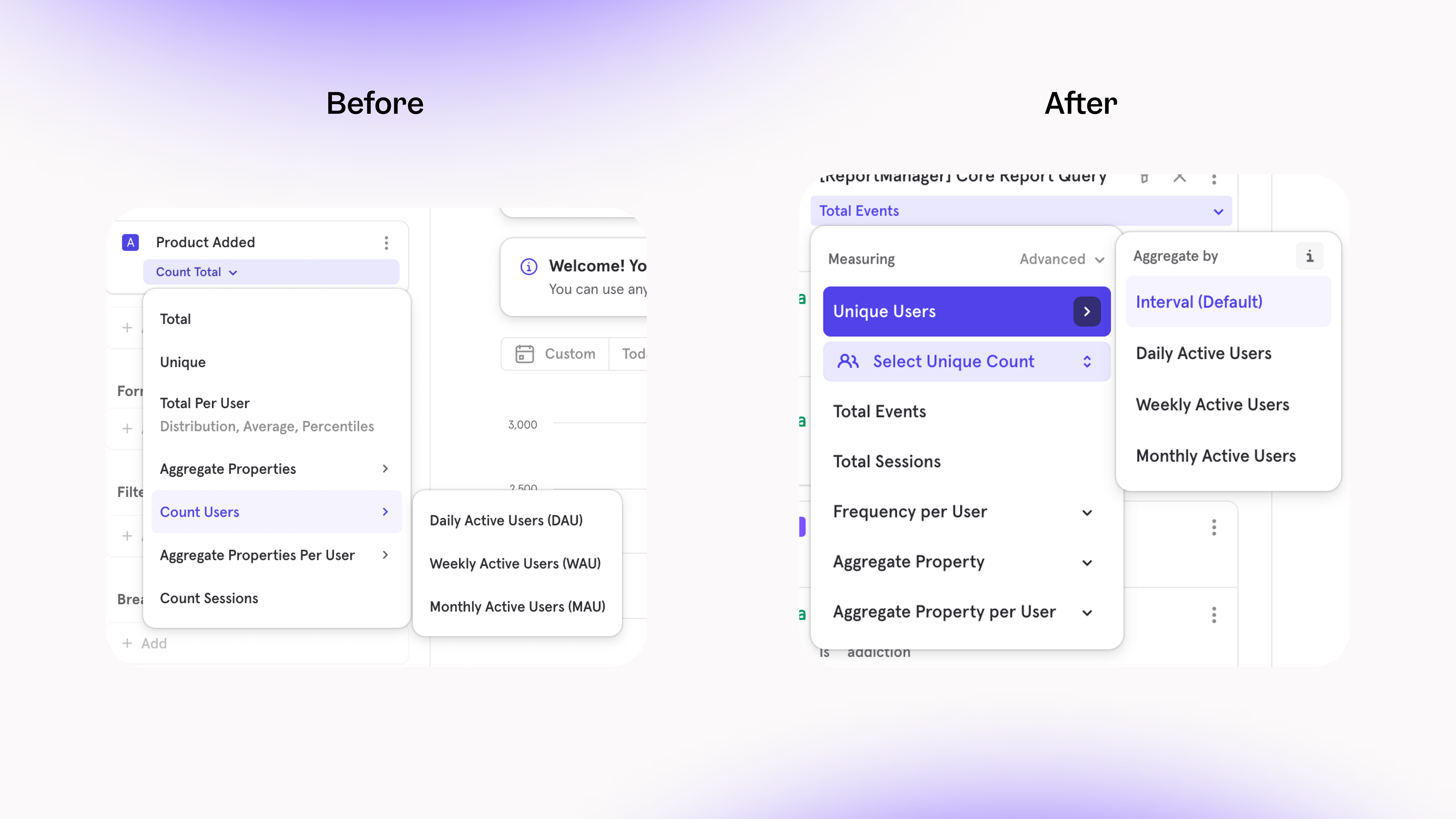
- Metrics can be measure to Rolling or Cumulative in the “Advanced” menu, which means it’s now possible to compare a rolling/cumulative metric with metrics using a different count
- You can also set a Formula to be Rolling or Cumulative
- This allows for comparisons that aren’t bottle necked by needing all metrics to be Rolling or Cumulative, for example, you can set a “target metric” in the same analysis as multiple cumulative metrics to visualize how long it will take for a trend to reach a goal.
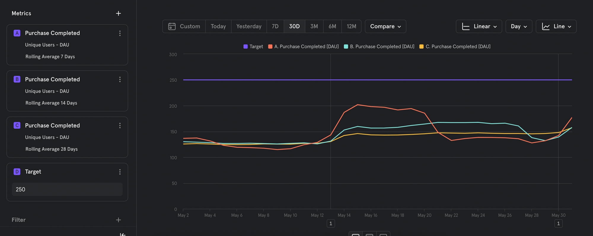
Focus on the right metrics with Hide/Unhide
It’s now possible to hide or unhide events from your visualization so you can focus on the metrics that matter.For example, when you have two events and one formula, your formula metric might be difficult to analyze since it’s a significantly smaller number than the other events. By hiding the other events, your visualization can scale appropriately to view the formula properly.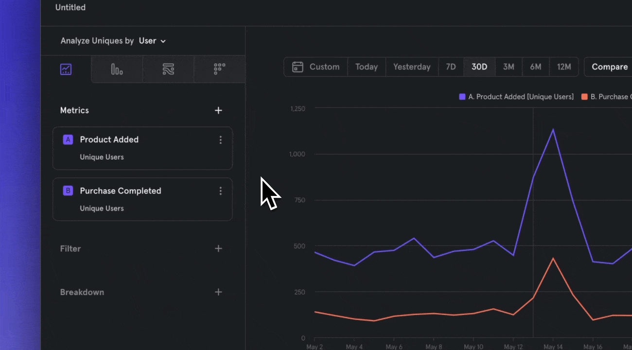
Formulas now behave as metrics
Formulas have forever been an integral part of Mixpanel to create new metrics (Bounce Rate, Conversion) from existing data — and now, we’ve improved the usability of Formulas to help you encounter less roadblocks and speed up your analysis workflow.In the past, Formulas behaved as their own entity in the query builder, and you had to create separate Formulas (A = Product Added, B = Purchase Completed) to resurface the original events in the visualization.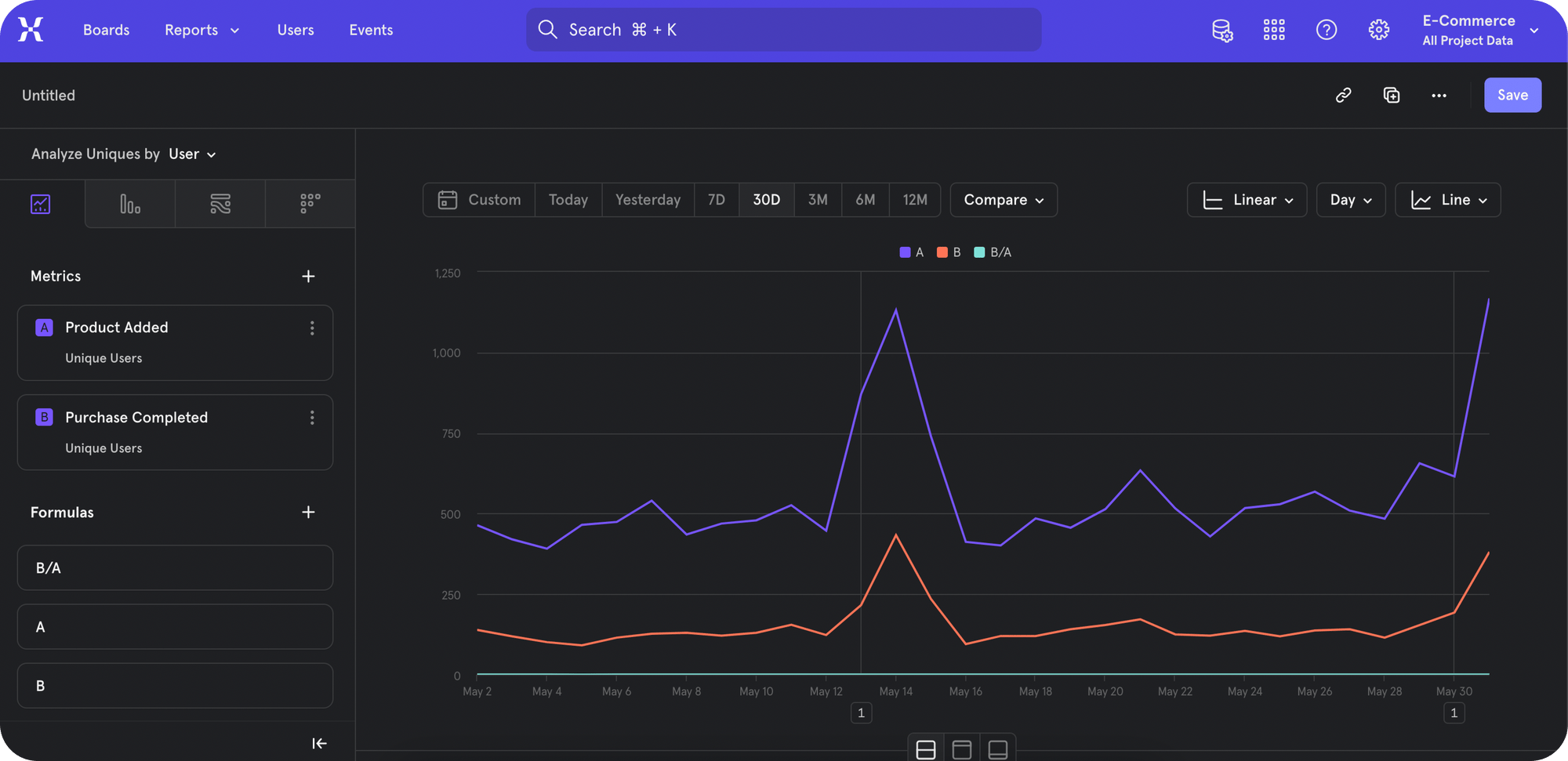
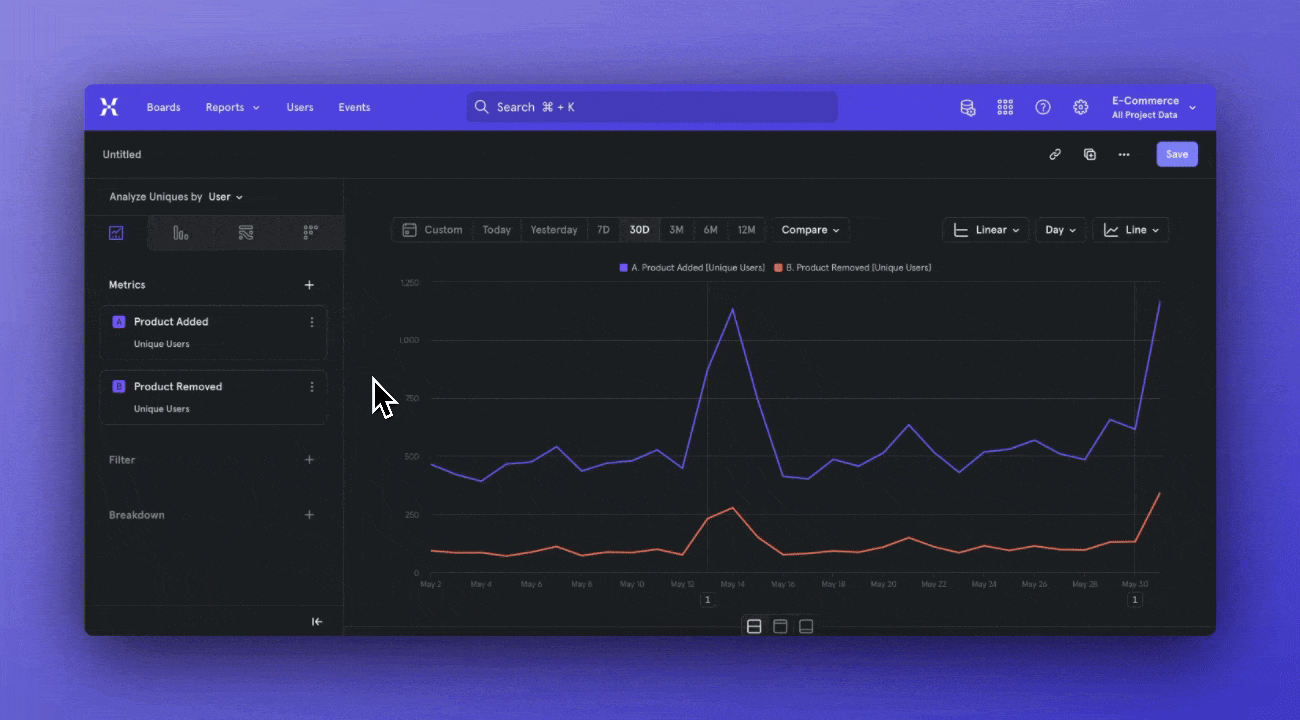
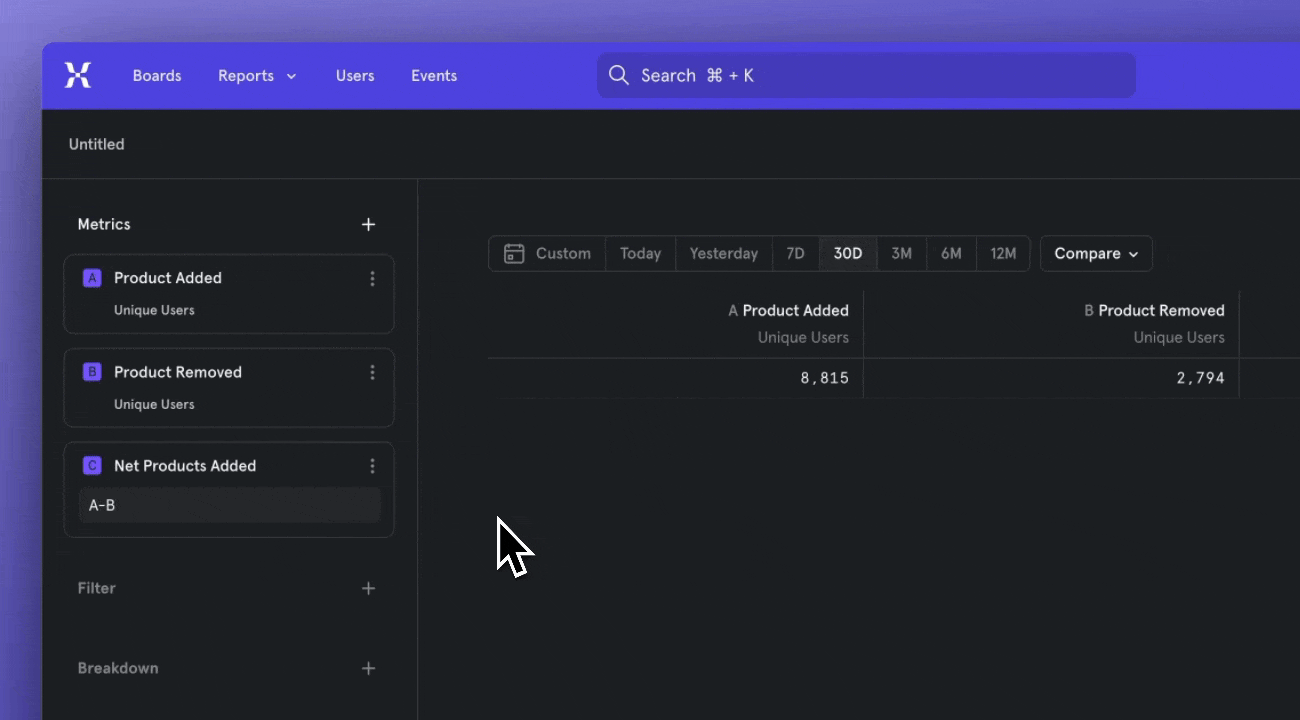
Finding a template is easier than ever
Templates are supposed to make your life easier, but we heard that figuring out how to access templates was confusing and difficult. So we’ve rolled out phase one of our plan to make finding templates easier, starting with when you click the New Board button.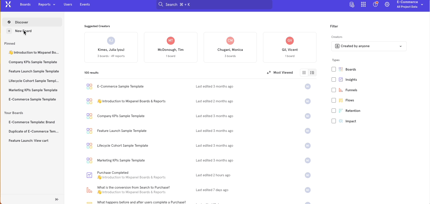
Automagically answer questions with Starter Board
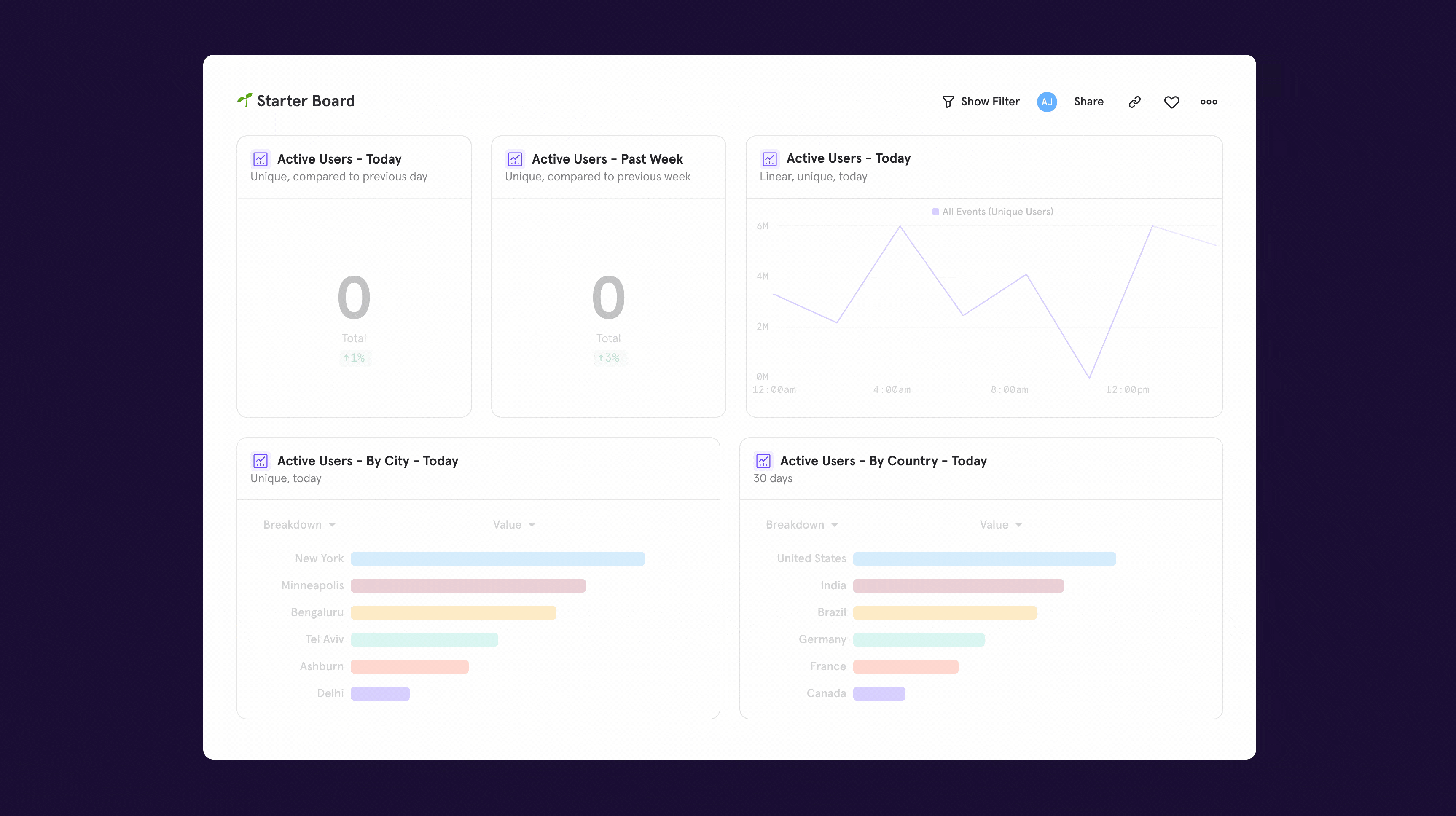
Warehouse Connectors now supports importing Users & Groups
You can now use Warehouse Connectors to import User and Group tables from your warehouse. With this capability, you can extend source-of-truth data about users and groups into Mixpanel for analysis.This importer leverages the same modal as the event importer so that there is one cohesive experience for event, user, and group data. We support importing user and group tables where properties are stored as columns or JSON objects. For more information, check out our docs.Manage implementations more easily with event metadata
Link to DemoOur latest data governance improvement makes it easier to investigate and fix data discrepancies, with peace of mind that you’re not disrupting your team’s workflows.You can now see event usage context in Lexicon, such as:- Who first queried an event?
- When was it first tracked?
- Which people queried it most recently? When?
Fluid, flexible organization with Boards on Boards
You can now nest Boards within other Boards for more flexible, contextual organization of your analyses.Boards on Boards allows you to customize your workspace in whatever way that best suits how your company works. Rigid folders or spaces don’t account for the fact that people at modern organizations collaborate across teams, projects, or topics. Spend less time figuring out organizational hierarchy, and more time sharing ideas.Some ideas for how you can nest Boards:- Product Focus Area Boards on General Product Team Board
- Feature Launch Boards on Enterprise Team Board
- Landing Page Deep-dive Board on Growth Team Board, on Company Board
Find what’s impacting conversion with Attribution
Your users will experience a multitude of touchpoints along their journey to a conversion moment like signup or purchase. But, how do you know which touchpoints are valuable - should you invest more budget in certain ads, or, are there certain banners on your website that get lots of clicks? With our long awaited Attribution feature, you can answer the million dollar question to make these critical decisions — which touchpoints contributed the most to conversion?Our multi-touch attribution models allow you to to assign fractional credit to each touchpoint in a user journey and find the highest performers. It’s also possible to compare how these models affect your conversion moment in one table.
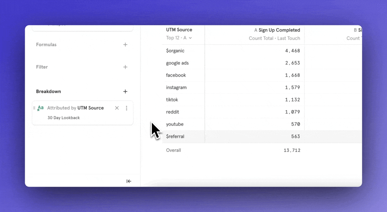
Introducing Warehouse Connectors: Sync event data from Snowflake & BigQuery
Link to DemoToday, all customers have access to Warehouse Connectors, which allows you to natively import data from Snowflake or BigQuery into Mixpanel. With this feature, you can set up recurring syncs from your data warehouse and ensure that Mixpanel is always in sync with your trusted data.This native connection not only simplifies event implementation by eliminating the need for engineering resources to manually track events, but it also makes analyzing all types of company data in Mixpanel easier, providing a holistic view of your customers.For example, you can bring into Mixpanel:- Application database tables: Signups, Reports Created, Dashboards Created
- Salesforce data: Opportunity Created, Account Created, Account Upsell
- Support data: Ticket Created, Ticket Resolved
- Billing/Consumption data: Invoice paid, subscription renewed
- Ad spend data: Click-through rate, cost per click, Google Ads spend
- Clickstream data from Snowplow: Views, clicks, etc.
- What is the % of sales opportunities do we win? What is the average deal size in North America?
- Which campaigns account for the most revenue? What is the breakdown of the ARR of customers that use this feature?
- What is our average time to resolve a ticket?
Troubleshoot better with a new design for Boards without data
We’re excited to announce that we have released a new design for Boards without data. Now when a report can’t populate, it will display one of two states: a faded out sample report or a “no data” status.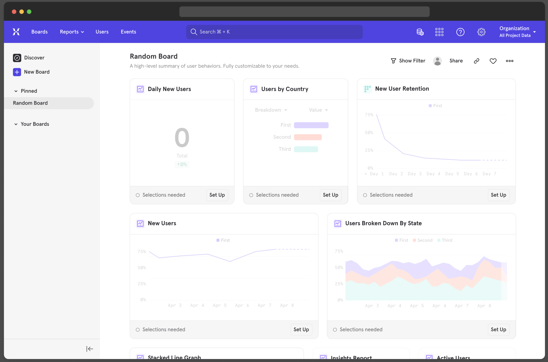
- Charts that show “no data” occur when an event has been tracked in the last 30 days, but a selected filter or date range result in no data for the report.
- If the report is configured with an event that hasn’t been tracked in past 30 days or has never existed, the faded sample report will appear.
- If you set up a report before this event starts being tracked, the report you create will show a faded out sample report like above.
- As data starts flowing, the report will populate as expected.
- If you set the date range on the report to a day where no one signed up for a subscription, the report will show “no data” because there were no subscription events tracked that day.
You can now move Boards between projects with Move
Introducing Move, a powerful new feature that allows you to move Boards from one project to another, or one organization to another. Simply hover over the menu icon in the top right corner and mouse over “Move to” to move a Board to a new project. This feature is available on all plan types at no additional charge. Permissions for this feature are managed by group admins, who have the ability to allow moving Boards between projects, or even organizations. It’s important to note that if you would like a version of the Board to stay in the parent project, duplicate it and move the new duplicate Board. Moving boards from projects based in the US -> EU as well as EU -> US is unavailable at this time.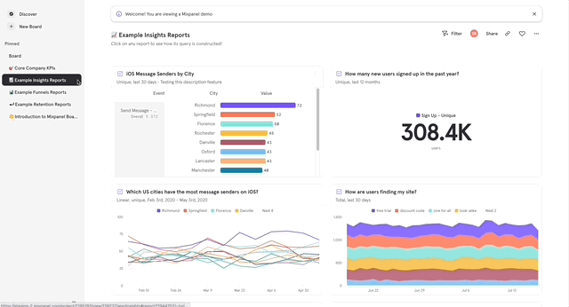
- An organization has Project A and Project B that support different products and teams within the organization.
- Team A has some fantastic Boards that have been well received by leadership and executives.
- Team B would like to replicate these reports without having to build them all from scratch.
Discover purchase behaviors with Cart Analysis
For ecommerce companies, understanding the purchase behavior of your users is vital when creating any revenue-driving strategy — whether that’s through website changes, marketing tactics, or product offerings. That’s why we built Cart Analysis to allow you to surface details about the items in your user’s cart (brand, category, price, etc) at different moments in their purchase journey (viewed product, added to cart, purchased). This is made possible by being able to look at any sub-property within a list of objects.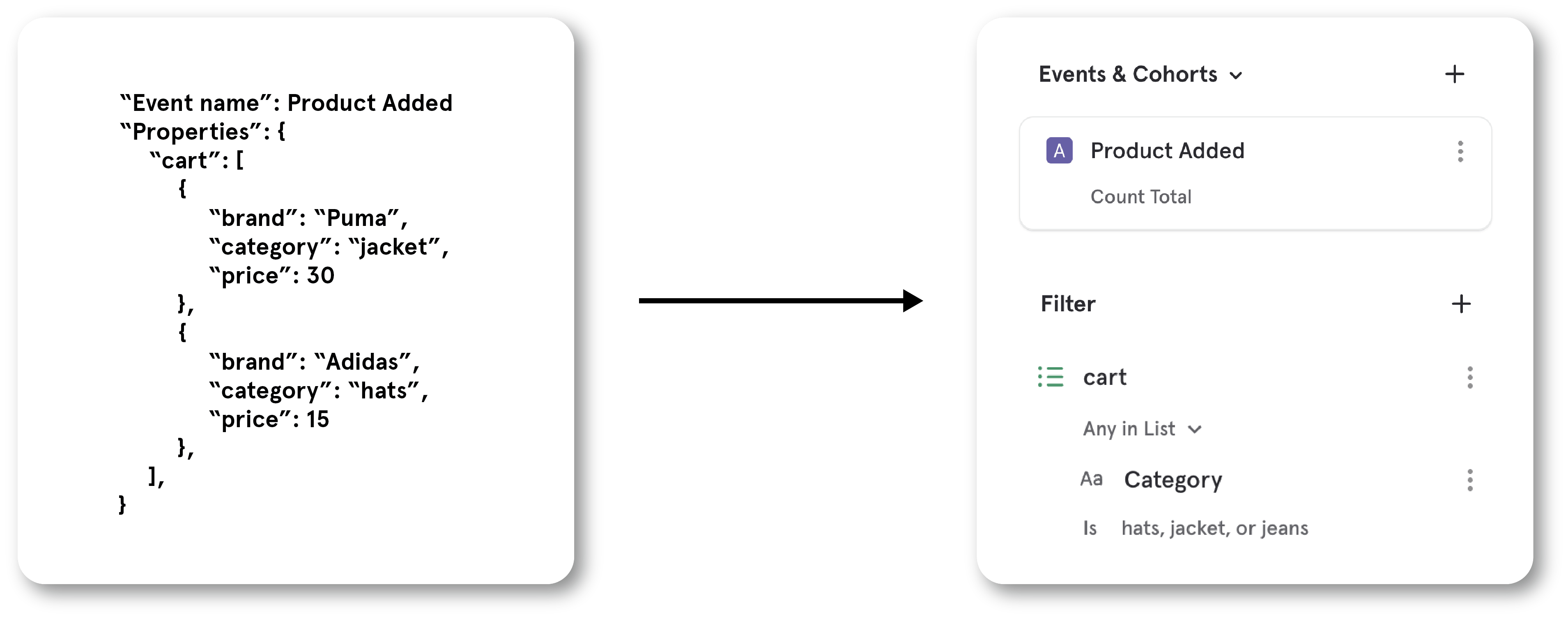

- Size: Buckets carts by the number of items they contain.
- Distinct Count: Count the number of carts that contain a specific brand or category.
Correlate user actions to key outcomes with Behavioral Breakdowns
Link to DemoActions speak louder than demographics, especially when it comes to finding what behaviors lead users to key outcomes.That’s why we built Behavioral Breakdowns — a new way to segment users by what they do, not just who they are. Now, you have the ability to measure the correlation between a user’s actions and their level of engagement, monetization, or other essential metrics.Here are a few examples of how you can leverage Behavioral Breakdowns to inform your approach in getting users to perform a key action:- When trying to get users to follow more accounts, you see that users who comment on 5 pieces of content within a week have a higher rate of following others. So, you make the comment button more accessible to decrease the friction it takes to comment.
- To get more users signed up for your credit card, you target your emails to users that spend, on average, over $100 every time they shop on your eCommerce store because that segment is more likely to apply for a credit card.
Learn how users engage with your marketing tactics
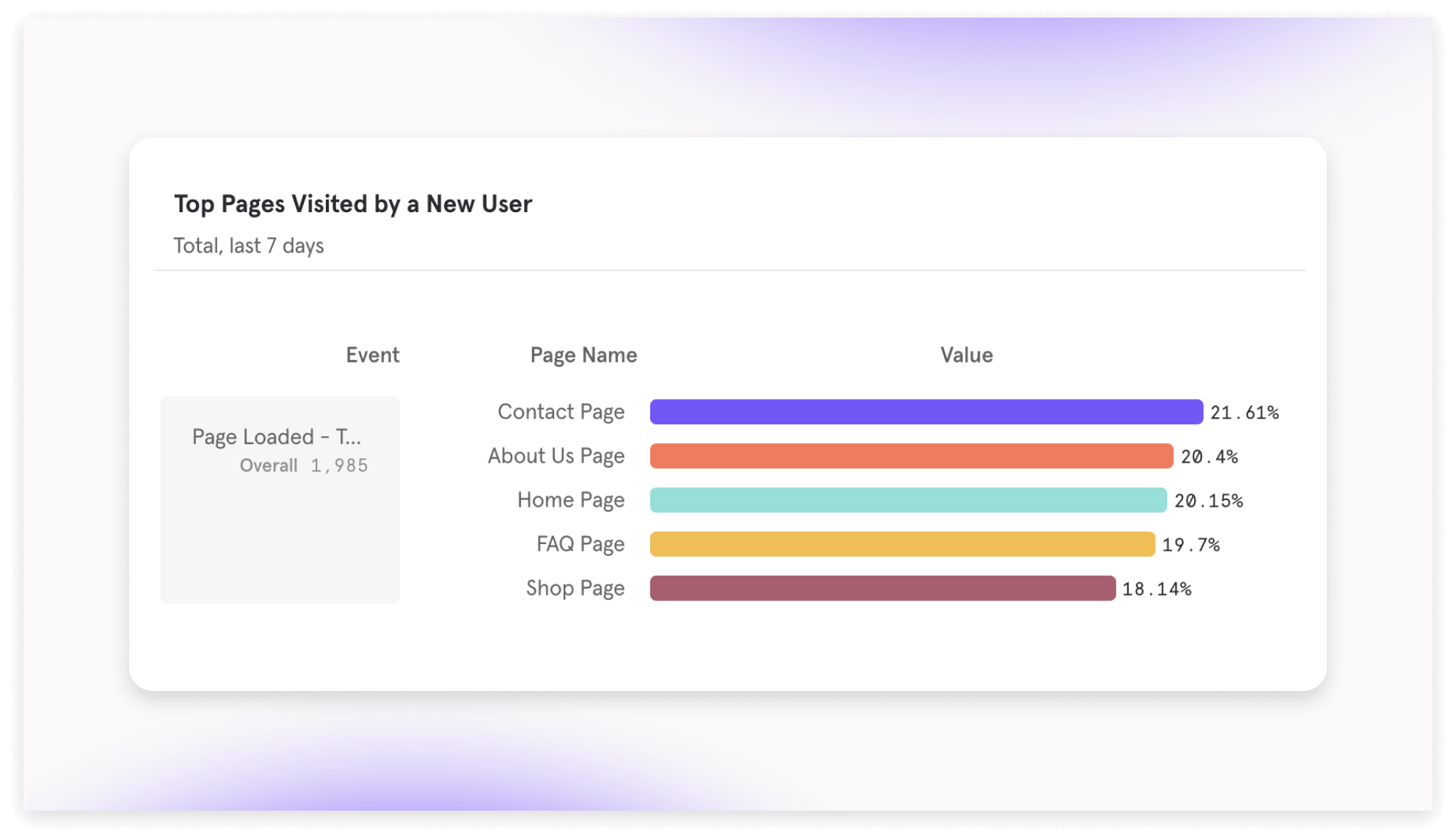
- UTM Tags (default: on) — automatically adds these parameters to all events:
- utm_source: track the source where traffic is coming from, including a website or advertiser
- utm_medium: track the advertising medium, including email and banner ads
- utm_campaign: track the campaign name associated with the traffic
- utm_content: track the specific link within in an ad that a user clicked
- utm_term: track keywords associated with campaigns
- Initial UTM: tracks the first time a user reaches any of the above parameters Tracking UTM tags help fuel attribution analysis so you can understand which campaigns, ads, or content is contributing the most, or least, to conversion.
- Page Views (default: off) — auto-track page views to build metrics like:
- Total Views: identify top performing pages to learn what content your users like best
- Bounce Rate: percentage of visitors who leave your website within 10s of viewing it
- Conversion Rate: percentage of visitors who complete a key action after visiting a page. Tracking the performance of your pages is the main way to understand if your website is driving value to your users and business. If you want to get started with web analytics, turning on auto-tracking pages can help you get started.
Track key ad metrics
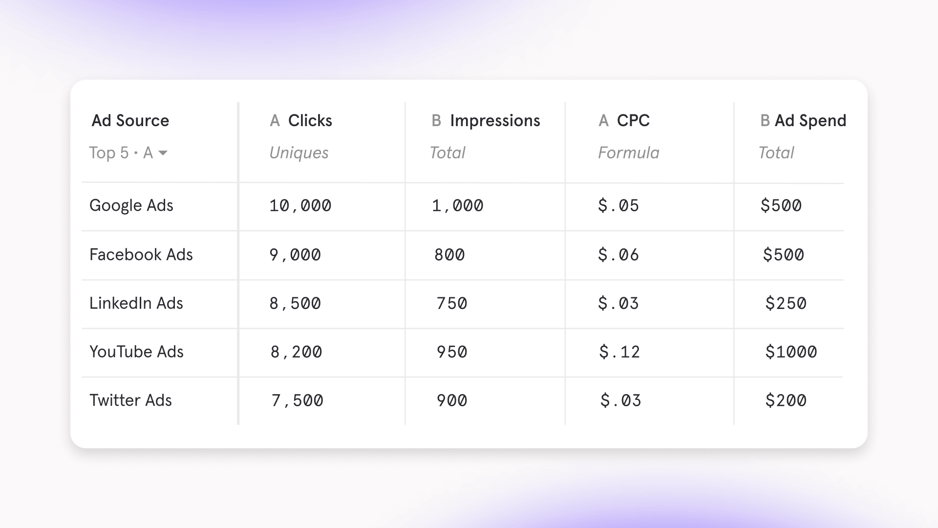
- Compare campaigns and how they affect cost-per-click to borrow strategies from well performing campaigns into poor performing campaigns
- Track the return-on-ad-spend across all ads to determine what channels need an increase in investment
- Compare different versions of an ad and compare which one has the higher click-through-rate to learn what copy, imagery, or other aspects resonate most with your audience
Vet new events and ensure data trust with Event Approval
Link to DemoOur new data governance setting ensures that only trustworthy data is surfaced to your team. Event Approval allows you to hide newly tracked events by default, and notify admins of these new events.With Event Approval, you can:- Provide a “stamp of approval” by making an event visible
- Let an event continue to be hidden if you’re unsure if it was implemented correctly
- Delete events that are mistakes
Get ahead of issues with Anomaly Detection and Root Cause Analysis
Anomaly Detection DemoRoot Cause Analysis DemoIntroducing Anomaly Detection and Root Cause Analysis, two new features to help you save time staying on top of metrics and getting ahead of potential issues in your product, data, or company.In addition to Custom Alerts where you can manually set a threshold for alerting, you can now use Anomaly Detection to be automatically alerted in Slack or email when your data falls outside an expected range. We use a robust open-source tool Prophet to forecast your time series data and determine whether the data point falls outside of your selected confidence interval.With any fired alert, you can create a Root Cause Analysis in one click that will automatically generate a Board with 12 reports broken down by popular properties of the event. This Board helps you quickly investigate potential causes of the metric change, and each alert is tethered to one Root Cause Analysis so you aren’t duplicating work if you see that others already diagnosed the issue.Ways you can catch and diagnose regressions faster with Mixpanel:- Alerted in #marketing Slack channel of a major drop in traffic for a key content landing page. From the Root Cause Analysis, see from last touch breakdown that there’s an issue in a paid ad campaign no longer driving traffic.
- Alerted via email of a major drop in your team’s recent feature launch engagement. From the Root Cause Analysis, see from browser breakdown that there’s a severe drop-off for Safari due to a new bug.
- Alerted in #engineering Slack channel of a major drop in DAU. From the Root Cause Analysis, see that the drop is driven by users in APAC, coinciding with holiday of Lunar New Year.
Explore analysis better with Discover
Our new Discover feature makes it easier to explore popular analyses to springboard your own work. The Discover page automatically surfaces top analyses and creators and provides more search controls to filter reports & Boards.Link to DemoHere are a few ways to use Discover:- Find existing analyses: filter searches by the teammate or object type (Board, Insights, Flows, etc.). Build off someone’s previous work instead of redoing an analysis.
- Onboard new teammates: new people can quickly get their bearings by discovering the most popular analyses, or by exploring what top builders in the organization are measuring.
- Get inspired: browse what your teammates measure or how they organize their Boards, and be inspired to create similar high-quality analyses
Compare metrics side-by-side in one table
With Mixpanel’s revamped Tables report, you can compare your key metrics side-by-side to understand how your segments are performing.Link to DemoTables are often the best visualization to process a lot of data at once — so, we made sure to include controls that can quickly get you to the most readable layout, fast:- Focus on the performance of a specific metric by 1) selecting a metric to sort your segments by, and 2) specifying it as ascending or descending order.
- Treat each data point as its own row in Ungrouped View, or preserve the hierarchy of your breakdowns in Grouped View.
- Control how many segments are displayed, so you can focus on the most relevant data.
- As a product manager, you can consider offering localized content that is tailored to the needs of users in specific countries and cities that are not performing well.

- As a growth marketer, you can compare how an increase in marketing spend since last month has effected the key metrics across marketing channels.

- As a product manager in e-commerce, you can determine what product you no longer want to sell by surfacing which items have the worst performing conversion.

Easily create and manage Custom Alerts
We’ve revamped Custom Alerts to make it easier for you to notify your team when a metric significantly changes.Link to DemoWith just one click, you can set up Slack or email alerts for:- When an important metric reaches a target, such as if “sign-ups” in “Japan” reaches 1000
- Monitoring unexpected behavior (or potentially faulty data), such as when any event in any segment changes by more than 25%
Explore new questions with Custom Buckets
Introducing Custom Buckets, a super simple way to group existing breakdowns to form meaningful segments. This added power can help you explore new, complex questions about your product usage by slicing & dicing like never before - all on the fly in an easy-to-use interface. Here are a few types of analysis you can build with Custom Buckets:Age Cohorts: Group an age breakdown to determine how a new feature has affected a key usage metric for different generations (Gen Z = ages 18-26, Millennial = ages 27-41) since last month.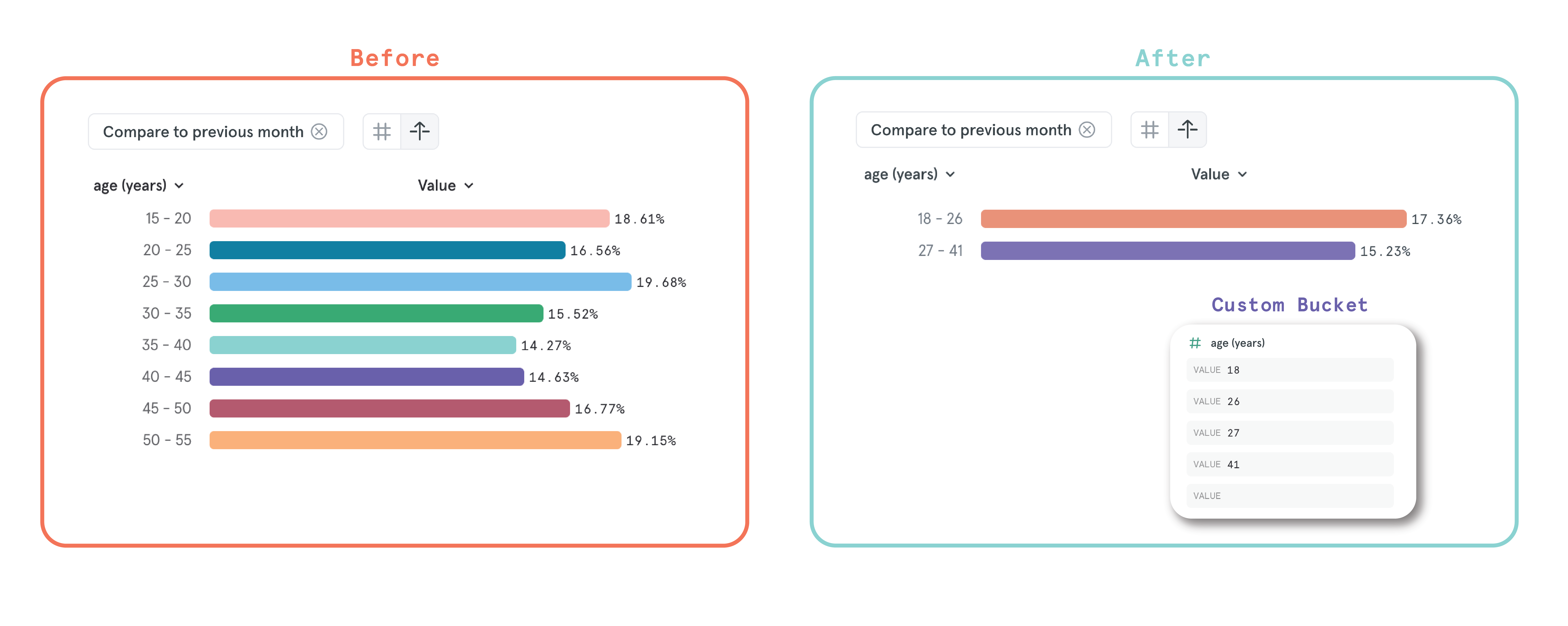
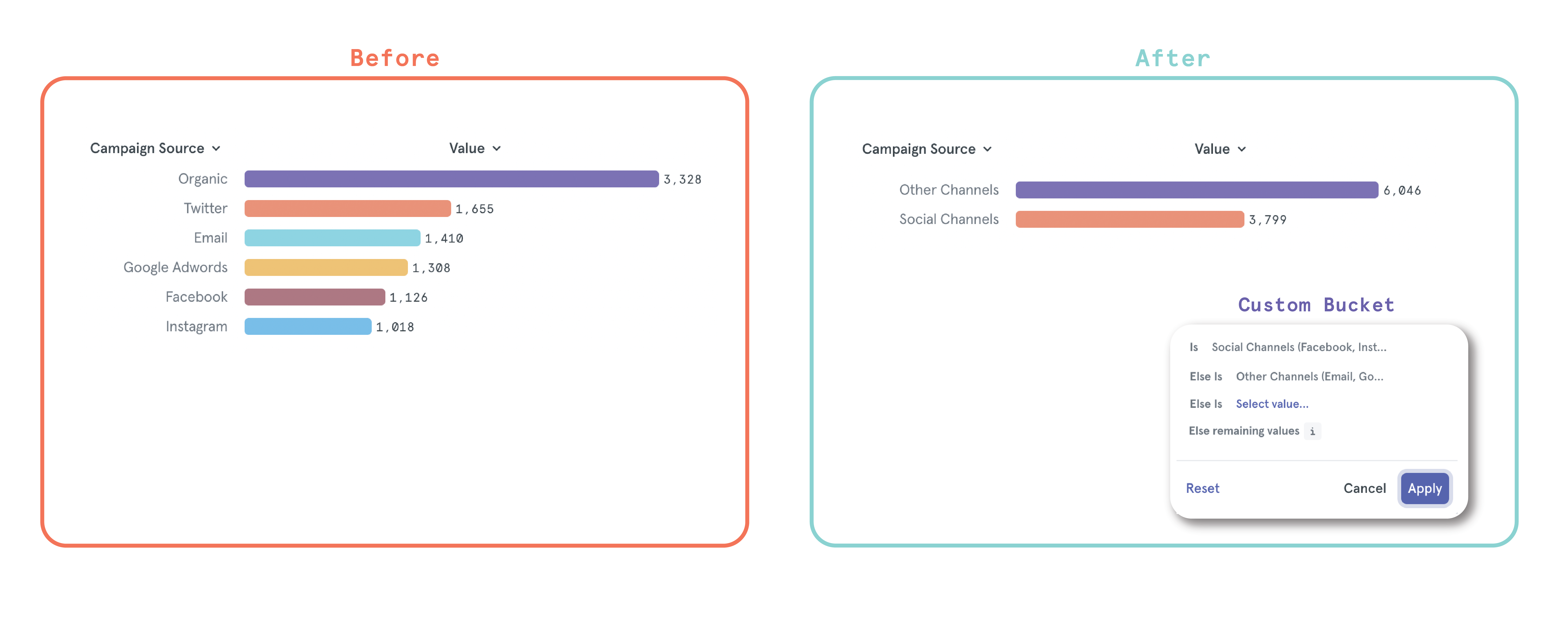
Calculate retention based on a calendar interval
Our new Calendar Retention setting allows our users to define retention on their own terms - now, you can switch your retention calculations from a rolling time window to calendar interval in just one click. Whether you want to align your retention data to internal records or other analysis tools, you can now create a reliable retention analysis that you and your team can trust to be accurate with your business’s needs.You might enjoy Calendar Retention if:- Your app or service has one engagement a day, so you want to capture the daily sessions that fall outside of the 24-hour window but occur on the next calendar day.
- There’s a marketing campaign running week-to-week, so you can scale weekly marketing spend based on calendar week retention increasing or decreasing.
- You need to align your retention metric to a monthly or quarterly calendar interval when sharing out retention performance to investors.
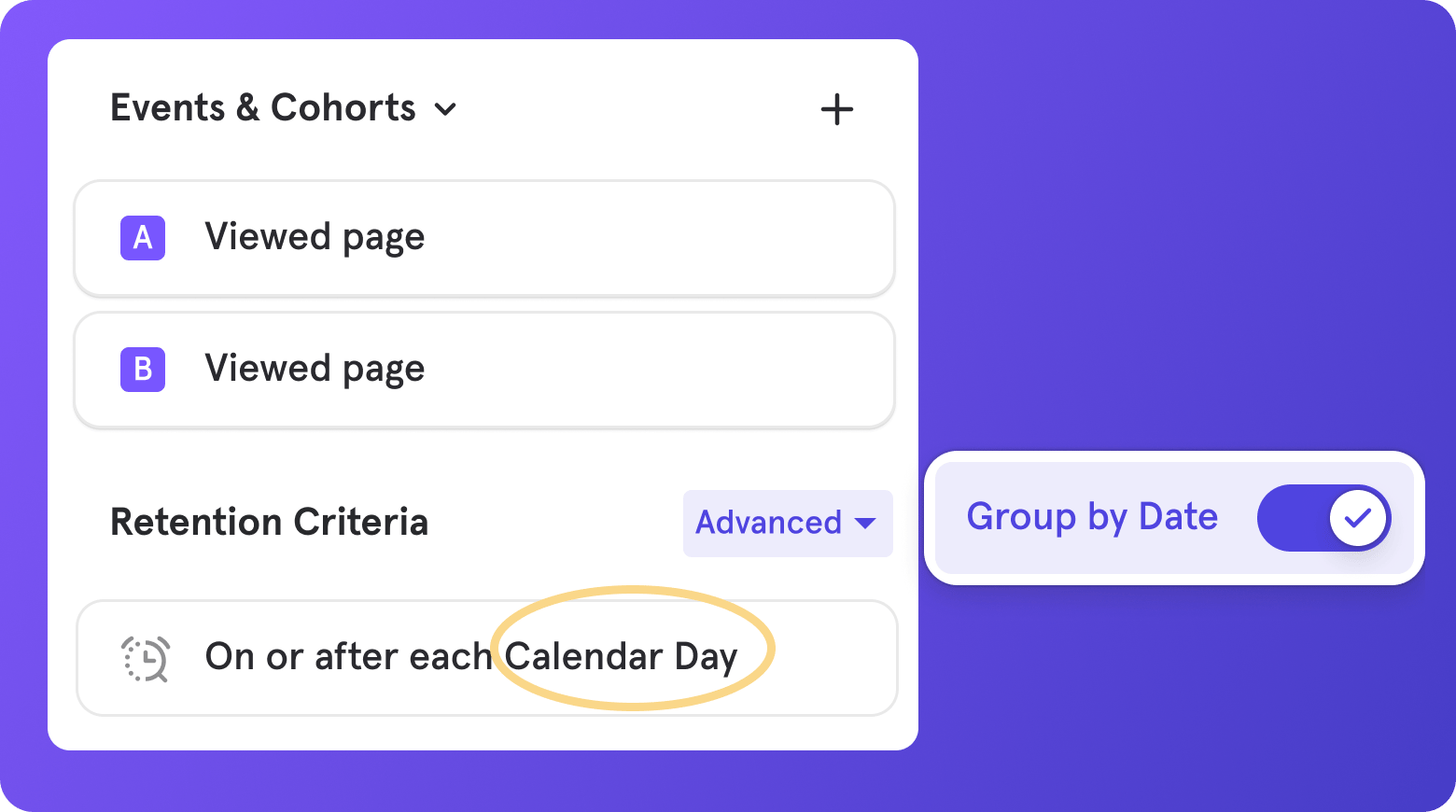
Embed Mixpanel in Figma, Notion, Coda, and more
View Users now available in Flows & more charts
Back in March of 2022, we upgraded Mixpanel’s user insights analysis with View Users - a simple way to discover who’s contributing to a point on a chart or metric. Since then, Mixpanelers have leveraged this feature to learn more about their users who are driving product growth or stagnation.With so many people enjoying the power of View Users, we’re excited to bring this functionality to additional areas of Mixpanel:- Flows report
- Trends Chart in Funnels, Retention, and Retention Frequency report
- Frequency Chart in Funnels report
- Top Paths Chart in Funnels report
- Time To Convert Chart in Funnels report
- Metric Chart in Insights and Funnels report
- Pie Chart in Insights report
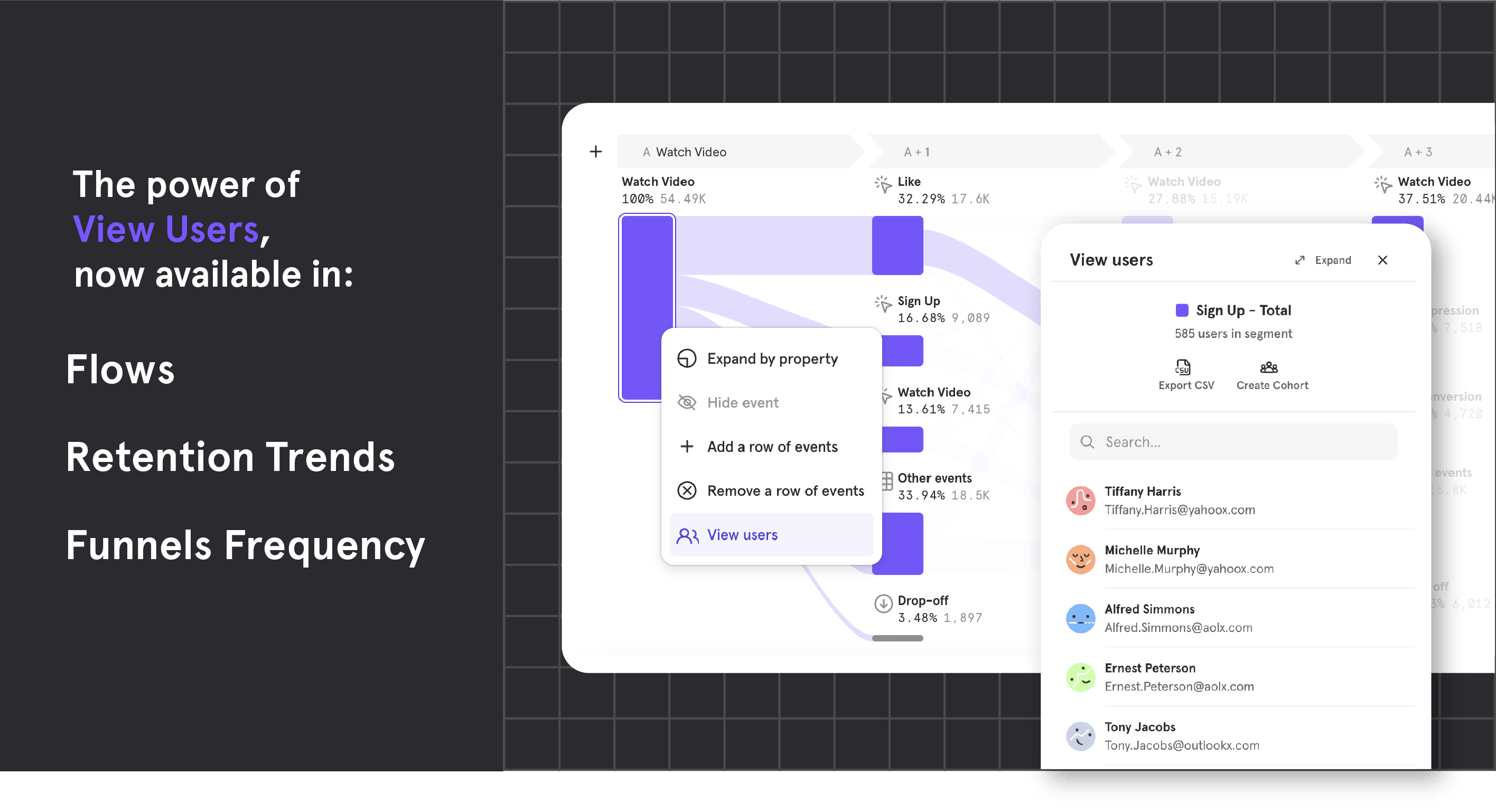
Add your Insights Table to Boards
If you’re a fan of visualizing data in table format, you can now save your table to a Board and preserve your analysis. To leverage this new capability, simply add a table to your Board or switch an existing Insights chart into its table format.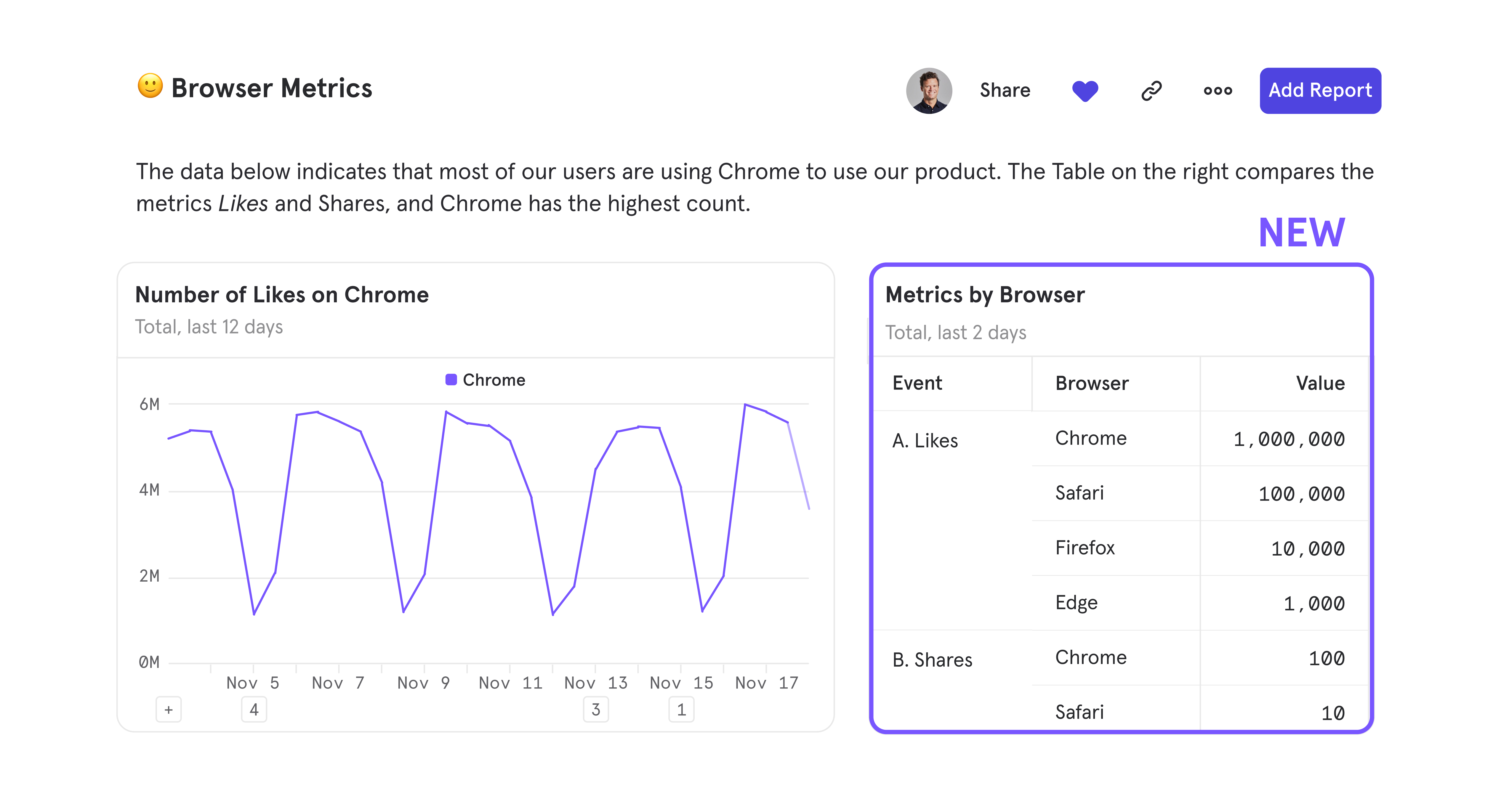
Other Updates
URLs are meant to be short and sweet - now, sharing your Mixpanel analysis is super easy with shortened URLs supported on all reports and Boards.Collaboration just got easier with Boards
We’re excited to introduce Mixpanel Boards, a new collaborative workspace that replaces our existing dashboards. Unlike an inflexible dashboard that only shows product metrics, Boards empowers teams to share complete context, dig into the data, and make better product decisions together. What’s included in Boards:- Text cards: Add text to share the reasoning behind tracking any metric (with support for rich text formatting!)
- Media cards: Give more color with a screenshot or feature walkthrough with YouTube, Vimeo, or Loom, or just spice things up with great memes
- Adjustable card height and width: Insert, drag, and resize cards to make your analyses more organized and readable
- Viewer transparency: Hover over the top right corner to quickly see who has recently viewed your Board, so you can know your impact
Mixed Improvements in Mixpanel
Perfecting Mixpanel’s workflows are a top priority for us, and that’s why our customers appreciate our best-in-class design when answering their everyday product questions. We take pride in focusing on the small, but vital incremental improvements that help Mixpanel become faster, more intuitive, and an overall joyous experience for our users.This month, we’re introducing our Mixed Improvements: updates that enhance Mixpanel’s workflows and upgrade your product analytics experience.Query builder refinements- Report tabs have been adjusted and color-coded to help you easily recognize where you are during an analysis.
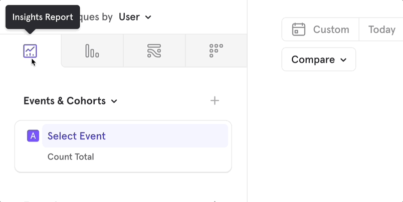
- The query builder is much easier to scan, all thanks to the new way of adding event and cohort blocks via the header of each section.
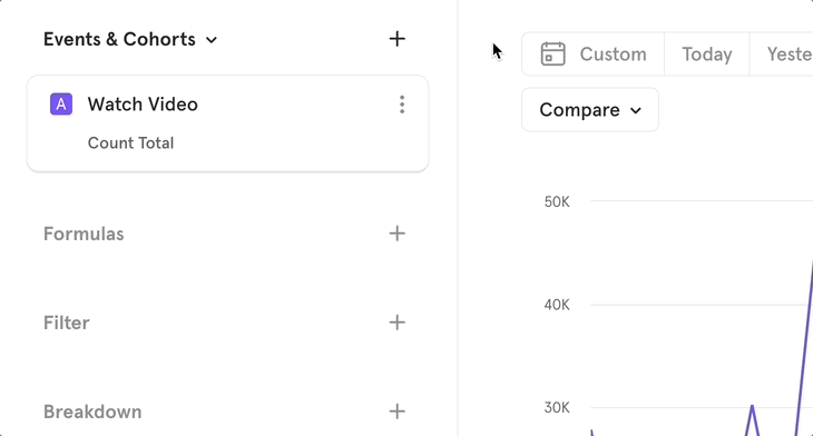
- Query blocks feel super reactive with their new design that reflects all the possible states they can be in.
- Headers, like Event & Cohorts, stick to the top so you don’t have to scroll back up to add other query blocks.
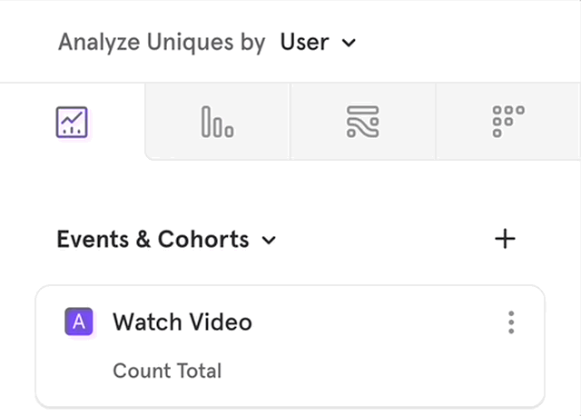
- We’ve added arrow controls for a quicker way to input your number of steps in Flows report.
- Dragging and dropping query blocks that are partially populated (uncompleted) is now possible across the query builder.
Other updates
- Flows report has been made even more intuitive - hover over a path to find the percent of users who performed that next step, and left-click on an event to pull up the action menu.
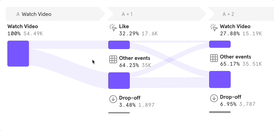
- Dashboards feel quicker than ever now that loading times for report editing in a Dashboard have decreased considerably.
- Build and rebuild your Dashboards faster than ever with supported Undo (⌘+Z) & Redo (Shift+⌘+Z).
- Render optimizations to data tables have helped them feel snappier and scroll much smoother.
- All dates in Mixpanel have been streamlined to one format, for example, Thu Jul 14, 2022 7:00 AM.
Accurate Event Ordering with Millisecond Precision
Say hello to accurate event ordering with Millisecond Precision. Now, even if you have multiple events happening within the same second, Mixpanel has the power to decipher the exact sequence in which those events occurred.Check out any Flows report to view millisecond level of precision firsthand!Before you can view events at Millisecond Precision, please make a note of two key points:- You need to update your SDK to ingest events with millisecond timestamps. All previous versions only track at second precision. The minimum versions that support ms time stamps are as follows:
- Swift - 3.3.0
- Obj-C - 4.2.0
- Android - 6.3.0
- Flutter - 1.6.0
- React Native - 1.5.0
- Unity - 3.3.0
- Javascript - historical versions have already been tracking ms timestamp. No action is to be taken if using this SDK.
Note: If you are sending data into Mixpanel via a CDP or the DWH, no change is required at your end if you’re already tracking data at ms precision.
- Only forward-looking data will be tracked at ms precision. This means that once you update your SDK, it will take some time to accumulate data with ms precision before you can see it reflected in your analysis.
Sessions improvements and new functionality
We’ve added two updates to session tracking in Mixpanel for more flexibility when defining your sessions and a simpler process to slice and dice this data. With Property Based Sessions and Sessions Properties, you can take advantage of a whole new way to analyze how users engage with your product:- Property-Based Sessions: have your own parameters that define a session? No worries - simply attach a Session ID property to your events, and Mixpanel will register all instances when a session starts and ends. Even if your sessions are complex — start from multiple events, have a max duration of 6 hours, and end after 30 minutes of inactivity — Property-Based Sessions can manage these parameters.
- Session Properties: borrow any property from the events that define a Session Start or Session End to break down your user engagement data like never before.
Reorient your view of charts and tables
Mixpanel’s charts and tables both provide a unique way to view data and capture insights. But, sometimes you’re only in need of the table. Or, you need both the chart and table for a holistic analysis. That’s why we’ve introduced Layout Controls and Visual Grouped Sort to give you control over the orientation of your report.Layout Controls
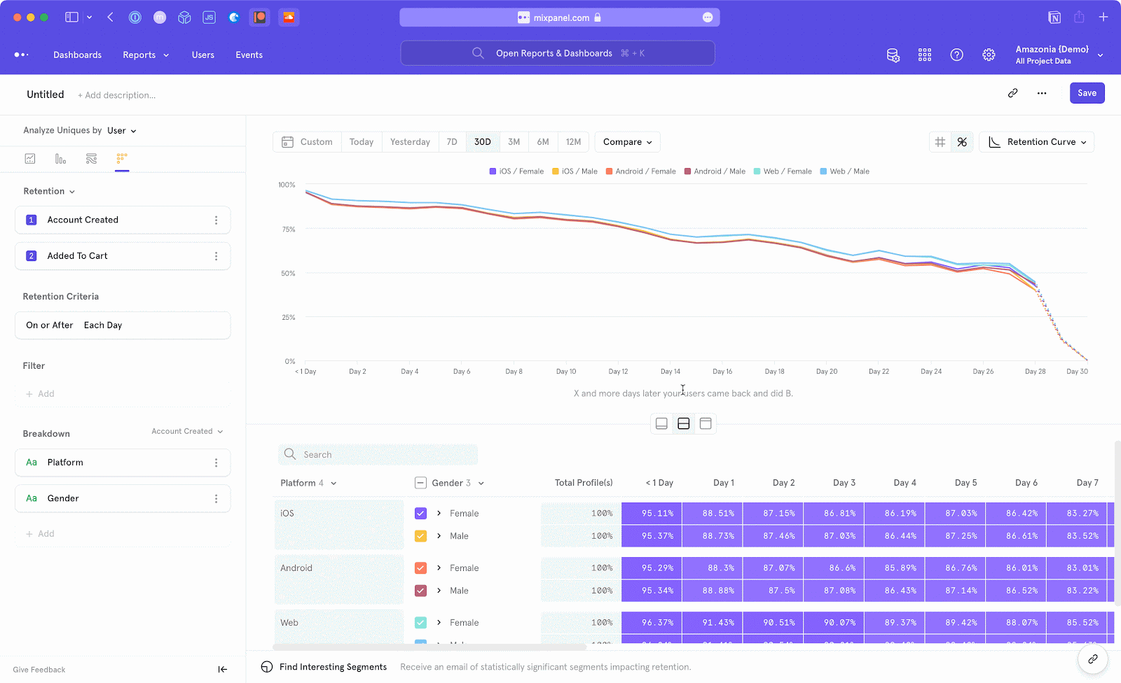
- Chart Focus: expand your chart so it is the only focus
- Split View: split screen between both your chart and table
- Table Focus: hide the chart completely to view the full, un-collapsed table
Visual Grouped Sort
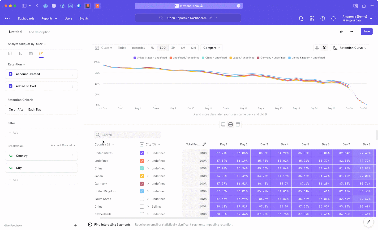
Before
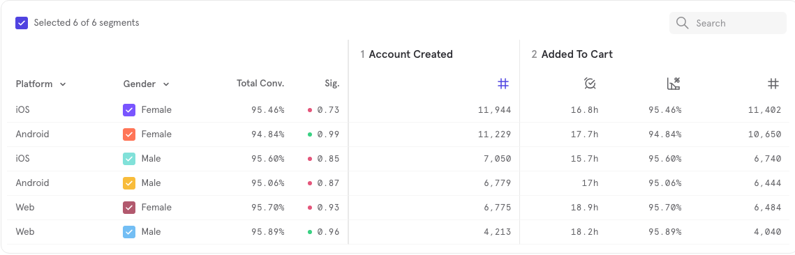
After